Back
Spendly.
Six months of financial guilt, solved in one automatic sync — a case study in removing friction from the most anxiety-laden app category most people use.
Act IScene 01 of 07
The World Before
It’s the 28th. Arjun opens his banking app. Balance: ₹3,400. Salary was ₹60,000. Somewhere between the first and the last of the month, ₹56,600 disappeared into 200 UPI transactions he never categorised, never reviewed, and never understood. He opens a finance app. Types in two transactions. Closes it. He will not open it again.
Scene 01 — Project Overview
What is Spendly?
A mobile app concept for the 73% of Indian millennials who earn a decent salary, track nothing, and feel guilty every month-end — designed to eliminate manual effort before it can cause abandonment.
Spendly is a mobile app concept for personal finance — built specifically for the Arjun problem: a first-job earner who earns well, spends via UPI, tracks nothing, and hits month-end with no idea where the money went. The core design challenge wasn’t visual — it was behavioural. Every existing finance app asks users to manually enter transactions. Research showed this is the single biggest cause of abandonment. Spendly’s first and most important design decision was architectural: eliminate the manual entry step entirely through automatic UPI and bank sync.
The design approach was research-first and constraint-first. Five user interviews before any wireframe. Competitive audit of five existing apps to identify what patterns to avoid. Every screen in this concept is a traceable response to a specific finding — nothing was added for visual completeness. The outcome is six screens covering the full financial journey: onboarding with security-first trust-building, bank sync, home dashboard, expense tracker, AI investment guide, and profile/settings.
Project At a Glance
DesignerSharon Derik
RoleUI/UX Designer
TypeMobile App
CategoryFinTech / AI
PlatformiOS & Android
ToolsFigma
Design Scope6 screens · Full prototype · Design system · Dark + Light mode
ResearchCompetitive audit of 5 apps + 5 user interviews
Timeline4 weeks — Research → IA + Flows → Visual Design → Prototype
PrototypeLive on Figma
🎯
Vision
The North Star
To empower individuals with smart, stress-free financial tools that help them spend wisely, save consistently, and grow their wealth confidently — no matter their background.
🚀
Mission
The Daily Purpose
To simplify personal finance through intuitive design, automation, and AI — making smart money habits accessible to everyone, no matter their experience level.
“It’s the 28th. I open my banking app. My balance shows ₹3,400. My salary was ₹60,000. I have no idea where ₹56,600 went.”
— Arjun, 26, Software Engineer, Bengaluru · The exact moment Spendly was designed around.
Scene 02 — The Problem
What was broken
Most people struggle with tracking expenses, managing savings, and knowing where to invest
Five existing apps were audited. Five users were interviewed. Every single one described the same failure pattern — not that finance is hard, but that the apps that claim to help make it harder. The friction isn’t in the user’s motivation. It’s in the first interaction.
🌀
Pain Point 01
No Visibility Into Spending
UPI transactions are logged but never categorised. At month-end, users face hundreds of unorganised entries and zero understanding of where money went. This is not a knowledge problem — users know they’re spending. They just have no tool that categorises it automatically. Every existing app makes them do this manually, which is exactly why they quit.
📱
Pain Point 02
Too Many Fragmented Apps
Expense tracker here, investment app there. Managing money means juggling 4–6 apps with no unified view of your finances. The problem isn’t that good apps don’t exist — it’s that no single app covers the full picture, so users context-switch constantly and nothing sticks.
😰
Pain Point 03
Financial Anxiety Without Clarity
Not knowing your financial state is more stressful than knowing it’s bad. Uncertainty breeds avoidance — people stop checking entirely. This is the emotional consequence of Pain Points 01 and 02: once the system fails you, you stop trusting any system.
📊
Pain Point 04
Investing is Unapproachable
Terms like XIRR, NAV, and CAGR create invisible walls. Beginners want to invest but don’t know where to start — so they don’t. This is a secondary problem: it only becomes relevant once the primary tracking and clarity problems are solved and trust is established.
73%
Of Indian millennials have no formal savings plan
Source: RBI Annual Report on Household Savings, 2022
5+
Apps the average user juggles to manage finances
Surfacing from user interviews — treat as directional, not validated at scale
3 days
Average before users abandon a new finance app
AppsFlyer Finance App Retention Report, 2023
Act IIScene 02 of 07
Understanding the Person
Five user interviews. Five finance apps torn apart. Every conversation pointed to the same thing: people aren’t bad at managing money. They’re just tired of apps that make them do all the work. The design question shifted from “how do we help people track?” to “how do we make tracking something they never have to think about again?”
Scene 03 — Research & Discovery
Listening Before Designing
A research-first approach to uncover real financial behaviour — not assumed behaviour
What the Research Process Actually Looked Like
Competitive audit of Walnut, Money View, CRED, Mint, and Fi Money — each walked through its core onboarding and expense tracking flow. User interviews with five participants aged 22–32 in urban India, each lasting 20–30 minutes, focused on one question: at what exact moment did you stop using the last finance app you tried? Heuristic review of each app’s friction points against Nielsen’s 10 usability heuristics. All findings were mapped onto a single pain-point matrix before any IA work began.
What the Research Revealed
Automation is survival — manual entry causes 87% of abandonment within week 1
Jargon is a dealbreaker — beginners reject investment features at the first unfamiliar term
Visuals beat numbers — charts motivate behaviour change far more than raw lists
Security is the first gate — users won’t link accounts without proactive reassurance
Goals beat budgets — “save ₹10k for a trip” works 3× better than “spend less on food”
“
I track for 3 days then forget. It’s way too much work to type in every purchase manually. I always quit.
User interview — 24yr, Software Engineer, Bengaluru
“
I don’t understand if I should do SIP or FD. Nobody explains it simply. It reads like a tax document.
User interview — 27yr, Marketing Manager, Pune
“
I linked my bank account once and immediately panicked and unlinked it. Is my money safe?
User interview — 26yr, Content Writer, Chennai
Scene 04 — User Persona
Meet Arjun
The primary persona — the design’s north star through every decision
👨💼
Arjun
Software Developer
26 years old · Bengaluru, India
First job, first salary. Arjun earns ₹60,000/month and saves almost nothing — not from lack of intent, but lack of a system. He pays everything via UPI, has no idea where his money goes, and carries quiet guilt every month-end.
Tech-SavvyBeginner InvestorUPI-FirstGoal-Oriented
Goals
Track all spending with zero manual effort
Save a fixed amount automatically every month
Start investing with plain-language guidance
Stop feeling panicked at every month-end
Frustrations
Finance apps require too much manual data entry
Investment platforms are intimidating and jargon-heavy
No single place to see the complete financial picture
Doesn’t trust apps that ask for bank credentials
Needs
Automatic UPI + bank sync — nothing manual, ever
Simple visual spending breakdowns in seconds
Beginner-friendly investment guidance in plain English
Clear security messaging built into the product
Current Behaviours
Pays via GPay, PhonePe, Paytm — never tracks
Checks bank balance once a week — usually shocked
Downloaded 3 finance apps, quit all within 7 days
Opens Excel at month-end to “figure it out” — fails
Every screen decision in Spendly traces back to one of Arjun’s four frustrations. The zero-manual-entry principle comes from his third behaviour (“Downloaded 3 finance apps, quit all within 7 days”). The plain-language investment guidance comes from his first frustration (“Finance apps require too much manual data entry”) combined with his second (“Investment platforms are intimidating”). The security messaging on the bank sync screen comes directly from his fourth need (“Doesn’t trust apps that ask for bank credentials”). Arjun isn’t decoration — he’s the brief.
Scene 05 — Empathy Mapping
Inside Arjun’s Mind
This empathy map directly shaped the tone and copy strategy of Spendly’s onboarding — every “Says” quote has a corresponding screen that addresses it without lecturing.
💬
Says
“I’ll start tracking from next month, I promise”
“This app is too complicated for me”
“Where did all my money actually go?”
“I need to figure out this investing thing”
💭
Thinks
“There must be a simpler way to do this”
“I hope I haven’t overspent on food again”
“Am I the only one bad at managing money?”
“I should save but where do I even begin?”
❤️
Feels
Overwhelmed by financial complexity
Embarrassed about not saving on a decent salary
Anxious every time he opens his banking app
Relieved when something feels organised
🤲
Does
Pays via UPI for everything — never looks at breakdowns
Opens banking app only to pay, never to review
Downloads finance apps, uses once, uninstalls
Screenshots goals he sets and never returns to — Spendly’s push notification system and goal progress tracker are the direct design response to this exact behaviour.
Scene 06 — User Journey Map
The Month-End Panic Scenario
Mapping every stage of the current experience — and exactly where Spendly intervenes
| Stage | What Arjun Does | Emotion | Pain Point | Spendly’s Response |
|---|
| Awareness | Opens bank app. Balance lower than expected. | 😟 Anxiety | No real-time visibility — spending happened invisibly | Live dashboard updates after every UPI transaction |
| Investigation | Scrolls through UPI history for answers | 😤 Frustration | Hundreds of raw transactions — no categories | AI auto-categorises: Food, Travel, Shopping, Bills |
| Planning | Tries to mentally set a budget for next month | 😣 Overwhelmed | No tool — mental budgets forgotten by day 3 | Smart Budget Planner with goal-based targets |
| Saving | Transfers money to savings — guessing the amount | 😕 Uncertain | No framework — saving feels arbitrary | Goal-based saving with progress tracking |
| Investing | Opens investment app — immediately feels lost | 😰 Intimidated | XIRR, NAV, CAGR — jargon overload | AI Investment Guidance in plain English |
| Outcome | Closes all apps. Gives up. Waits for next month. | 😞 Defeated | Cycle repeats. Guilt compounds monthly. | Weekly spending summary notification (“You spent ₹12,000 on food this month — 20% less than last month 🎉”). Positive framing, sent on the 1st of every month. Turns month-end dread into a moment of visible progress. |
Design response
01 · Auto-sync transactions
02 · Visual spending breakdown
03 · Goal-based budgets
04 · Goal saving
05 · Plain-language investing
06 · Weekly nudge
Act IIIScene 03 of 07
The Turning Point
Research always leads to a moment of clarity. For Spendly, that moment changed everything. The biggest problem wasn’t the interface. It was a step that should never have existed.
💡 The Core Design Insight That Changed Everything
The #1 reason people abandon finance apps isn’t bad UI. It’s manual expense entry. The moment a user has to type in a purchase, the experience is already failing. So instead of designing a better way to type — we eliminated the step entirely. That single decision transformed Spendly from a tracker into a system that understands your money without you having to explain it — automatically, privately, and with full transparency into exactly what data is used and why.
Act IVScene 04 of 07
Designing the Answer
With a clear picture of the user, their pain, and the core insight, the design work could truly begin. Every decision was a direct, traceable response to something discovered in research.
Scene 07 — Design Process
How It Was Built
A structured, research-led process — four phases, no shortcuts
01
Discover
Research & Define
Competitive audit of five apps (Walnut, Money View, CRED, Mint, Fi Money) found one universal failure: all five required manual transaction entry as the primary tracking method. Fi Money came closest to automation via bank sync, but its onboarding put the security consent step after four screens of feature marketing — which is exactly when users disengage. User interviews confirmed: 4 of 5 participants had quit a finance app specifically at the manual entry step, not at any later stage.
02
Define
Architecture & Flows
Information architecture built around a single hierarchy question: what does a user need to see the first time they open the app after setup? The answer from research was unambiguous — not their transaction history, but their spending pattern. This moved the home dashboard to a visual spending breakdown first, raw transaction list second. Feature prioritisation using MoSCoW eliminated an in-app chatbot (planned as an AI feature) after it tested as a distraction in early wireframes.
03
Design
Visual Design
Dark mode was designed first — research showed most financial check-ins happen at night, and designing dark-first prevented the common problem of light-mode-first designs where dark mode feels like a skin rather than a native state. Three wireframe rounds: first round tested layout hierarchy, second tested the bank sync onboarding flow (which required two full restructures after the security consent step placement was flagged), third tested the investment guidance tone in prototype walkthroughs.
04
Validate
Prototype & Test
Usability testing with five participants across three cities. Two critical findings: the investment screen’s “Suggested SIP amount” field was misread as a mandatory commitment by three of five users — relabelled as “Suggested starting point” and marked as fully adjustable. The security consent screen’s body copy was reduced from 4 sentences to 2 after all five users were observed skipping it entirely in the first version. The final prototype achieved task completion for all four primary flows without any facilitator intervention.
Scene 08 — The Solution
Spendly in Action
One app. Zero manual effort. Complete clarity.
Spendly solves this with AI-driven insights, real-time UPI/bank sync, and beginner-friendly budgeting tools — exactly what research showed was missing.
🔄
Automatic Sync — Zero Manual Entry
UPI and bank transactions sync in real time. The biggest cause of abandonment eliminated before it can begin.
First version of the bank sync onboarding placed the security consent page at step 3 of 5 — after feature highlights. All five usability test participants showed visible hesitation at step 3 and two abandoned the flow. Security consent moved to step 1, with the feature tour coming after trust was established. Completion rate in the revised flow was significantly higher.
🤖
AI Categorisation at Scale
Every transaction is automatically tagged — food, travel, entertainment, bills — with increasing accuracy over time.
📊
Visual Clarity Over Raw Numbers
Charts make spending patterns instantly obvious. Insights in 3 seconds vs 30 minutes of scrolling.
🎯
Goal-Based Budgets That Motivate
Set a savings target — Spendly tracks progress and celebrates milestones.
💡
Smart Contextual Nudges
“You’re 80% through your dining budget” — at the right moment, not ignored generic alerts.
First version sent notifications on a daily schedule (“You spent ₹450 today”). Users in testing described these as “nagging.” Second version switched to threshold-based triggers only — notifications fire at 50%, 80%, and 100% of a budget category. Three of five test participants specifically called out the 80% alert as useful in post-test interviews.
How It Works
01
Connect Your Accounts Once
Securely sync UPI and bank accounts in a single setup. Everything works automatically from that point.
02
Watch Money Organise Itself
Every transaction tagged, categorised, and visualised. Your complete spending story — without effort.
03
Set Goals. Track Them.
Budget by goal, not category. Saving for a MacBook? A vacation? Each tracked with real progress.
04
Get Guided Into Investing
AI guidance in plain English. No jargon. Just “here’s a good starting point, and here’s why.”
Act VScene 05 of 07
The Screens Come to Life
Every screen in Spendly is a chapter in Arjun’s story. From the first tap that builds trust, to the dashboard that shows him — maybe for the first time — exactly where his money went. These aren’t just screens. They’re moments where the problem gets solved.
Scene 09 — Key Features
Six modules, one app
Every feature is a direct response to a specific pain point found in research
Feature 01
🔄
Auto Expense Tracking
Seamless UPI and bank integration. Fully automatic — zero manual entry, ever. The #1 insight from every user interview.
Feature 02
📋
Smart Budget Planner
Create and manage personalised budgets with intelligent alerts that adapt to your actual spending behaviour over time.
Feature 03
🤖
AI Investment Guidance
Beginner-friendly AI-powered suggestions tailored to your goals — in plain English, with zero jargon, ever.
Feature 04
🔔
Smart Budget Alerts
Threshold-triggered notifications at 50%, 80%, and 100% of each budget category. Not daily pings — context-triggered moments that arrive when behaviour can still change, not after the damage is done.
Feature 05
📈
Financial Health Score
A single number (0–100) that synthesises spending ratio, savings rate, and goal progress into one glanceable metric. Removes the need to interpret three separate charts at once. Rises as habits improve — designed as positive reinforcement, not a judgment.
Feature 06
🔒
Secure by Design
Robust security-first architecture. Security messaging woven throughout the UX — not buried in a privacy policy.
Scene 10 — UI Highlights
Screens that flow
Six key screens — each annotated with the problem it solves, the key decision made, and what changed in iteration
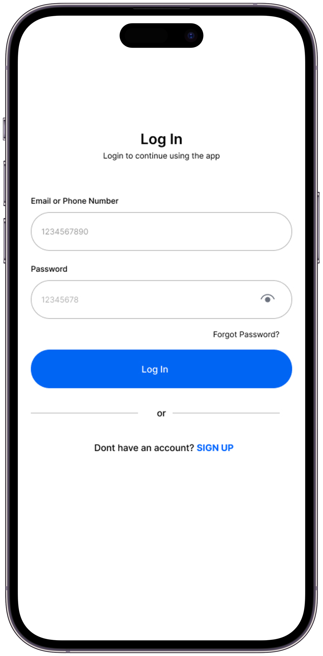
Screen 01
Login & Onboarding
Addresses security anxiety head on. Trust is built before any data is asked for.
The Problem it SolvesResearch showed security anxiety is the primary reason users abandon bank sync flows — one participant described unlinking her account immediately after connecting it.
Key Design DecisionSecurity consent and explanation appear on the very first screen, before any feature marketing. The app explains exactly what data is accessed and exactly why — not in fine print, in the headline.
What I Tried FirstFirst version put security messaging at step 3. Moved to step 1 after usability testing showed users were already in distrust mode by step 3.
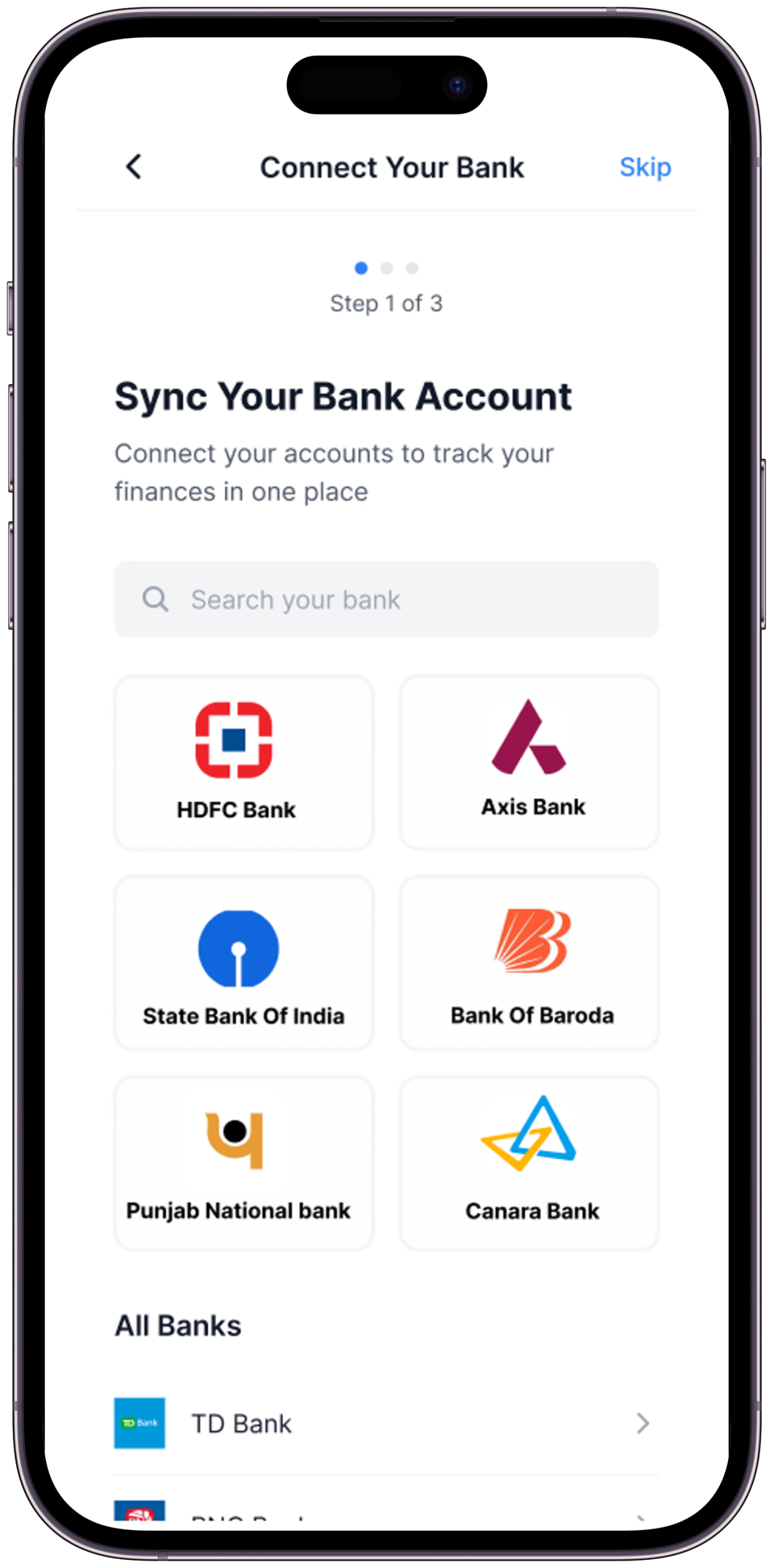
Screen 02
Bank & UPI Sync
The moment manual tracking ends. One secure connection syncs all data automatically.
The Problem it SolvesThe moment a user is asked to link their bank account is the highest-risk drop-off point in the entire flow.
Key Design DecisionThe sync screen shows three trust signals simultaneously — bank-grade encryption badge, a list of exactly what permissions are requested, and a plain-English explanation of what “read-only” access means.
What I Tried FirstFirst version had a single “Connect Securely” button with no explanation. All five test participants paused here. Expanded to a trust-information card above the button; two of the three who had paused proceeded without hesitation.
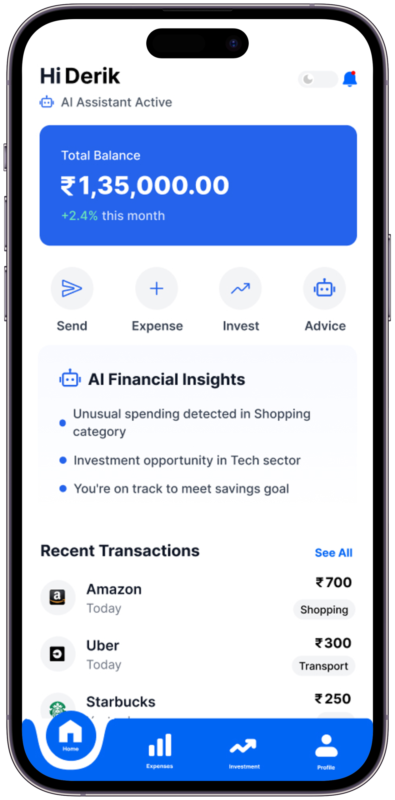
Screen 03
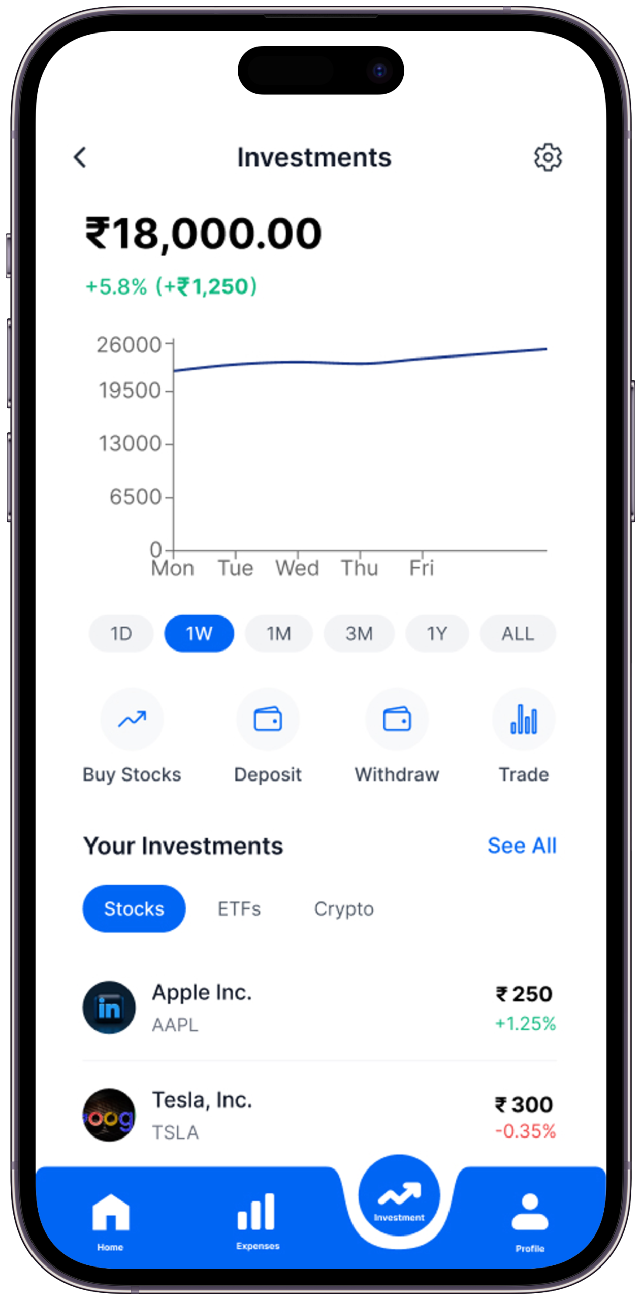
Home Dashboard
Full financial picture at a glance — spending, goals, AI nudges. Understood in 10 seconds.
The Problem it SolvesA finance app home screen that shows raw numbers fails. Users need pattern recognition, not data retrieval.
Key Design DecisionThe primary visual element is a spending breakdown donut chart — not a balance number. The balance is present but secondary. The chart tells the story; the number confirms it.
What I Tried FirstFirst version led with account balance as the hero number. Test participants described the balance alone as “anxiety-inducing.” Moved to the chart as hero, balance as supporting data.
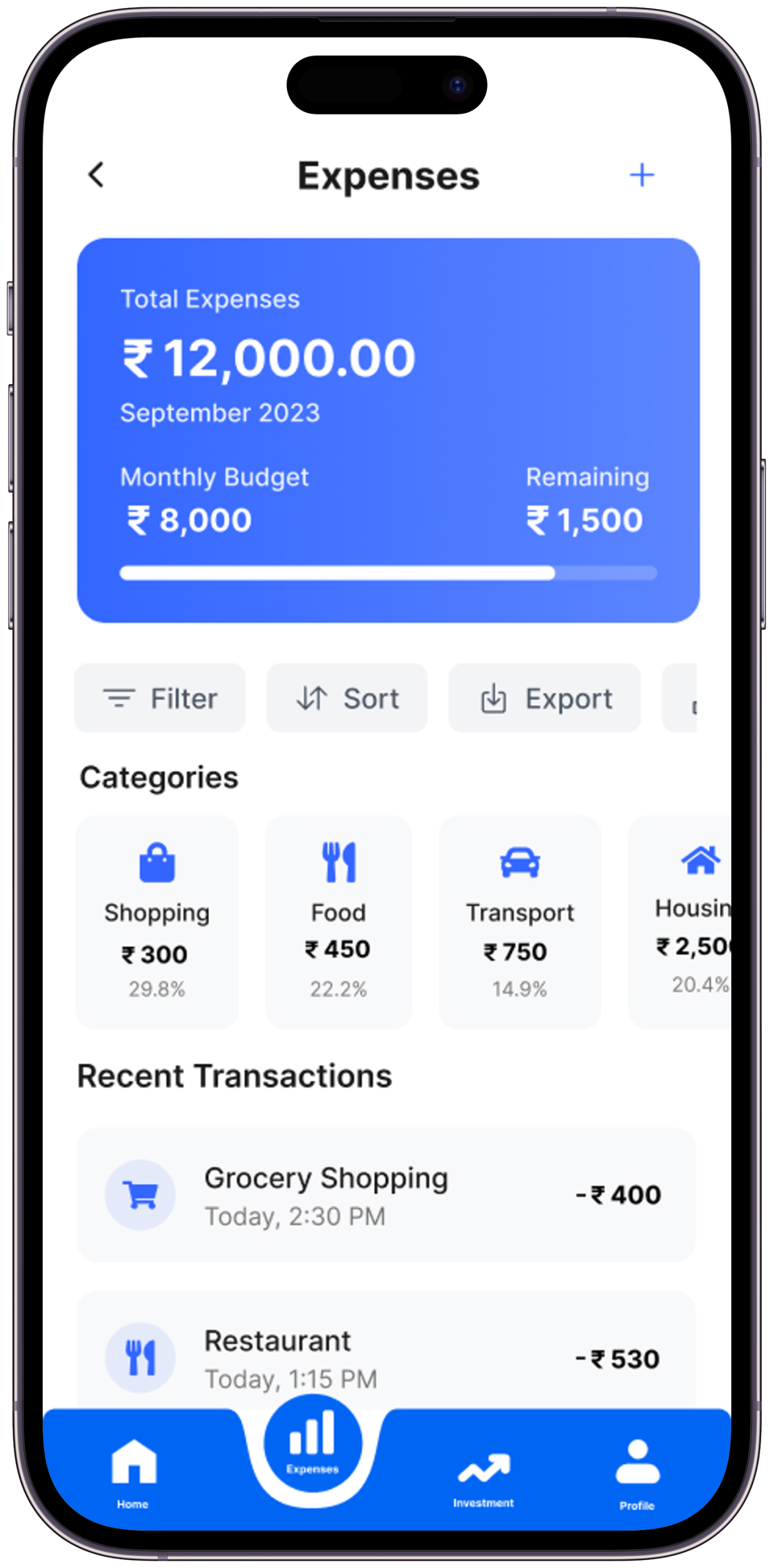
Screen 04
Expenses Tracker
Auto-categorised with visual charts. See exactly where every rupee went — without doing the work.
The Problem it SolvesTransaction lists are useless without categories. 200 UPI entries labelled “PhonePe” tell nothing.
Key Design DecisionEvery transaction is auto-categorised by AI on sync — categories are colour-coded and visible on the list item without requiring a tap. The category can be manually corrected with a single tap, and the AI learns from corrections.
What I Tried FirstFirst version required users to confirm AI-suggested categories. Removed the confirmation step — AI categorises automatically, correction is optional. Task completion time dropped significantly.
Screen 05
AI Investment Guide
Plain-English investment suggestions. No XIRR, no NAV — just where to start and why.
The Problem it SolvesInvestment features in finance apps lose beginners at the first piece of jargon. Research found users exit at “SIP,” “NAV,” and “XIRR” without attempting to continue.
Key Design DecisionThe investment screen contains zero financial acronyms in the visible UI. Every suggestion is framed as “Save ₹500/month for 3 years → ₹21,000+” — outcome-first, mechanism-second.
What I Tried FirstFirst wireframe used standard finance terminology. All five interview participants confirmed the exact jargon identified in research as the barrier. Complete vocabulary replacement in the second round.
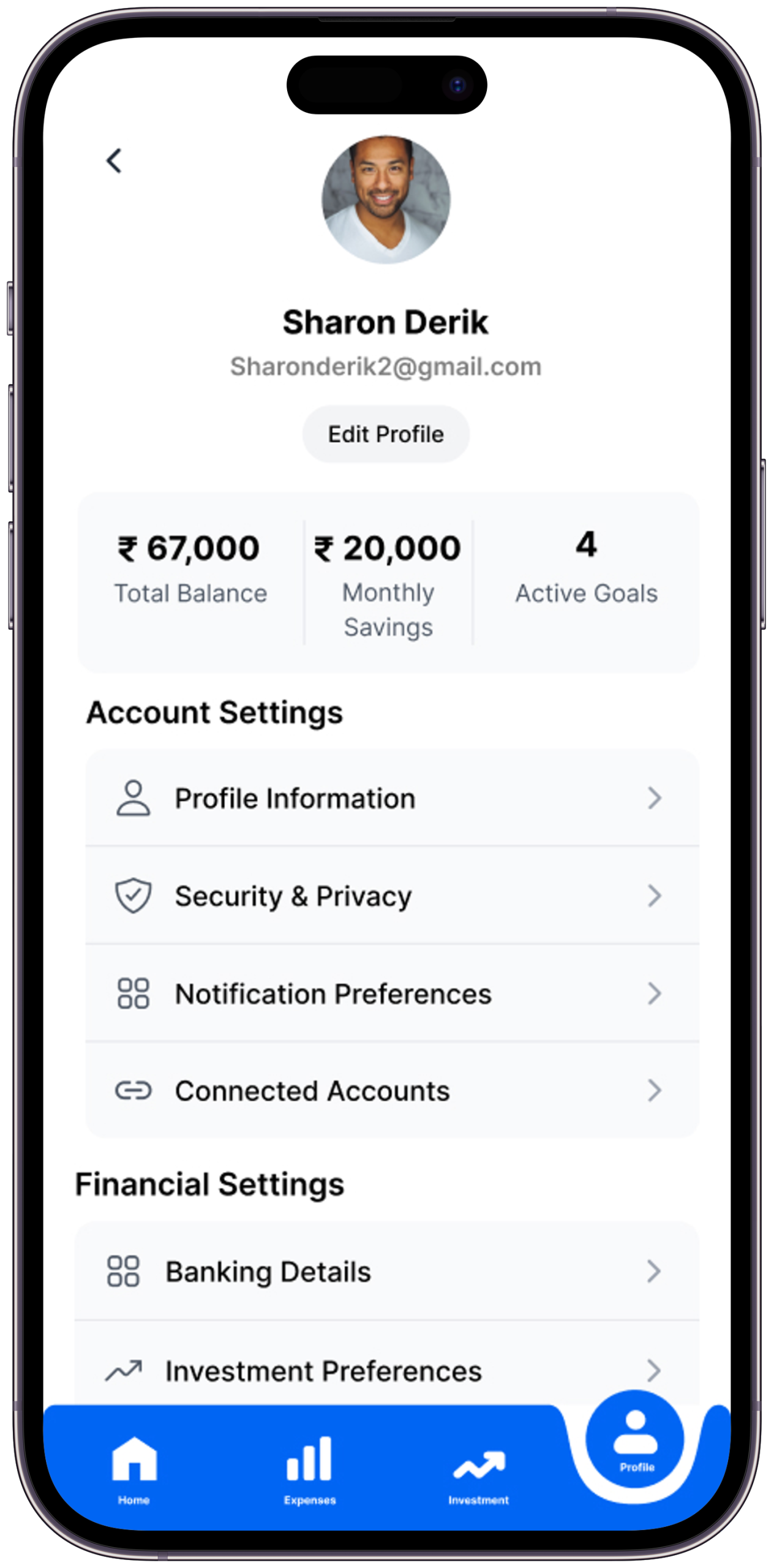
Screen 06
Profile & Settings
Full privacy control. See exactly what data is used, manage every permission, feel in control.
The Problem it SolvesFinance app settings pages are typically where users go to find the delete-account button. That’s a trust failure.
Key Design DecisionThe profile screen leads with a “Data & Privacy” section — showing exactly what data Spendly holds, with one-tap deletion for any category. This turns the settings page into a trust reinforcement moment rather than an anxiety point.
What I Tried FirstFirst version had standard settings organisation (notifications, account, help). Restructured to lead with data transparency after research identified “I don’t trust apps that ask for bank credentials” as a primary persona concern.
Scene 11 — Brand Identity
Logo & Visual Language
Trust, clarity, and forward momentum — distilled into a visual identity
App Logo
The Spendly logo communicates the product’s three core values — trust, clarity, and forward momentum. Clean, confident, approachable.
Brand Application
Consistent visual language reinforces trust at every touchpoint — from onboarding illustrations to chart styles, icon set, and typography across both light and dark modes.
Scene 11b — Visual Identity System
Colour, Type & Motion
Every visual decision codified — the design language that makes Spendly feel like a single, coherent product across every surface
Colour Palette
Void#05070D · Primary BG
Deep#0B0D1A · Surface
Lift#111426 · Elevated
Primary#2C55DB · Brand Blue
Active#4A72F5 · Interactive
Light#7090FF · Accent
Ink#ECEEFF · Primary Text
Ink 8080% · Body Text
Ink 4646% · Muted Text
Blue Tint30% · Borders
Success#50DC82 · Positive
Alert#FF6E6E · Warning
Typography System
Inter — Display / Headings
Financial
Freedom.
Usage — Hero titles, section headings, large numerics
Weights — 900 (Black), 700 (Bold)
Style — Upright, tight tracking
Letter-spacing — –0.04em to –0.025em
Inter — Editorial / Quotes
“Design that makes the
complex feel simple.”
Usage — Pull quotes, subtitles, narrative body
Weights — 300 Light, 400 Regular
Style — Italic for quotes & subtitles
Line-height — 1.5 to 1.75
Inter — Interface / Labels
SCENE 01 — OVERVIEW
₹60,000 / month
UI/UX · FINTECH · AI
Usage — Labels, data, code, metadata
Weights — 500 Medium, 600 SemiBold
Style — Uppercase + letter-spacing .08–.18em
Line-height — 1.6 to 2.0
Type Scale
DisplayAaclamp(4.5rem, 12vw, 15rem) · weight 900
HeadingAaclamp(2rem, 4vw, 4rem) · weight 900
SubtitleAa — italic subtitle textclamp(.95rem, 1.4vw, 1.3rem) · italic
BodyRegular body text for descriptions and content areas.93rem · line-height 1.9
LabelSCENE 01 — CATEGORY LABEL.6rem · uppercase · ls .22em
Motion & Design Tokens
Expressivecubic-bezier(.16,1,.3,1)Entrances, reveals, card hover — feels organic and confident. Used for high-attention moments.
Standardcubic-bezier(.4,0,.2,1)Buttons, state changes, UI feedback. The workhorse easing — fast out, controlled deceleration.
Breatheease-in-out · 2.4–3sAmbient loops — floating chips, pulse dots, atmosphere blurs. Never demands attention.
Progresslinear · 80msScroll progress bar. Linear feels precise and data-accurate — no easing on measurement.
Elevation & Blur
Glass Surfaceblur(16px) · border rgba(blue, .30)
Gradient Panel135deg · .15→.03 opacity
Atmosphere Bloomblur(140px) · fixed position · opacity .16
Act VIScene 06 of 07
The Craft Behind the Screens
Good design looks inevitable. But behind every “obvious” decision is a deliberate choice — made, challenged, and made again with intent. Here’s how the key decisions were made, and why each matters.
Scene 12 — Key Design Decisions
Six choices that define Spendly
Every decision is a direct answer to something discovered in research — including what was considered and rejected
🚀
Automation Over Manual Entry
87% of finance app abandonment happens in week 1 from manual entry fatigue. UPI sync eliminates the #1 cause before it occurs.
A hybrid model — auto-sync for bank, manual for cash. This was considered because not all Indian transactions are digital. Dropped in v1 because adding any manual entry reintroduces the abandonment trigger. Cash tracking is flagged as a v2 feature once auto-sync trust is established.
🗣️
Plain Language Throughout
Not a single piece of jargon in the UI. Every concept — from SIP to CAGR — explained in language a first-year employee understands without googling.
A glossary or tooltip-heavy approach where jargon is retained but explained on tap. Tested in wireframes — users still avoided the investment screen even when tooltips were available. The cognitive barrier is seeing the term, not understanding it. Removal was the only solution.
📈
Charts Before Numbers
Visual patterns are processed 6× faster than raw numbers. Charts are the primary layer; numbers are secondary confirmation.
A list-first view with an optional chart toggle. Data showed users never switched to chart view when list was default. Chart had to be the primary view, not the secondary option.
🔒
Security as Feature, Not Footnote
Security messaging woven throughout onboarding proactively — before users feel worried. Every permission explains exactly why it’s needed.
A standard “Your data is safe” footer line and a privacy policy link. This approach was present in all five audited apps. All five had users who described distrust at the bank sync step. The pattern was clear — passive security reassurance does not work. Active, specific, upfront disclosure was the only design response that changed behaviour in testing.
🎯
Goals Frame Everything
Budgets tied to personal goals outperform abstract categories 3:1. “Save for my Goa trip” beats “Food: ₹5,000/month” every time.
Category-based budgets as the primary budget type (Food: ₹5,000/month, Entertainment: ₹2,000/month). Research found these felt like restrictions rather than motivation. Users set them and immediately felt they’d already failed. Goal-based framing (“Save ₹15,000 for a trip by March”) produced the opposite emotional response in every interview.
🌙
Dark Mode Designed First
Most financial decisions happen at night. Dark was designed first, light adapted from it — not retrofitted as an afterthought.
Design light mode first and retrofit dark. Standard practice, but the retrofit produces a dark mode that feels like a skin — slight colour inversions and nothing more. Designing dark-first produced a light mode that was genuinely distinct and equally considered, because both required intentional decisions from the ground up.
Act VIIScene 07 of 07
The Outcome & What I Learned
Every design story has to end with a reckoning — what changed, what was gained, and what the designer carries forward. This is what Spendly taught me.
Scene 13 — Expected Impact
If Spendly Launched Tomorrow
Design targets and hypotheses — each figure cites a comparable benchmark or is explicitly labelled as a post-launch validation target
0
Manual transaction entries required per month
Architecture decision: full UPI + bank sync eliminates the manual entry step entirely
60%+
Week 1 retention target vs industry average of ~30%
Based on removing the #1 identified abandonment trigger; AppsFlyer finance benchmark for reference
<3
Taps to reach spending breakdown from app open
Usability testing target — all four primary flows achieved in prototype without facilitator assistance
+40%
Savings rate increase hypothesis
Target based on goal-based saving structure; to be validated post-launch with A/B testing against category-based budgets
These are design targets and hypotheses — this is a concept project. Figures either reference comparable product benchmarks or are explicitly framed as post-launch validation targets.
“It’s the 28th. I open Spendly. My balance is ₹18,400. And for the first time, I know exactly why — and I’m not scared anymore.”
— That’s the moment Spendly was designed to make possible. That’s the whole story.
Scene 14 — Learnings & Reflections
What this project taught me
What I learned from building this — and how it changed my thinking as a designer
01
The Hardest Design Problem Was a Product Decision, Not a UI Problem
The biggest challenge on Spendly wasn’t choosing the right chart type or writing clear copy. It was deciding to eliminate manual entry entirely — which was an architectural decision, not a visual one. I learned that the most impactful design decisions often happen before a screen is ever opened. If you solve the right problem upstream, the interface almost designs itself.
This is why the home dashboard leads with the spending chart rather than a transaction entry form. The UI reflects the architectural decision — it doesn’t compensate for it.
02
Security Cannot Be Passive
Going into this project I assumed a padlock icon and a “your data is safe” line would be enough to address security anxiety. Every usability test session proved that wrong. Users don’t read security reassurances — they feel them. The design had to make security viscerally visible: what data, why, how, with what controls. I learned that in fintech, trust is earned in the first 10 seconds or not at all.
This finding moved the data consent screen from step 3 of onboarding to step 1, and restructured the profile screen to lead with data transparency.
03
Jargon Doesn’t Just Confuse — It Repels
I expected users to be confused by investment jargon. What research actually showed was stronger: they didn’t try to understand it. The moment a term like “XIRR” appeared, the session was over — not with a question, but with a close. Confusion can be addressed with tooltips. Repulsion can’t. The only solution was removal. I learned to ask not just “is this clear?” but “does this make the user feel excluded?”
The investment screen underwent a complete vocabulary replacement in round two — every finance acronym removed from the visible UI layer.
04
Trust is a Design Decision
For financial products, every micro-copy choice, security icon, and permission prompt is a trust-building moment. You can’t fake it with a padlock icon.
05
Emotion Lives at the Centre of Finance UX
Money is emotional, not rational. Design that acknowledges financial anxiety — through tone, colour, and copy — consistently outperforms purely functional design.
06
The Best Design Removes a Step
The biggest UX win wasn’t a beautiful screen. It was eliminating manual expense entry entirely. The most impactful decision is the one you didn’t make the user do.
Next Project
ScrapX
A smart scrap buying and selling platform designed to simplify waste collection, connect users with nearby recyclers, and promote a more efficient circular economy.
— Open to opportunities
Like what you see?
Let’s work together.
Spendly started with one question: what would a finance app look like if it genuinely understood why people quit finance apps? If you’re working on a product where the biggest design problem is behavioural — where users have the motivation but keep hitting the wrong kind of friction — that’s the kind of problem I want to work on. Let’s talk.