The World Before CaliFit
Priya has 25 minutes and a yoga mat. She opens YouTube, searches “beginner calisthenics”, gets 237 results, watches two videos, attempts one exercise, does it wrong, feels nothing. Closes the app. By week two she’s quit again — not because she’s lazy, but because no system told her what “right” looked like or where she was going.
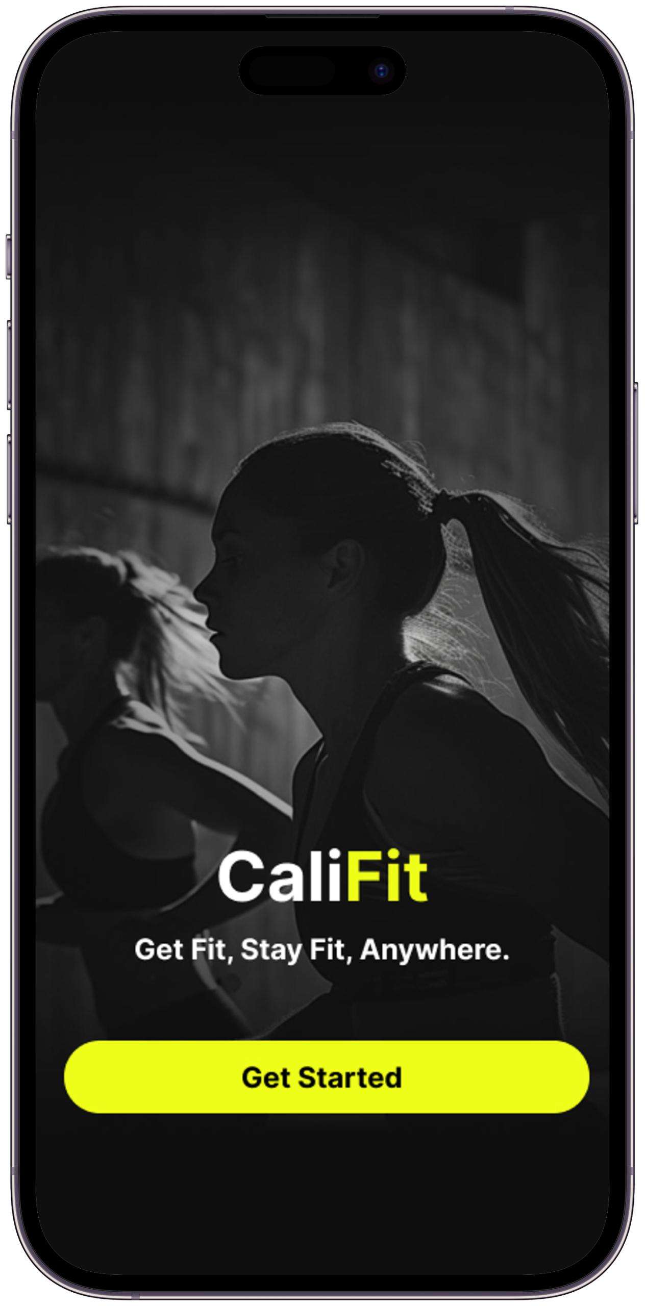
What is CaliFit?
A mobile app concept that goes beyond tracking — designed to catch the exact moment users lose confidence, and turn it into the moment they stay.
CaliFit is a calisthenics app concept built around one research finding: people don’t quit fitness apps because they’re not motivated. They quit because the app runs out of answers at the exact moment they need guidance most. The design challenge wasn’t “how do we make fitness look good?” It was behavioural — how do we design a system that catches a user at 11pm after they’ve missed three sessions and makes them open the app anyway?
The approach was research-first. Six apps audited. Three community platforms analysed. Five user interviews. Every screen in CaliFit is a traceable response to a specific moment of failure in a real user’s fitness journey. The outcome is a seven-feature concept covering the full arc: personalised onboarding, coached sessions with form guidance, a visual skill progression system, compassion-first rest tracking, adaptive session length, milestone celebrations, and community accountability. The Figma prototype is fully interactive.
To make calisthenics the most approachable, sustainable, and rewarding form of fitness on the planet — proving that no gym, no equipment, and no experience required means no excuses left standing between you and the strongest version of yourself.
To give every person a personalised coach in their pocket — one that understands their level, respects their time, celebrates their progress, and meets them exactly where they are, every single day. Not a plan. A system that grows with you.
“I open YouTube. Search ‘beginner calisthenics’. Get 237 videos. Watch two. Attempt one exercise. Do it wrong. Get frustrated. Close the app. Watch Netflix instead.”
What was broken
Calisthenics is one of the most accessible forms of fitness — yet most people quit before week two
Six apps were audited. Five users were interviewed. Three Reddit communities were analysed across 200+ threads. The pattern was unambiguous — not a single person quit because they lacked motivation on day one. Every quit happened at the same four moments: no clear starting point, a form injury from a bad GIF, invisible progress that made effort feel pointless, and a rigid plan that broke the first week real life intervened.
Understanding the Person
The assumption going in was that people quit fitness apps because they lose motivation. Research broke that assumption within the first interview. People don’t lose motivation — they lose direction. And once an app has nothing left to tell them, they leave. That single shift — from “how do we motivate?” to “how do we always have the next answer?” — changed every design decision that followed.
Listening Before Designing
A research-first approach to understand real fitness behaviour — not aspirational fitness behaviour
Competitive audit of six apps — Nike Training Club, Freeletics, Calisthenics Skill, Madbarz, Thenics, and StreetWorkout. Each was walked through from onboarding to week two, looking specifically at the moment the app ran out of answers. User interviews with five participants aged 22–32 who had quit at least one fitness app. Each interview focused on one question: at what exact moment did you stop opening it? Reddit analysis across r/bodyweightfitness and r/calisthenics — 200+ posts filtered to “quit,” “stopped,” “gave up,” and “restart” — to find patterns at scale that five interviews couldn’t. App store review mining on all six audited apps for recurring one-star complaints. All findings consolidated before any IA work began.
Meet Priya
The primary persona — the design’s north star through every single decision
Priya wants to get stronger without going to a gym. She’s tried three fitness apps in the past year and quit each one within two weeks — not from laziness, but because she never knew if she was doing things right or actually getting better. She has 20–30 minutes most evenings and a yoga mat.
Mapping the emotional arc
Tracking Priya’s experience from curiosity to quit — and finding where CaliFit intervenes
| Stage | Action | Feeling | Pain Point | CaliFit Opportunity |
|---|---|---|---|---|
| Awareness | Sees a calisthenics video, feels inspired | 🔥 Excited, hopeful | Generic searches lead to overwhelming results | Smart onboarding quiz → personalised programme on Day 1 |
| Onboarding | Downloads app, creates profile | 😐 Impatient, wants to start fast | Long setup flows cause drop-off before first session | 60-second onboarding → straight into first workout |
| First Session | Attempts first workout | 😰 Anxious about doing it wrong | GIF instructions leave form a guessing game | Step-by-step coach view with form cues and breathing guides |
| Week 1–2 | Maintains routine, tracks sessions | 💪 Motivated, building habit | No visible progress markers — feels like plateau already | Skill tree map shows unlocked movements and next milestones |
| Week 3 | Misses a session due to work | 😔 Guilty, considers quitting | Broken streak punishes rather than supports | Rest day framing, “pick up where you left” compassion model |
| Month 2+ | Achieves first milestone | 🎉 Proud, re-energised | Most apps don’t celebrate skill unlocks meaningfully | Skill tree update shows Priya she’s 60% toward Archer Push-Up — a movement she couldn’t name two months ago. The milestone isn’t “congratulations,” it’s a new challenge that makes the last two months feel like a foundation, not a finish line. |
The Design Process
The research produced five findings but only one that changed the entire direction. Once it became clear that the app needed to always have the next answer — always know what comes after this session, this week, this phase — the information architecture had to be rebuilt from scratch. The skill tree existed on paper before a single screen was wireframed, because without it, nothing else in the app made sense.
How the solution took shape
From user insight to tested interface — the four-phase design approach
Competitive audit of six apps found a universal IA problem: all six presented the workout library and session player as separate, manually navigated tools. None of them told you what to do next — they showed you a library and trusted you to self-direct. User interviews confirmed: not a single participant could name what their app’s “next goal” was. The HMW that shaped everything: How might we make the next step so obvious that the user never has to ask?
Information architecture was built around one sequence: assessment → programme → session → feedback → update. The skill tree was the most complex IA challenge — it needed to show current position, next reachable goal, and full future path simultaneously without overwhelming. Three IA versions were explored; the final version used a three-level visibility rule: mastered nodes always visible, next unlock highlighted, future nodes greyed but present. This was the version that passed clarity testing without feeling like a wall chart.
Dark mode was the only canvas considered — research showed most home workouts happen early morning or late evening, and light mode in a dim room creates eye strain within the first session. Three wireframe rounds: first round tested the session player flow (where to put form cues relative to the rep counter), second round tested the skill tree layout (radial vs linear vs hub-and-spoke), third round tested the onboarding quiz (5 questions vs 3 — 5 produced a significantly more accurate programme in testing, but added 40 seconds).
Usability testing with five participants across different fitness experience levels. Three critical findings changed the design: the skill tree was initially too dense — participants with no calisthenics vocabulary couldn’t read the movement names (changed to icon-first with movement names as secondary labels). The adaptive session length feature was initially buried in settings — moved to a one-tap modifier on the session start screen after three of five participants missed it entirely. The compassion rest model copy was confusing in its first version (“Rest logged as recovery” was misread as “this session is marked as rest” — rewritten to “Take it easy today. We’ll pick up exactly here tomorrow”).
The Answer
Every problem has a solution hiding inside it. The question is whether you’ve understood the problem well enough to recognise it. This is what research made possible.
Not another fitness app
A coaching system disguised as an app — intelligent, adaptive, and designed around real human behaviour
The Screens Come Alive
Design is not what it looks like. Design is how it works. But it has to look right too — because first impressions set the tone for trust, and trust is what brings people back.
Seven features, one mission
Every feature earns its place by solving a specific, research-validated pain point
6 screens. One cohesive vision.
Scroll to explore. Every screen built to a single brief: make the next step obvious, the current moment enjoyable, and the progress impossible to miss.
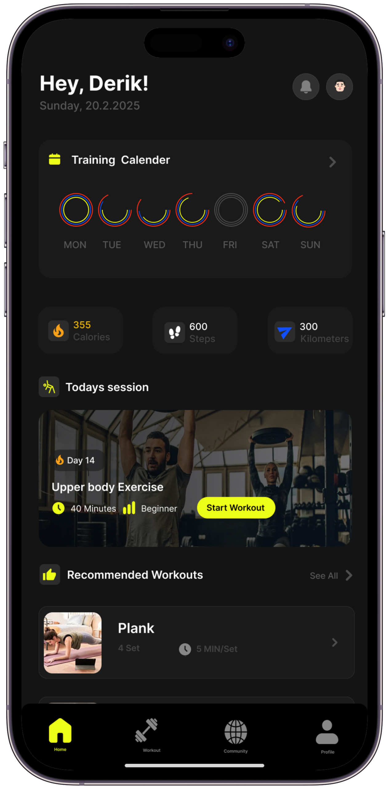
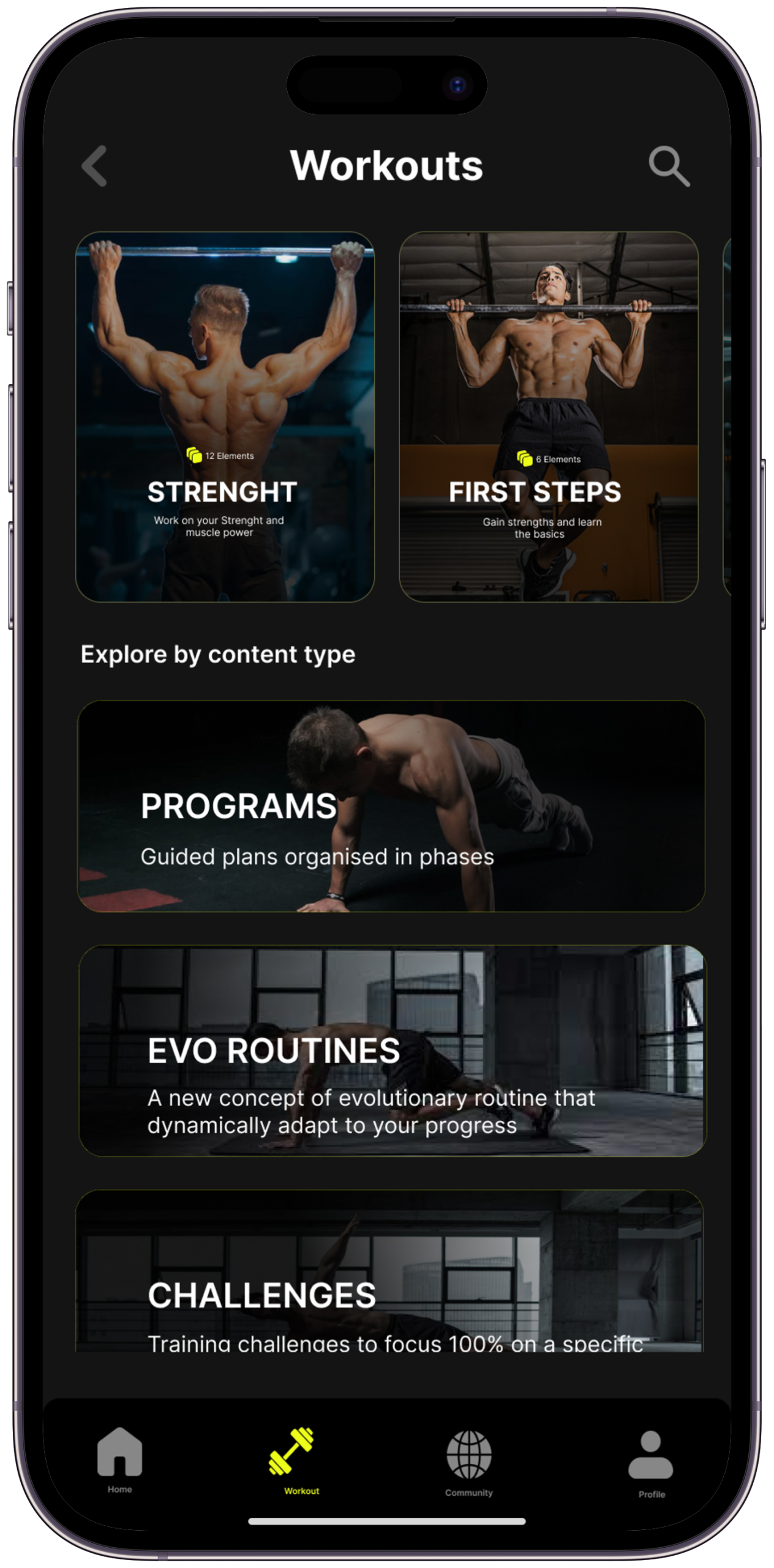
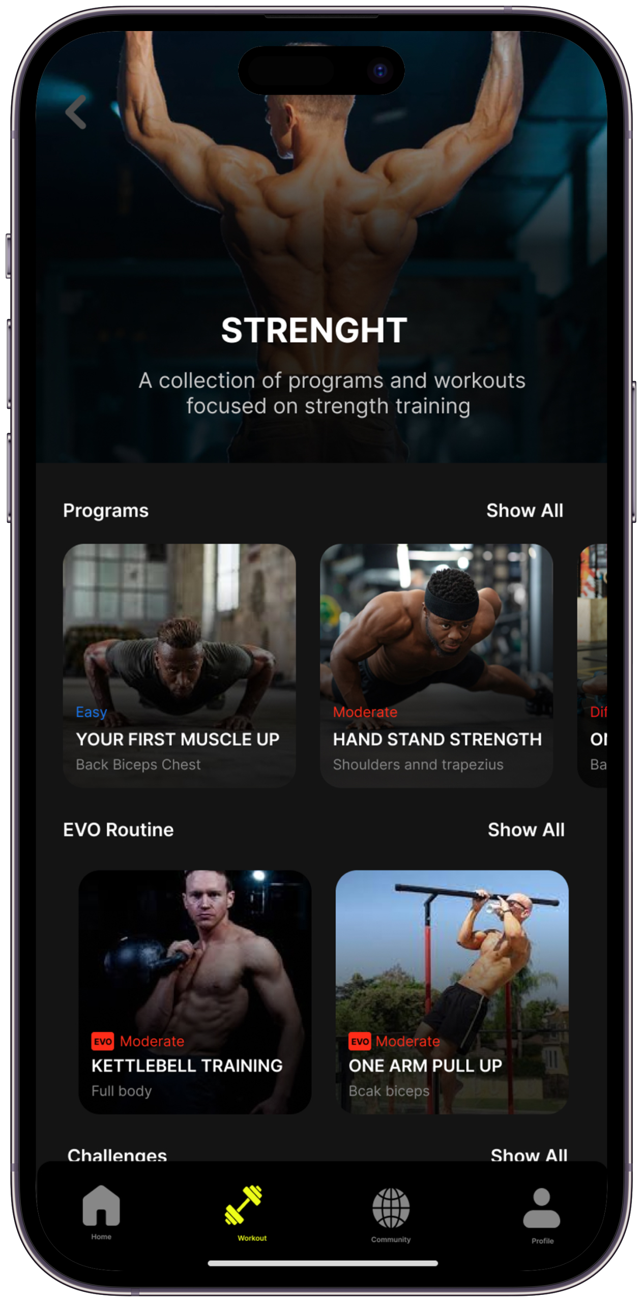
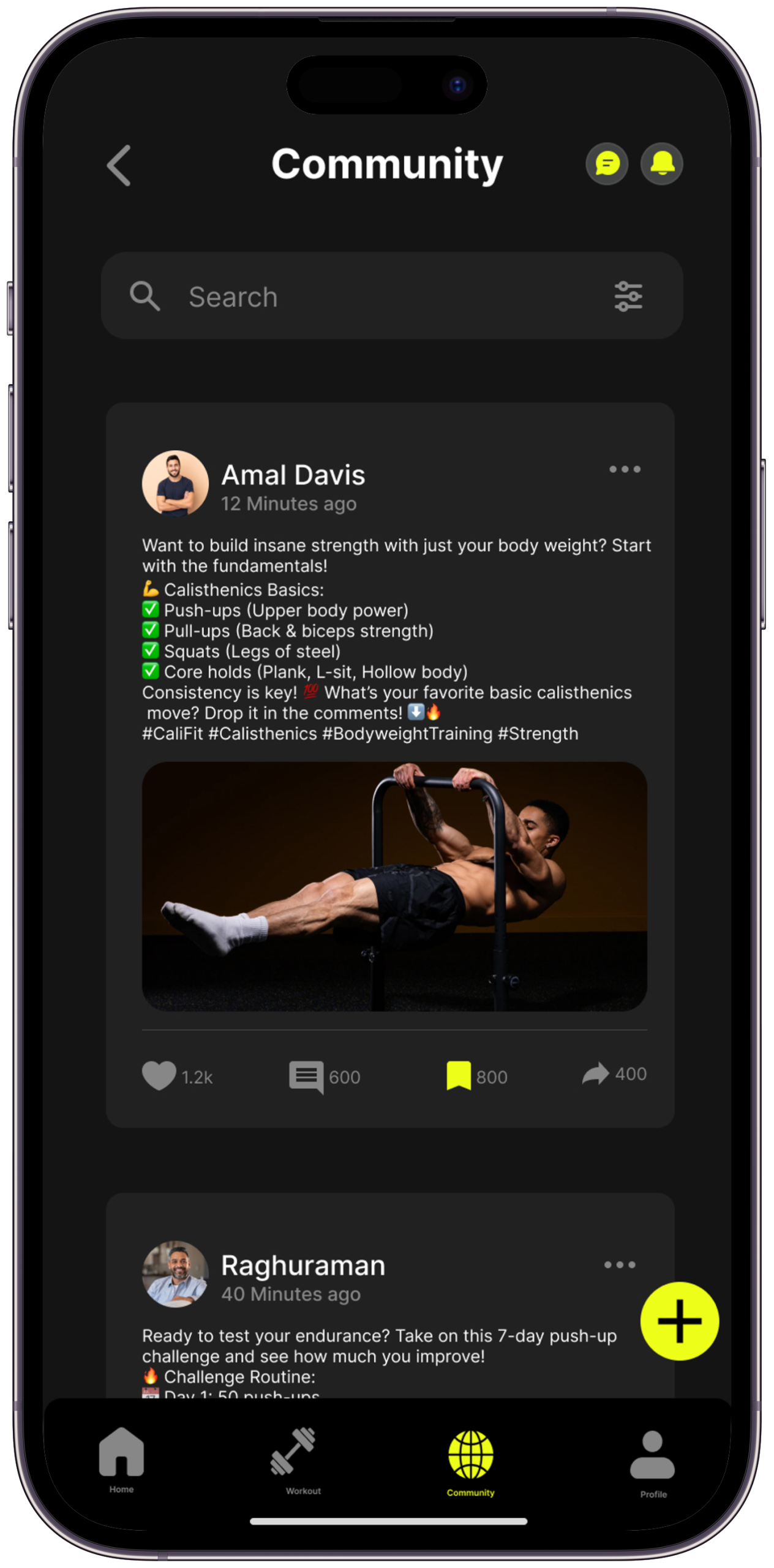
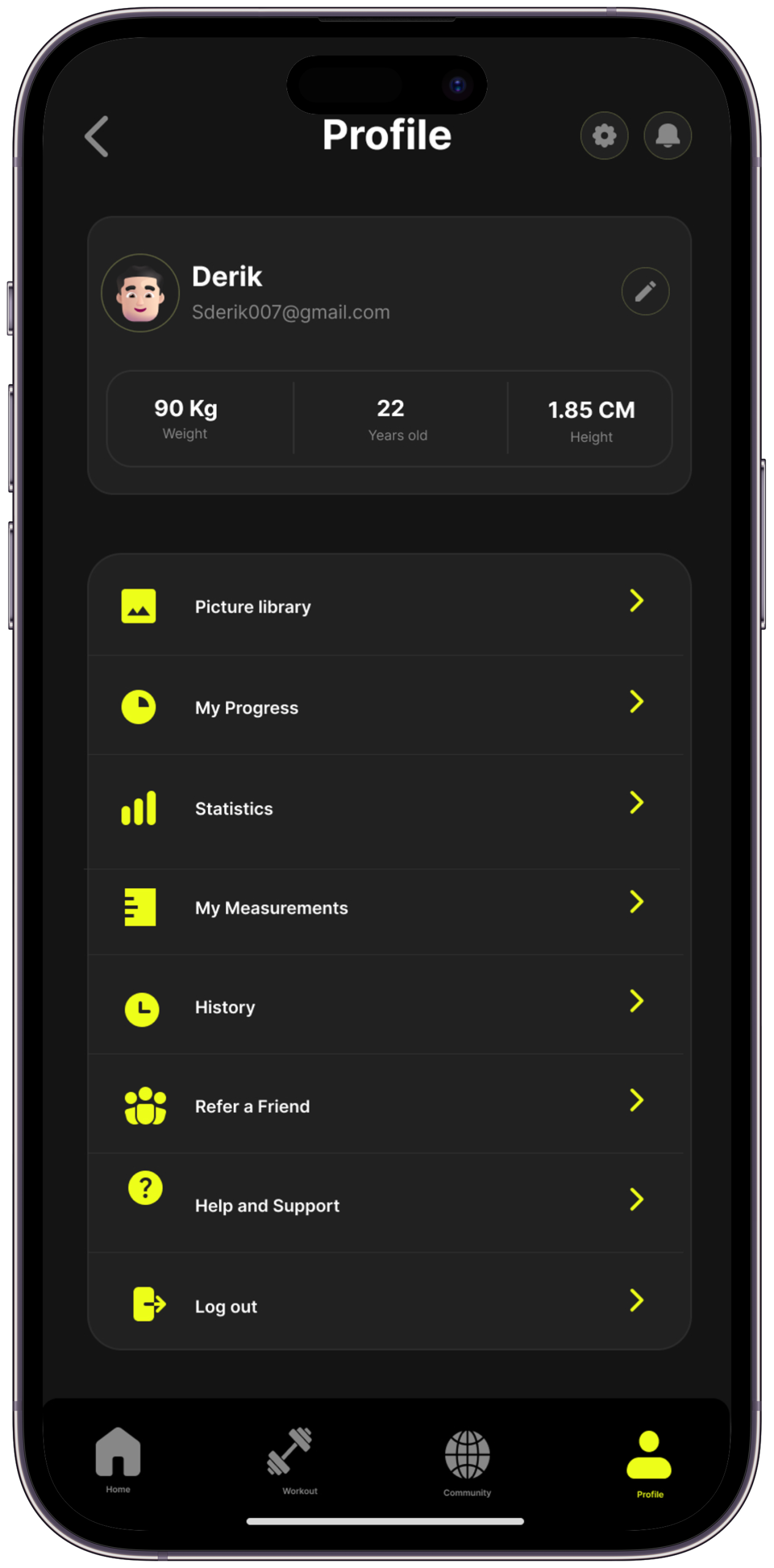
From first-time onboarding to long-term skill progression — every screen designed around one question: does this make the next step obvious and the current moment worth continuing?
What each screen actually solves.
The design thinking behind each screen — the problem it addresses, the decision made, and what changed in iteration
Design language that earns trust
A visual system built for dark environments, high contrast, and motion — reflecting the energy of calisthenics itself
The CaliFit palette is built on deep, near-black backgrounds that create focus and reduce visual fatigue during active sessions. #EDFE19 — Electric Yellow — is the single accent: high-visibility, high-energy, and impossible to miss. It’s the colour of forward motion.
Three typefaces carry distinct roles. Playfair Display brings editorial weight to milestone moments and big numbers. Instrument Serif Italic gives section subtitles a human, spoken quality. Syne handles all UI copy — clean, confident, no noise.
The Craft Behind the Screens
Good design looks inevitable. But behind every “obvious” decision is a deliberate choice — made, questioned, and refined with a specific user need in mind. Here’s how the key decisions were made, and exactly why they matter.
Six choices that define CaliFit
Every decision is a direct answer to something discovered in research — including what was considered and rejected
The Outcome & What I Learned
Every design story ends with a reckoning — what changed, what was gained, and what the designer carries forward. This is what CaliFit taught me.
If CaliFit Launched Tomorrow
Design targets and usability testing outcomes — each figure is explicitly sourced or framed as a hypothesis
“It’s Tuesday evening. I open CaliFit. Today’s session is ready. I tap begin. Twenty minutes later I’ve unlocked a new movement. For the first time, I know exactly where I’m going — and I can’t wait for tomorrow.”
What this project taught me
What I took away from CaliFit — and how it permanently changed my design thinking
LifeTrack is a personal productivity and habit-tracking app built around the idea that progress should feel personal, not performative. It combines daily goal-setting, streak-free habit loops, and a weekly reflection system — designed for people who want to build a life they’re proud of, one intentional day at a time.
Let’s work together.
CaliFit was built around one question: what does the app say to the person who just missed their third session and is deciding whether to ever open it again? If you’re working on products where the hardest design problem is the gap between intent and follow-through — where the user wants to do the thing but the system keeps losing them — that’s the problem I want to solve. Let’s talk.