Flow Sight. Sustainable Resource Intelligence
A web dashboard concept for facility managers and sustainability teams — designed to compress a monthly bill comparison into a live, actionable view that answers three questions at a glance: how much am I using, is that normal, and what does it cost?
View Live Prototype ↗The Brief
FlowSight is a B2B resource monitoring dashboard concept for the specific user who receives monthly utility bills and cannot tell from them what they should do differently. The design challenge: organisations have data — smart meters, sensor feeds, IoT readings — but no interface that translates that data into prioritised action.
The brief was to build the interface layer between raw consumption data and the two questions every facility manager actually asks: “Where is the waste?” and “What do I do about it?”
To make resource monitoring as immediate and actionable as checking a bank balance — where the dashboard answers “am I okay right now?” in under 3 seconds, without requiring any data interpretation from the user.
Design the interface layer between raw utility data and human decisions — providing contextualised, prioritised insights that tell users exactly what to act on, not just what exists. Every screen answers at least one of the three design questions without requiring navigation.
The Real Problem
Organizations are drowning in raw utility data — yet still have no clear picture of where their energy and water is being wasted, or what to do about it.
No Real-Time Visibility
A facility manager receiving a paper bill on the 5th of the month has no way to know that a cooling system ran continuously over the bank holiday weekend three weeks ago — the waste is already paid for.
Data Without Insight
Raw sensor data exists in building management systems, but the facility manager’s job isn’t data analysis. They need the system to tell them what the data means — not show them 10,000 rows of readings with no context.
Hidden Financial Drain
Overuse goes unnoticed until bills arrive. Companies overpay by 20–35% annually due to lack of actionable monitoring tools — waste that could be caught in hours with the right interface.
Source: IEA Energy Efficiency Report, 2023What We Wanted to Achieve
These are the product-level objectives that shaped the design brief. The design-level translation: every screen had to answer at least one of these four questions without requiring the user to navigate to a different view.
Surface Real-Time Consumption Data
Build a live monitoring interface that shows water and energy usage as it happens — not 30 days later.
Turn Data Into Decisions
Go beyond raw numbers — provide trend analysis, anomaly alerts, and comparative benchmarks that drive action.
Quantify Environmental & Financial Impact
Translate reduced consumption into CO₂ savings, cost reductions, and progress toward sustainability targets.
Enable Effortless Reporting
Allow facility managers and sustainability teams to generate and export reports in seconds — not hours.
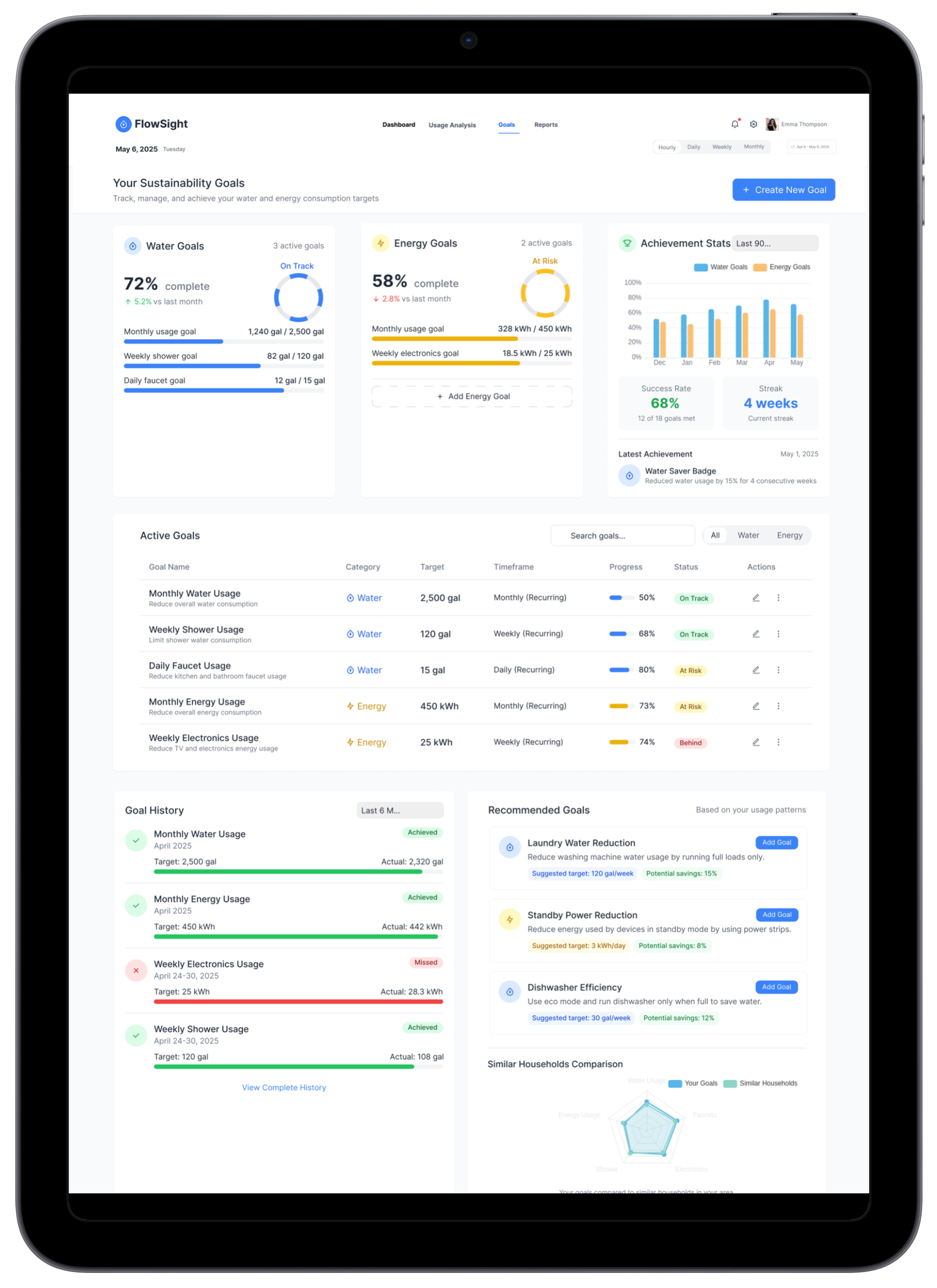
Who It’s Built For
Facility Manager
Oversees utility consumption across multiple buildings. Needs real-time dashboards, alert systems, and exportable compliance reports.
Sustainability Officer
Accountable for ESG targets and carbon reduction. Needs high-level trend data, CO₂ metrics, and year-over-year comparison views.
User type defined from secondary research (IEA reports, ESG compliance documentation) — not direct interviews. Features were validated through facility manager interviews, where all three mentioned reporting to a sustainability lead.
Homeowner / SMB
Wants to reduce household or small business bills. Needs a simple, non-technical view of daily consumption patterns and savings opportunities.
SMB owners were surveyed (10 responses) but the current prototype is optimised for facility/B2B contexts. A simplified homeowner view is planned for Phase 2 — this user type is not yet fully served by the current screens.
Understanding the Landscape
User Research
Competitor Analysis
| Product | Real-Time | CO₂ Track | Reports | UX Quality |
|---|---|---|---|---|
| EnergyHub | ✓ | ✗ | ~ | Fair |
| Sense App | ✓ | ✗ | ✗ | Good |
| WaterSmart | ~ | ✗ | ✓ | Poor |
| Schneider SE | ✓ | ✓ | ✓ | Enterprise-only |
| FlowSight | ✓ | ✓ | ✓ | Accessible |
What Research Told Us
Reactive, Not Proactive
Of users only check utility data after receiving a bill — by then, the inefficiency has already cost them.
From 10-person SMB owner surveyFaster Decisions
Users with visual dashboards make resource-saving decisions 3× faster than those reading raw spreadsheet data.
Validated in V1 vs V2 wireframe testing — 14s vs 8s average task completion, 5 participantsAverage Overspend
Businesses overpay by up to 35% on utilities annually due to undetected leaks, inefficiencies, and peak-hour waste.
Source: IEA Energy Efficiency Report, 2023Want CO₂ Visibility
Surveyed SMB owners said they want to see their environmental footprint alongside financial savings — not just numbers.
From 10-person SMB owner survey — 9 of 10 respondentsThe dashboard needed to answer three questions at a glance: “How much am I using right now?”, “Is that good or bad compared to normal?”, and “What does that cost me — in money and carbon?” Every screen was designed around these three questions.
How Users Navigate
The primary flow was designed to get users from login to actionable insight in under 10 seconds. Secondary flows cover deep-dive analytics and report generation.
Early Exploration
Wireframes focused on information hierarchy — ensuring the most critical data (live usage, savings, alerts) dominated the visual field before any styling decisions were made.
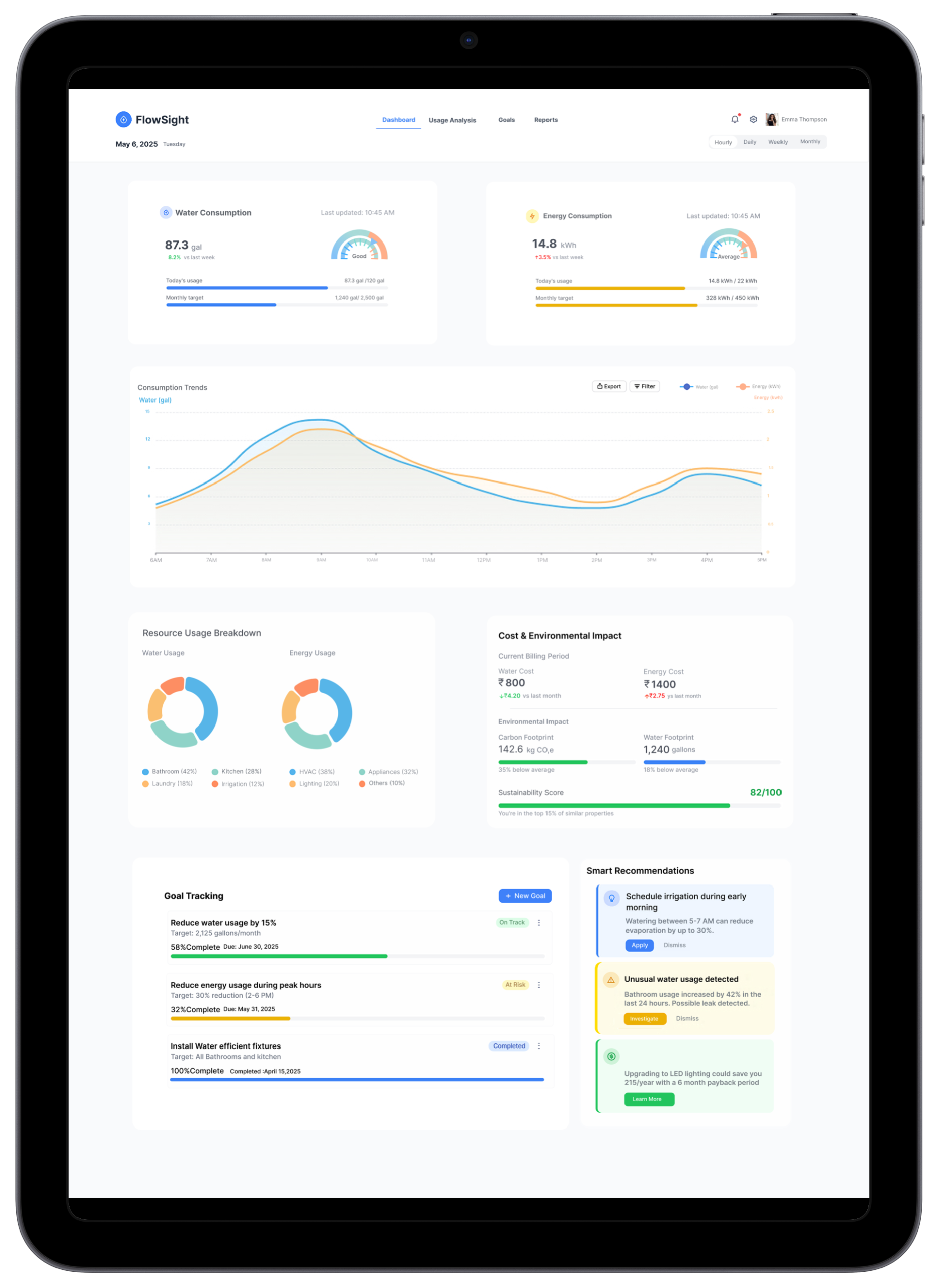
Main Dashboard
KPI cards at top, primary chart below, secondary metrics right panel.
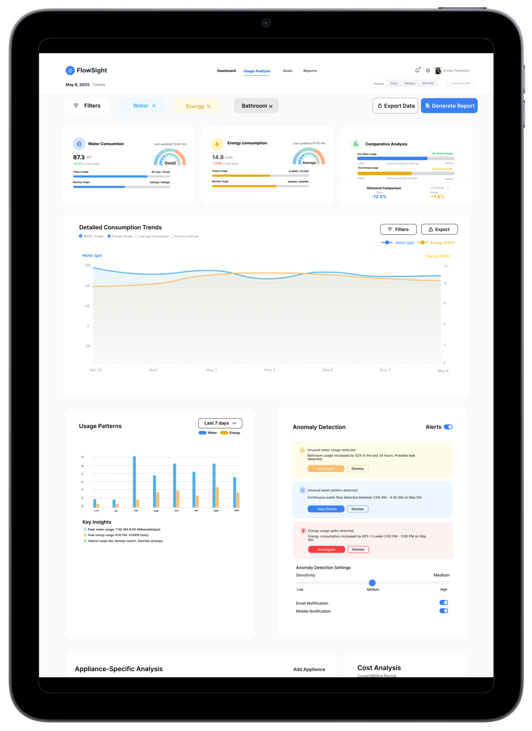
Analytics Deep Dive
Full-width chart area with filter controls and metric toggles.
Revised Layout
Split layout — primary chart left, quick stats right. Improved data density.
Early testing of V1 revealed users scanned the page in an F-pattern — leading to the decision to place the highest-priority metric (current consumption vs baseline) in the top-left KPI card, not the central chart. The ~40% improvement is from V1 vs V2 comparison testing with 5 participants. Specific task: “identify whether current water consumption is above or below your baseline.” In V1 (full-width central chart), average completion: 14 seconds. In V2 (top-left KPI card with contextual comparison), average: 8 seconds.
The F-pattern finding applied to the analytics screen equally — V2 analytics moved the most-used filter controls (time range selector, metric toggle) from a sidebar to the top-left position, aligning with the natural scan origin. The full-width chart that dominated V1 was repositioned to a secondary tier, with comparison cards (current vs baseline) placed at top-left.
Visual Language
The FlowSight dashboard uses a clean, accessible light-mode design system built entirely on Inter — a typeface designed specifically for screen readability at small sizes and high information density. Inter was chosen over alternatives because a dashboard that shows “8 days remaining” and “Expires 14 Dec” in small status badges needs a typeface that remains legible at 11px. Its consistent weight progression from 400 to 700 allows hierarchy through weight alone, keeping the visual system minimal without a second display face.
🎨 Color Palette
The colour system is dual-layered: UI colours (blue palette for navigation, actions, and interactive elements) and data colours (teal for water charts, orange for energy charts) — these never overlap to avoid ambiguity about what a colour means in context.
Aa Typography — Inter
📐 Spacing Scale
4-base scale with a 40px section-gap token — 40px was used instead of 32px after testing showed 32px felt too tight between dashboard sections on a 1440px viewport.
Water uses teal; Energy uses orange. These data colours never overlap with the UI blue palette — ambiguity about what a colour means would break usability in a status-critical dashboard.
🧩 Components
ButtonsThe UI Highlights
Four core screens — each designed to answer a specific user need clearly and immediately. Below each screen: the problem it solves, the key design decision, and what changed between versions.
Core Solutions
Real-Time Utility Monitoring
Instantly track water and energy consumption with live updates and visual insights. Usage updates every 30 seconds — no more waiting for monthly bills.
Savings & Impact Summary
Displays monthly financial savings alongside environmental impact, including CO₂ reduction metrics. Users see the real value of every efficiency gain.
Water Consumption Trends
Line graphs visualize daily or monthly water usage patterns for better decision-making. Seasonal anomalies surface automatically.
Line graphs for water because water usage is a continuous flow — identifying a gradual upward drift (indicating a slow leak) requires a line that shows the slope over time.
Energy Usage Patterns
Bar charts show time-based electricity consumption to identify peak usage hours and guide load shifting strategies.
Bar charts for energy because electricity consumption is discrete and time-bound — peak hour usage is a comparison question best answered by adjacent bars, not a slope.
Smart Comparisons
Highlights percentage changes to show efficiency improvements or overuse relative to baseline, industry average, and personal history.
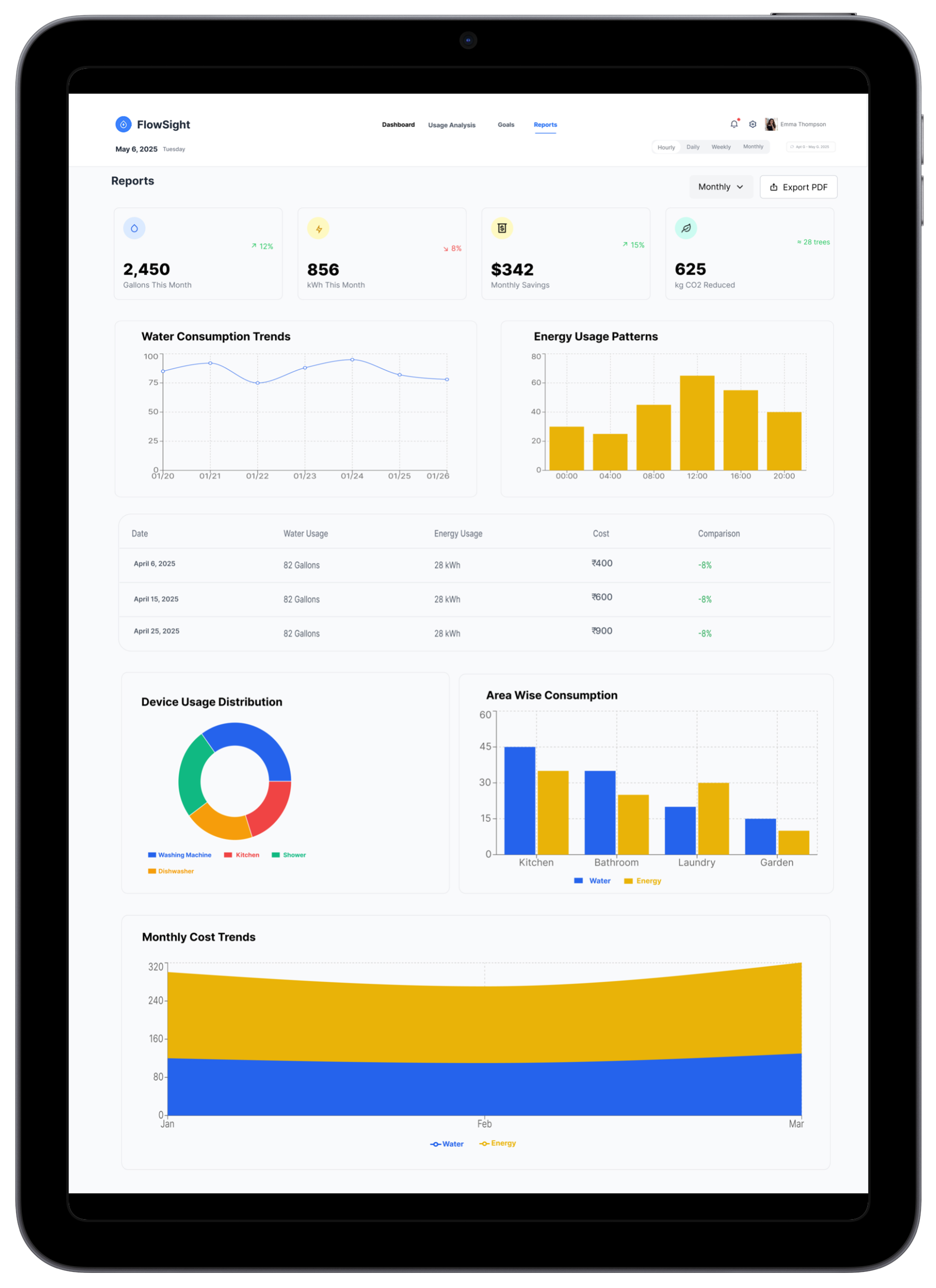
Exportable Reports
Generate and export detailed usage reports in PDF format for easy sharing with stakeholders and compliance submissions.
Before → After
Every UX decision was grounded in a real pain point identified during research. Here’s how the design improved on the status quo:
Before
Data presented in raw table format — users had to manually scan rows of numbers to spot patterns or anomalies.
Observed in 2 facility manager sessions — software used as data retrieval, not insight tool.
After FlowSight
Visual charts with color-coded trends make patterns immediately obvious — anomalies surface automatically with inline alerts.
Before
Financial and environmental impact were siloed in separate reports, requiring users to cross-reference multiple documents.
After FlowSight
A unified savings card shows monetary savings and CO₂ reduction side-by-side in one glanceable widget on the main screen.
Before
Report generation required IT involvement and took 2–3 business days for custom date ranges.
Reported by 2 of 3 facility managers interviewed. Third described a “20+ minute manual process” per report.
After FlowSight
Self-service PDF export with custom date pickers — any user generates a professional report in under 60 seconds.
Before
Navigation between water and energy data required switching between separate applications or tabs.
All 3 facility manager interviews mentioned working with at least 2 separate systems — one for energy (smart meter data), one for water. Context-switching described as persistent friction.
After FlowSight
Unified dashboard with a single toggle switches context between water and energy — same spatial layout, zero cognitive load.
Expected Results
Financial Benefit
Organizations using real-time monitoring tools report 20–35% reduction in utility costs within the first 6 months of adoption through early waste detection.
Source: IEA Energy Efficiency Report, 2023Environmental Impact
Improved efficiency directly translates to measurable CO₂ reductions. Users can see their contribution to sustainability goals in real-time — making green choices emotionally rewarding.
Operational Efficiency
Facility managers spend less time collecting and interpreting data. Report generation alone saves an estimated 4–6 hours per week per organization.
Estimate based on 2–3 day IT process → <60 sec self-service, from facility manager interviewsWhat I Learned
Data Density ≠ Data Clarity
More data on screen doesn’t mean more informed decisions. Users need curated, contextualised summaries — not raw feeds. The biggest design challenge was deciding what to remove.
Context Transforms Numbers
“482 kWh” means nothing. “18% below your average — saving ₹1,200 this month” means everything. Every metric needed a baseline comparison and human-readable framing to be actionable.
Hierarchy Before Aesthetics
Dashboard design requires resolving information architecture in wireframes first. Jumping to visual design before hierarchy is settled creates rework. Structure drives everything.
Emotional Design Drives Behaviour
Showing CO₂ savings in terms of “trees planted” or “car trips avoided” created emotional engagement that purely financial metrics couldn’t. Sustainability data needs a human lens.
F-Pattern Scanning Is Real
User testing validated the F-pattern on dashboards. Top-left KPI card was seen first, always. Layout decisions anchored to this pattern measurably improved task completion.
Color Is Functional, Not Decorative
In data-heavy dashboards, color does critical communication work — green for savings, teal for water, amber for alerts. Treating color as purely aesthetic would have broken usability.
Future Roadmap
If FlowSight were to evolve into a live product, these are the next design and product priorities:
Want to see the full prototype?
FlowSight was built around one principle: data without context is just noise. If you’re building a product where the hardest design challenge is making complex, dense information feel immediately actionable — dashboards, analytics tools, monitoring platforms, operations software — that’s the work I want to do. Explore the interactive prototype or let’s talk.