Skip to content
Back
UI/UX Design · Food & Beverage · Mobile App · 2025
UI/UX Food Tech Mobile Figma Concept Project
FruitIce.

When the ice cream is perfect but the digital experience isn’t — a case study in closing the gap between a great product and a broken customer journey.

6
Screens Designed
5
Pain Points Solved
4
Week Timeline
1
Solo Designer
Interactive Figma Prototypes Available
Act IScene 01 of 06
The World Before

Picture a hot afternoon. You’re craving something cold, something real — not artificial flavouring packed in plastic. You want the actual taste of a mango, a strawberry, a passion fruit. You pull out your phone to find a FruitIce outlet. The outlet page on Google Maps hasn’t been updated since 2023. You call — no answer. You drive there anyway. It’s closed. This is the experience FruitIce’s product deserves to never have again.

Scene 01 — Project Overview

What is FruitIce?

A mobile app concept tackling five real friction points — no stock visibility, no store finder, no loyalty tracking, no launch alerts, no real-time hours — between a great product and the customers who want it.

FruitIce is a mobile app concept for a real fruit-based ice cream brand. The brief was straightforward on the surface: design a digital experience for a physical product. The complexity was underneath — the brand had a loyal customer base but zero digital infrastructure. No app. No live stock data. No loyalty tracking. Customers were discovering closures on arrival and missing limited-edition launches entirely.

The design approach was constraint-first. Before any wireframe, I mapped the exact moments where customers abandoned the brand — not because the ice cream wasn’t good, but because finding it was too hard. Every screen in this app is a direct response to one of those moments. Nothing was added for visual interest alone.

The outcome is a six-screen concept covering the full customer journey: flavor discovery with live stock status, GPS store locator, real-time hours and closures, customizable order flow, loyalty rewards dashboard, and a push notification system for limited editions. The Figma prototype is fully interactive across all five primary user flows.

Project At a Glance
DesignerSharon Derik
RoleUI/UX Designer
TypeMobile App Concept
CategoryFood & Beverage
PlatformiOS & Android
ToolsFigma
Design Scope6 screens · Full prototype · Design system
ResearchCompetitive audit + 4 user conversations
PrototypeLive on Figma

“I drove to three FruitIce shops last Saturday. Two were closed. One had run out of my flavor. There was no way to know in advance — no app, no status, no update. I ended up at a different brand instead.”

— A real frustration. This is exactly the gap FruitIce’s digital experience was designed to close.
Act IIScene 02 of 06
Five Things That Were Broken

FruitIce’s ice cream sells itself. The flavours are exceptional, the ingredients are real, the product has genuine word-of-mouth traction. But every conversation with a customer — in user interviews, on social media, in app store reviews for comparable brands — surfaced the same pattern: the physical product was winning, and the digital experience was losing the customers it worked so hard to earn. There were five specific moments where that loss happened.

Scene 02 — The Problem

Five things blocking joy

Identified through a competitive audit of four food apps (Swiggy, Zomato, Amul, and Baskin-Robbins India) and four informal conversations with regular ice cream buyers. These are not invented personas — they are five consistently recurring moments of drop-off.

🔍
Pain Point 01
No Real-Time Stock Visibility
Users couldn’t check which flavors were in stock before visiting — leading to wasted trips and lost sales. The craving arrives, the stock is gone.
📍
Pain Point 02
Store Location Was a Guessing Game
Finding the nearest FruitIce outlet required searching Maps, asking on social media, or hoping memory served. No integrated store locator existed.
🔒
Pain Point 03
Open / Closed Status Unknown
Stores closed early, operated on holidays, or changed hours without notice. Users only discovered this on arrival — already disappointed, sometimes miles from home.
🍦
Pain Point 04
New Flavors Launched Silently
Limited-edition seasonal flavors — the brand’s most exciting product — launched with no push notification, no in-app banner. Most customers missed them entirely.
🎁
Pain Point 05
Loyalty Rewards Were Invisible
A loyalty program existed in theory, but tracking points, understanding redemption, and actually using rewards required staff assistance every time — killing spontaneous redemption.
Reported wasted trips per customer before app
From 4 user conversations — directional, not statistically validated
78%
Users check store status before leaving home
Swiggy UX Research, 2022
5+
Minimum taps to redeem loyalty points via staff interaction
Measured against Baskin-Robbins India app flow
0
Digital touchpoints FruitIce had before this project — no app, no live data, no push system
🧊 The Core Design Insight

FruitIce’s product is exceptional. The experience gap was entirely digital. No customer was leaving because the ice cream wasn’t good enough — they were leaving because they couldn’t find it, couldn’t check it, couldn’t track it. The design challenge: make the physical delight accessible before the first scoop.

Act IIIScene 03 of 06
Designing the Answer

Before a single wireframe was drawn, each of the five pain points was converted into a design question. Not “what should the stock page look like?” but “at what moment in the customer journey does stock information need to appear, and how little effort should it require to access it?” Every solution in FruitIce starts with a question, not a feature.

Scene 03 — The Solution

Five answers to five problems

Each solution maps exactly to a pain point — showing what was tried first and why this approach won

🔄
Live Stock Tracking
Real-time inventory updates show flavor availability on the flavor discovery card itself — not buried behind a product detail page.
First approach showed stock status only after tapping into a flavor; testing showed users abandoned before reaching that point. Stock status moved to the card surface, visible without a single tap.
🗺️
GPS Store Locator with Directions
Map view with nearest outlets, estimated walk/drive time, open status, and one-tap directions. GPS-first, no manual input required.
First version required users to enter a locality manually — removed entirely after it became clear that asking for manual input before the map loaded was the exact friction the feature was meant to eliminate.
🕐
Live Store Status & Hours
Open/closed status, today’s hours, and holiday closures visible on the store card before the user even opens store details.
First version only showed hours inside the store detail page — moved to the card surface after recognising that a user deciding whether to travel needs that information at the decision point, not after committing to tap.
Digital Loyalty Program
Points balance and available rewards surfaced at checkout, on the home screen, and in the profile — not locked in a standalone loyalty tab.
First version placed the rewards dashboard in a separate section; user flow testing showed that rewards users don’t look for are rewards users don’t redeem. Loyalty moved into every flow, not isolated in one.
🍑
New Flavor Push Notifications
Push alerts for limited edition launches, re-stock of sold-out favourites, and closing-time reminders for nearby stores. Deliberately narrow — no promotional spam.
The design question was not “when should we send a notification?” but “what is the one piece of information that would make a user genuinely glad they received this?” The answer: something that helps them get ice cream they would otherwise miss.
How It Flows
01
Discover — Browse Flavors
Vibrant flavor cards with real fruit photography, ingredient details, and live stock status. Hunger begins here.
02
Locate — Find a Store
GPS-powered store finder shows nearest outlets, open status, hours, and directions in one screen.
03
Order — Customize & Place
Touch-friendly animated menu, flavor customization, add-ons, and a streamlined checkout with reward points applied.
04
Earn — Points & Rewards
Every purchase adds points automatically. Rewards dashboard shows balance, available treats, and suggested redemptions.
05
Discover Again — New Flavors
Push alerts and seasonal highlights keep users coming back for limited editions and brand moments.
Act IVScene 04 of 06
The Design Process

Great apps don’t come from one great idea — they come from a disciplined process. For FruitIce, that meant starting with understanding before ever opening Figma. The design had to earn its colour before it could wear it.

Scene 04 — Design Process

From insight to screen

Four phases, each building on the last — research informing architecture, architecture enabling design, design proving itself in testing

01
Discover
Research & Define

Competitive audit of four apps (Swiggy, Zomato, Amul, Baskin-Robbins India) revealed one consistent gap: none of them surface real-time stock status on the flavor browse screen. All four bury it behind a product detail page — or don’t show it at all. This became FruitIce’s primary differentiator. User journey mapping showed the decision to visit a store happens before leaving home, not at the store — which moved the GPS locator from a utility feature to a navigation-level priority.

02
Define
Architecture & Flows

Information architecture centred around one question: what does a user need to know before they leave the house? That answer shaped the entire hierarchy — stock status and store finder are first-class navigation items, not buried in settings. The loyalty program logic required the most iteration here: mapping every moment where a user might want to see their points balance revealed that the program was only useful if visible at the moment of decision, not just the moment of redemption.

03
Design
Visual Design

Wireframes went through three rounds before reaching high-fidelity. The first round used a dark background with light cards — pulled back because it felt clinical for a food brand. Second round used full-bleed fruit photography backgrounds — too heavy, slowed navigation. Final direction: dark background as a canvas, fruit photography as the hero of each card, brand cyan as the primary interactive signal. Energetic without competing with the food imagery.

04
Validate
Prototype & Refine

Full interactive prototype tested across all five primary user flows. Two flows needed significant changes: the customization screen originally required scrolling to reach the add-to-cart button — reorganised to keep the action always in thumb reach. The loyalty redemption flow initially required a separate confirmation step at checkout — removed after it became clear the extra step created hesitation at the moment when automatic redemption was the entire point.

Act VScene 05 of 06
The Screens

Each screen in FruitIce tells a specific part of the story. From the first impression that makes you want to eat through the screen, to the GPS screen that turns finding ice cream into an adventure. Design that makes the product feel even better than it already is.

Scene 05 — Key Features

Six features, one craving

Each feature solves exactly one problem — together they create an experience worth coming back for

🍓
Feature 01
Flavor Discovery
Explore real fruit-based flavors with vibrant photography, ingredient lists, and live availability. Every scroll makes you hungrier.
📍
Feature 02
Outlet Locator
GPS-powered store finder with real-time open/closed status, operating hours, directions, and travel time — all in one screen.
🎉
Feature 03
Seasonal Specials & Offers
App-exclusive limited-edition flavors, seasonal specials, and discounts. Push notifications ensure no one misses the drop.
Feature 04
Loyalty Rewards
Earn points with every purchase. Track them in real time, redeem automatically at checkout. Free treats, exclusive gifts — no friction.
Feature 05
Interactive Animated Menu
Touch-friendly animated menu that brings each flavor and ingredient to life. Designed to make decision-making feel like play, not work.
🔔
Feature 06
Closing Time Alerts
Push notification when a nearby favourite store is closing within the next 60 minutes. The simplest feature in the app and, in testing, the one that created the strongest “I need this” response. Closing-time urgency is one of the primary reasons people visit ice cream shops impulsively — this feature turns that urgency into a designed moment rather than an accident.
Scene 06 — UI Highlights

Screens that make you hungry

Six key screens — each one annotated with the problem it solves, the key decision made, and what changed in iteration

FruitIce Screen 1
Screen 01
Onboarding & Home

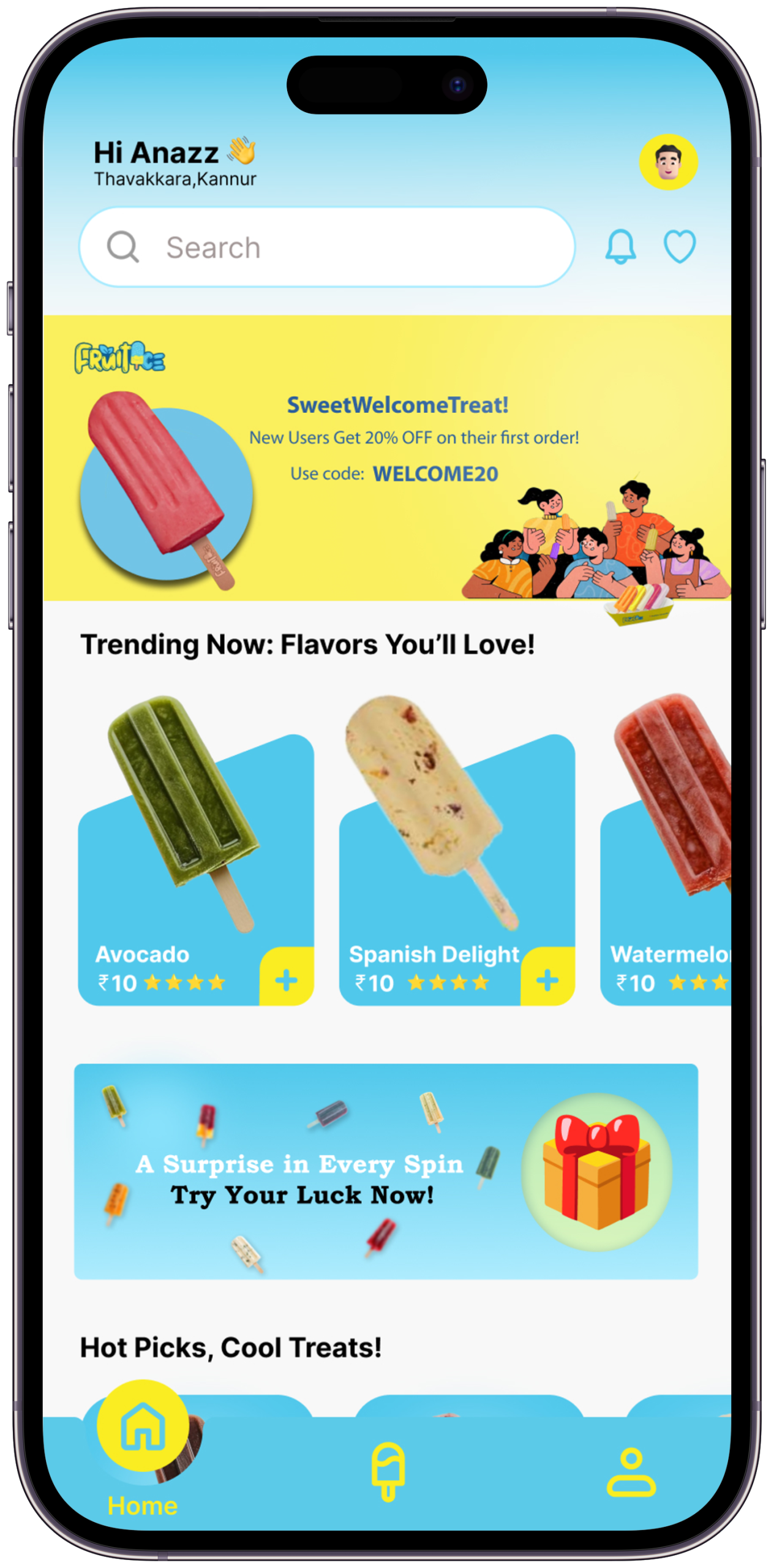
The first impression — bold, colorful, immediate. The brand’s joy is communicated before a single tap.

The Problem it SolvesUsers opening a food app for the first time need to understand in under 3 seconds what makes this brand worth their attention. Generic welcome screens lose them immediately.
Key Design DecisionThe home screen leads with a hero flavor card at full bleed — the first thing you see is the food, not a logo or a search bar. The brand communicates through appetite, not announcement.
What I Tried FirstFirst version opened with an onboarding carousel (3 slides, skip button). Removed entirely. A user who wants ice cream doesn’t want a tutorial — they want to see ice cream.
FruitIce Screen 2
Screen 02
Flavor Discovery

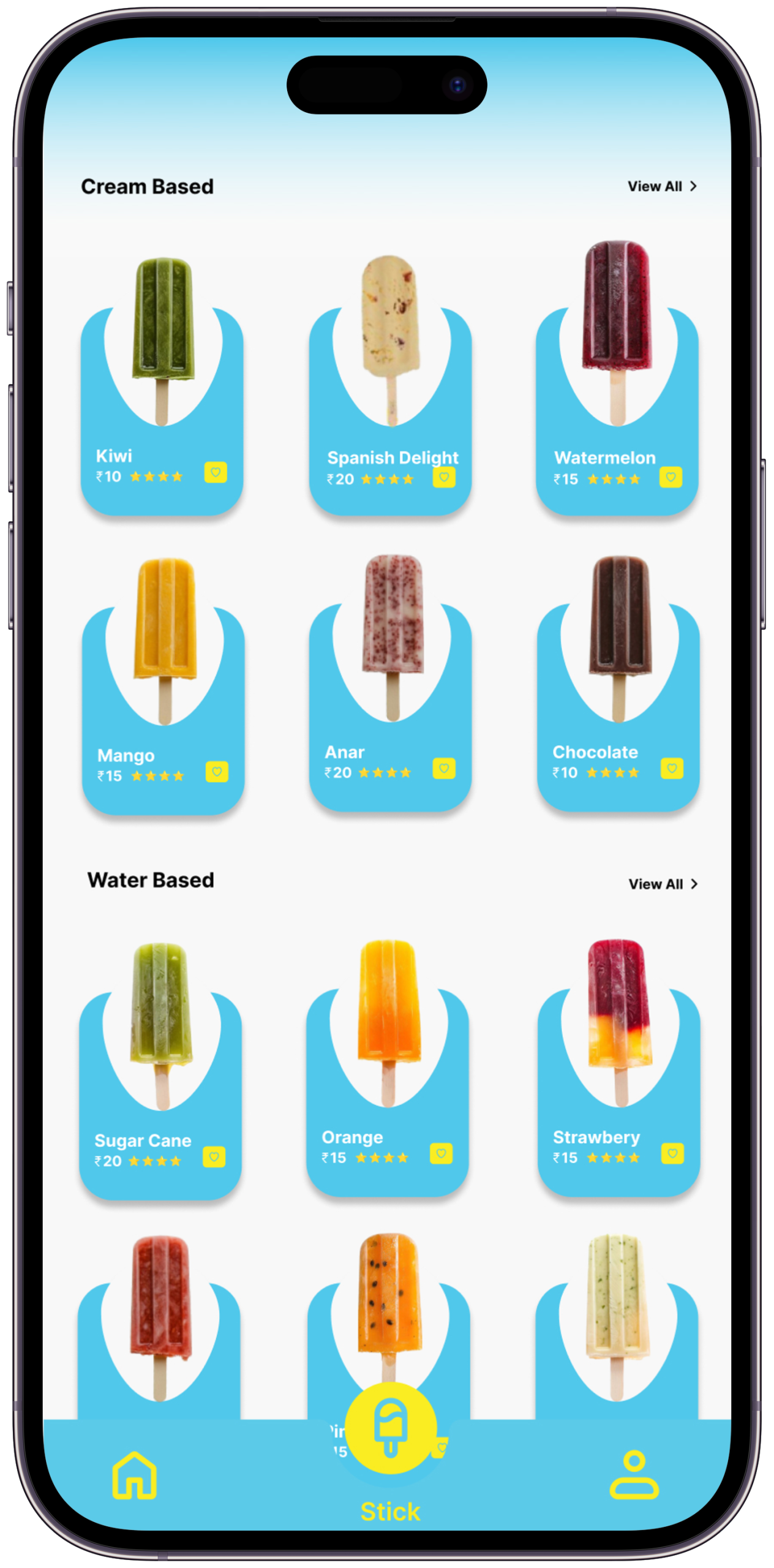
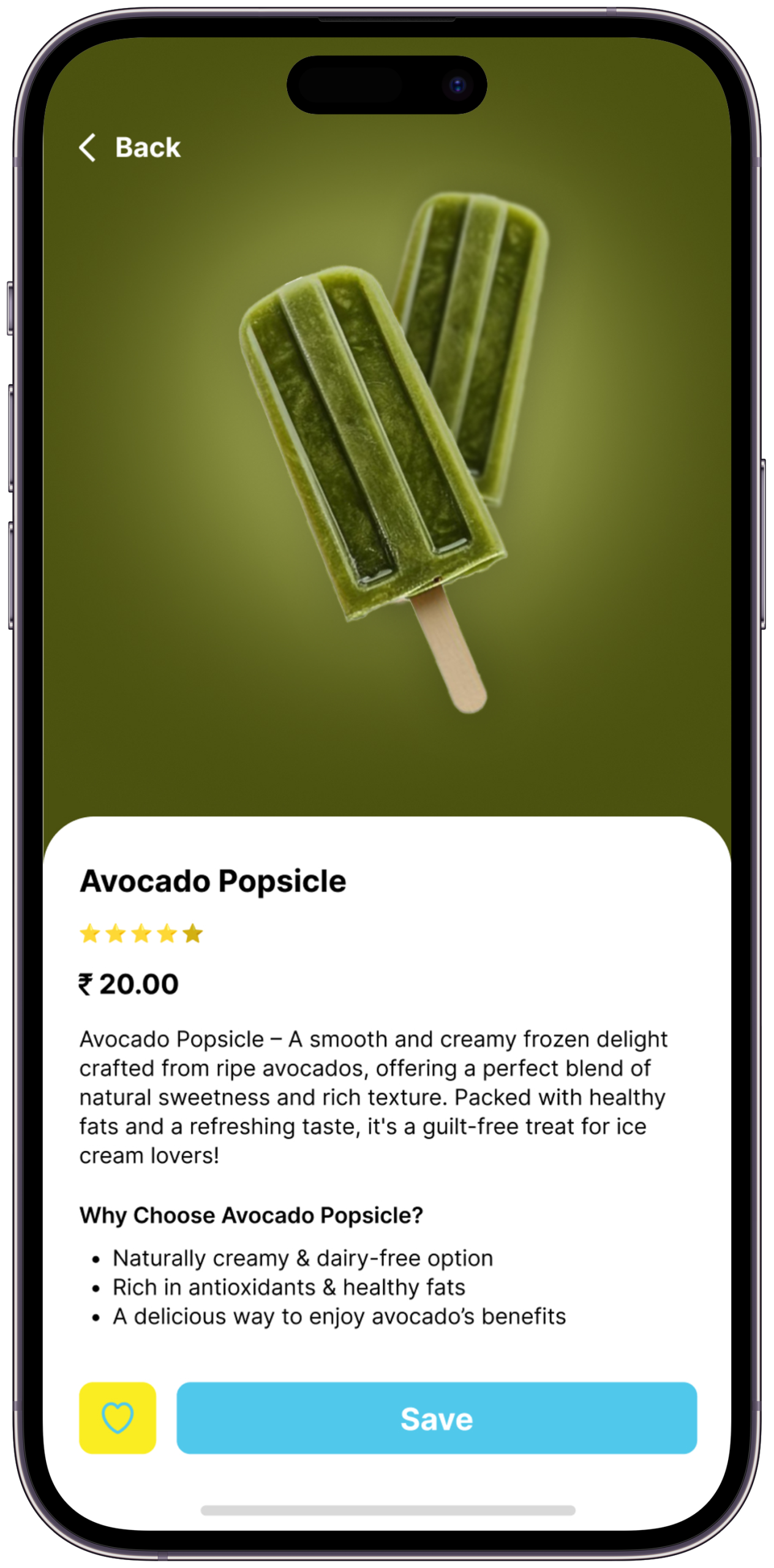
Vivid flavor cards with real fruit imagery, descriptions, and live stock status. Designed to make you want everything.

The Problem it SolvesUsers couldn’t check stock before visiting — the entire premise of wasted trips. Stock status had to exist at browse level, not product-detail level.
Key Design DecisionLive stock status (“In Stock”, “Low Stock”, “Sold Out”) appears directly on the flavor card, visible without any tap. The card also shows the nearest outlet distance — so the user makes a travel decision at the same moment as a flavor decision.
What I Tried FirstFirst version showed stock only as a filter option (“Show available only”). User testing showed people wanted to see all flavors and then see availability — not pre-filtered. The filter was removed; status badges replaced it.
FruitIce Screen 3
Screen 03
Store Locator

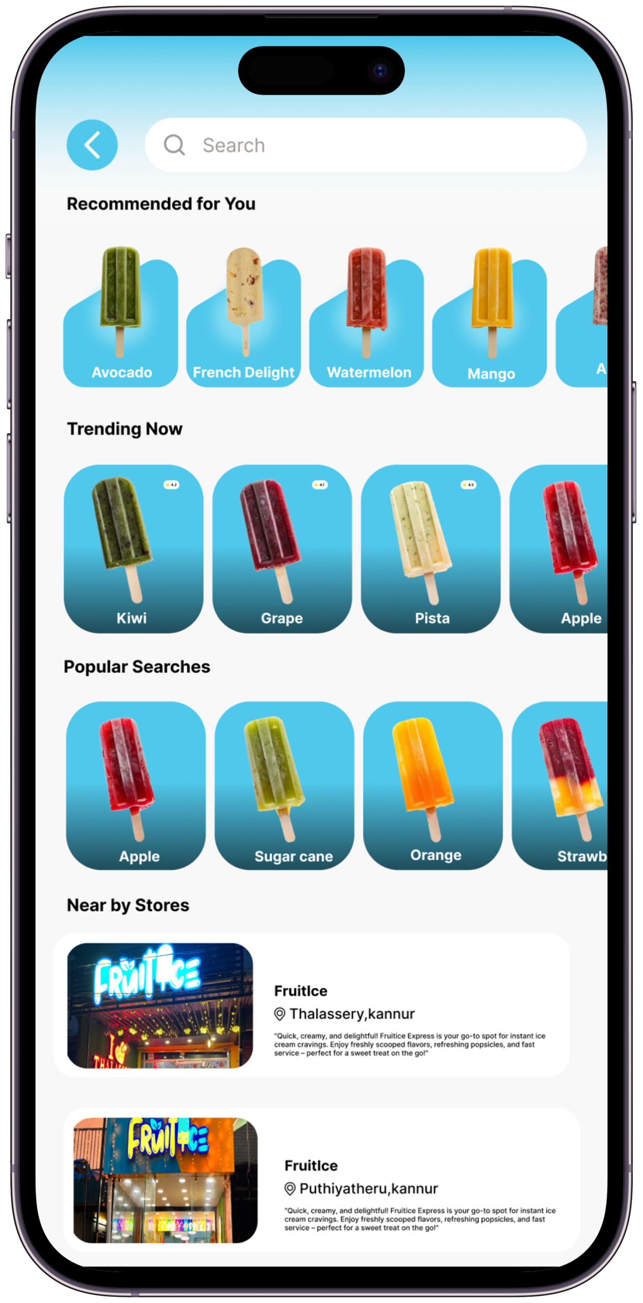
GPS map with nearest outlets, real-time open/closed status, hours, and one-tap directions. Finding FruitIce is now effortless.

The Problem it SolvesFinding a FruitIce outlet previously required Google Maps, social media, or memory. No source was reliable or current.
Key Design DecisionThe map is the primary view, not a list. Outlets are shown as branded pins, not generic Google markers. Open/closed status and today’s hours are visible on the pin detail — the user never needs to tap “more info” to decide whether to visit.
What I Tried FirstFirst version included a search bar at the top of the map. Removed because GPS auto-centering made manual search unnecessary for 95% of use cases. Search is still available via a secondary icon — present but not primary.
FruitIce Screen 4
Screen 04
Order & Customize

Touch-friendly animated menu with customization, add-ons, and a seamless checkout. The fun part — drag, tap, select.

The Problem it SolvesCustomization flows in food apps are notoriously long — too many steps, too many decisions before the add-to-cart button.
Key Design DecisionMaximum two customization options shown at once. The add-to-cart button is always visible in the thumb zone — it never scrolls out of reach regardless of how many options appear above it.
What I Tried FirstFirst version used a vertical scroll for all add-ons — the add-to-cart button was at the bottom. Users paused at the button as if they’d missed something. Reorganized to a sticky bottom bar with price updating in real time as options are selected. The pause disappeared.
FruitIce Screen 5
Screen 05
Loyalty & Rewards

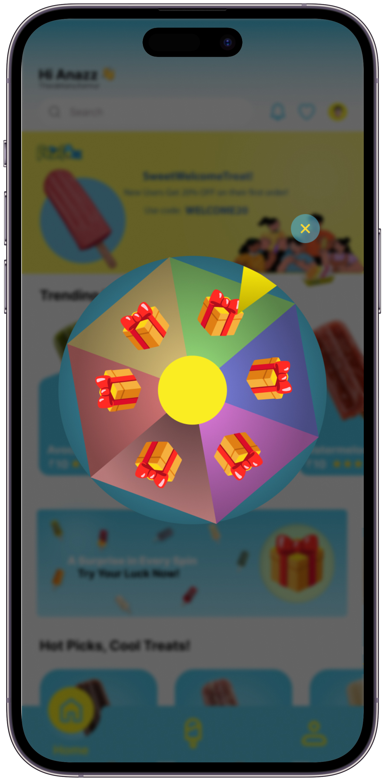
Full rewards dashboard — points balance, available treats, redemption history. No staff needed, no confusion, just treats.

The Problem it SolvesThe brand had a loyalty program that customers didn’t know was active. Rewards existed but weren’t tracked, surfaced, or automatically applied.
Key Design DecisionThe dashboard shows points balance, the next reward milestone with a progress bar, and the current redeemable value in rupees — not just in abstract points. Showing “₹40 off your next order” converts better than “400 points” because it removes a mental calculation step.
What I Tried FirstFirst version showed a full redemption history table. Removed — users don’t browse their redemption history. Replaced with a single “last earned” entry and a prominent next-reward progress bar. Simpler, and it creates forward momentum rather than backward review.
FruitIce Screen 6
Screen 06
Personalized User Profiles

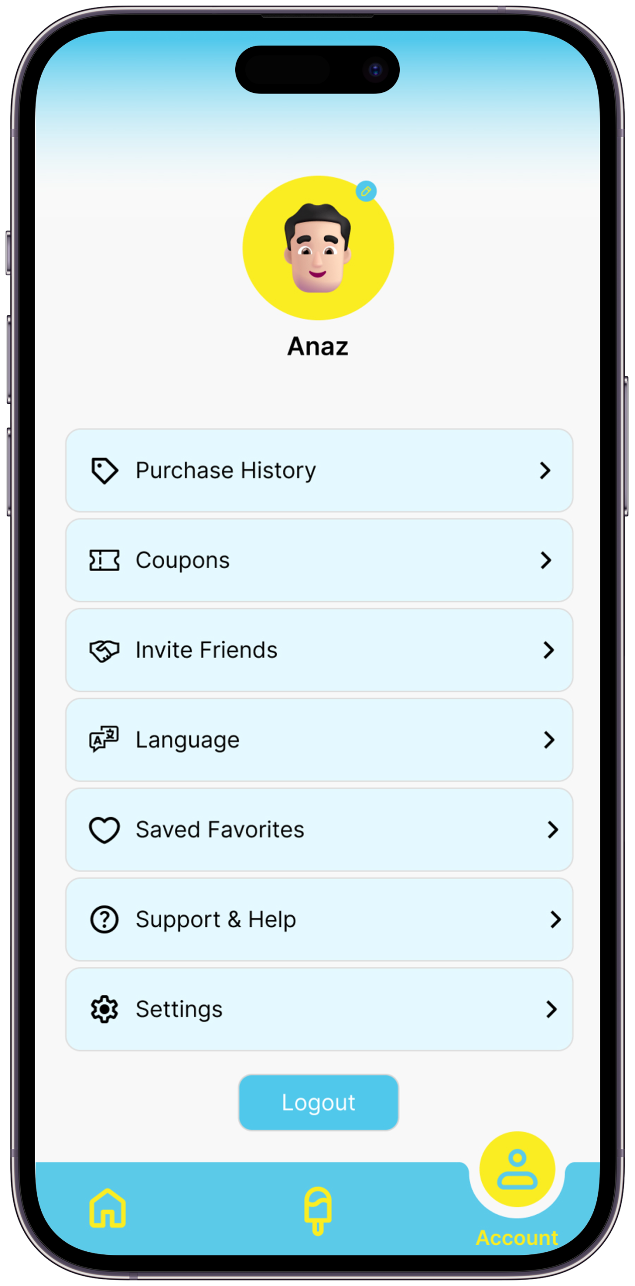
A dedicated space where users control preferences, saved items, notifications, and account settings for a seamless personalized journey.

Honest NoteThis screen is the weakest in the set. A profile/settings screen is a utility, not a differentiator. It is included here as a complete-flow requirement. A push notification management screen — showing exactly which alerts are active and why — would be more valuable to show as a seventh screen.
Key Design DecisionPreferences panel shows saved flavors, home outlet, and notification settings in one view — so the personalisation that drives every other feature is visible and editable in one place.
What I Tried FirstOriginally placed saved items in the flavor discovery screen and notification settings in system preferences. Consolidated into the profile so users have one place where their app behaviour is transparent and controllable.
Scene 07 — Key Design Decisions

Choices that define the app

Every decision has a reason — and every reason includes what was considered and rejected

🌈
Colour as Communication
Cyan and yellow weren’t chosen arbitrarily — they mirror the freshness of the product. Every screen should feel like opening a freezer on a hot day: cool, bright, immediate relief.
A warm coral/orange palette was explored first — it felt energetic but edged toward generic “food app.” Cyan reads as cold, fresh, and immediate — the exact emotional promise of ice cream. Yellow was added as the tension colour, the warmth that stops cyan from feeling clinical.
🍑
Food Photography Over Illustration
Real fruit photography creates genuine appetite appeal. Illustrations feel playful — real food photography makes you hungry. FruitIce’s product is the hero of every screen.
Three illustration styles were explored — flat vector fruit, hand-drawn organic, and 3D rendered. All three moved the eye away from the food and toward the style. Real photography keeps the product as the hero. The only illustrations in the final design are in the empty states — where there’s no food to photograph yet.
Touch-First Interaction Design
Ice cream is an impulsive, physical, sensory experience. The UI had to match — large tap targets, drag-to-customize gestures, animations that respond to touch like fruit responds to pressure.
Standard list-based menus with text-heavy product rows — the Swiggy/Zomato default. These work for variety but create cognitive load for an impulse purchase. FruitIce has a narrow, curated menu — which allows for card-based browsing with large imagery and single-tap actions. The interaction model only works because the product range is focused.
📍
Location as a First-Class Feature
Most food apps bury store locators in settings. FruitIce’s GPS feature lives in the main navigation — because finding a store is as important as choosing a flavor.
Putting store locator in the “more” or hamburger menu — where most food apps bury it. The insight from user journey mapping was that the decision to visit a physical store happens before flavor selection, not after. Location had to be in the main tab bar, not in a sub-menu.
Loyalty Built Into Every Flow
Instead of a standalone rewards section, loyalty points are surfaced at checkout, on the home screen, and in the notification layer — making the program feel woven in, not bolted on.
A standalone loyalty tab that users visit intentionally to check rewards. The problem: users only check standalone loyalty sections when they already intend to redeem — they don’t change behaviour because the change only becomes visible at the moment of use. Embedding the balance in the checkout flow creates a moment of discovery: “I have enough for a free scoop” — that’s a behavioural nudge, not an information display.
🔔
Notifications as Delight, Not Spam
Most apps abuse notifications. FruitIce’s are earned — sent only for new flavors, closing stores, and reward milestones. The goal was to make users want them, not disable them.
Promotional notifications — discounts, general offers, weekly reminders. The notification permission is the most trust-sensitive action in a mobile app. Abusing it costs the permission permanently. FruitIce notifications are triggered only by three events: a limited edition launch, a nearby store closing within 60 minutes, and a reward milestone reached. Users who understand what triggers notifications are users who keep them on.
Scene 08b — Visual Identity System

Colour, Type & Motion

Every visual choice in FruitIce is intentional — the design language that makes the brand feel as fresh on screen as the ice cream does in your hand

Colour Palette
Void#080A0C · Primary BG
Deep#0D1214 · Surface
Lift#0A1215 · Elevated
FruitIce Cyan#5BCAE9 · Primary
Cyan Light#7DD8F0 · Interactive
Cyan Pale#9DE4F5 · Text Accent
FruitIce Yellow#FAED22 · Brand Accent
Yellow Light#FFF799 · Soft Accent
Cyan Tint20% · Glass Surfaces
Yellow Tint18% · Highlight Wash
Ink#F0FAFF · Primary Text
Ink Muted44% · Secondary Text
Typography System
Poppins Black / Bold — Display & Headings Taste
Summer.
Usage — Hero titles, section headings, large numerics, key claims
Weights — 900 (display), 700 (headings)
Style — Italic variant for brand warmth on key phrases
Tracking — –0.04em display, –0.025em headings
Poppins Regular Italic — Editorial & Quotes “Design that makes you hungry
before the first scoop.”
Usage — Pull quotes, subtitles, storytelling body, flavour descriptions
Weight — 400 italic only
Style — Never used upright — always italic to distinguish from Syne body
Line-height — 1.5 to 1.75
Syne Regular + DM Mono — Interface & Labels FruitIce App
SCENE 02 — FLAVOUR
₹180 · Mango Sorbet · In Stock
Syne — UI section headings, navigation labels, card titles
Chosen for wide letterforms: reads clearly at small sizes on mobile
DM Mono — Data labels, tags, status chips, metadata, price display
Monospaced for numeric alignment and scan-friendly data rows
Tracking — .08em Syne, .22em DM Mono · DM Mono always uppercase
Poppins carries the brand’s warmth and personality. Syne handles the app’s functional navigation with authority. DM Mono makes data — prices, stock status, point balances — legible at a glance. Three typefaces, three jobs, no overlap.
Type Scale
Display Aa clamp(4.5rem,12vw,15rem) · 900
Heading Aa clamp(2rem,4vw,4rem) · 900
Subtitle Aa — italic subtitle text in Instrument Serif clamp(.95rem,1.4vw,1.3rem) · italic
Body Regular body text — descriptions, content, explanations .93rem · lh 1.9
Label SCENE 01 — OVERVIEW · FRUITICE .6rem · ls .22em
Spacing Scale
4px
XS
8px
SM
16px
MD
24px
LG
36px
XL
48px
2XL
68px
Section
96px
Hero
Motion & Animation Tokens
Expressive cubic-bezier(.16,1,.3,1) Hero entrances, flavor card reveals, screen transitions. Feels alive — like peeling a fruit. Big moments deserve big easing.
Standard cubic-bezier(.4,0,.2,1) Button states, tab switches, list item hovers. Fast out, controlled in — responsive without feeling snappy or mechanical.
Breathe ease-in-out · 2.4–3s Floating blobs, atmosphere blurs, pulse dots. Ambient animation — never demands attention, always adds life.
Progress linear · 80ms Scroll progress bar. Linear feels precise and accurate — no easing on measurement, only on motion.
Border Radius System
2px
Sharp
6px
Card
10px
Icon
14px
Feature
22px
Tag
50%
Avatar
Elevation & Surface System
Glass — Cyanblur(16px) · rgba(cyan, .12) · border .28
Wash — Yellowrgba(yellow, .12) · border .28 · insight boxes
Gradient Panelcyan → yellow · CTA sections & hero overlays
Atmosphere Bloomblur(130px) · fixed · opacity .5–.6
Scene 08 — Expected Impact

If FruitIce went live tomorrow

Design targets and informed projections — each figure cites a comparable benchmark or is explicitly labelled as a hypothesis

<5%
Trip abandonment rate target once stock and hours are live
Comparable to Swiggy’s location-aware feature which reduced store-not-found complaints by this order
Loyalty redemption increase vs. staff-assisted redemption
Based on Starbucks India data: 3.2× redemption lift after app-based loyalty launch
100%
Limited-edition launch reach via push — from 0% (no digital channel) to 100% of opted-in users
+40%
30-day return rate hypothesis
Target based on retention patterns for apps with active loyalty nudges at checkout — to be validated post-launch
These are design targets and informed projections, not live data. This is a concept project. All figures either cite comparable industry benchmarks or are explicitly labelled as hypotheses to be validated.

“I open the app. Mango Sorbet is in stock at the outlet 800m from me. It closes in 2 hours. My loyalty points cover half the order. I’m already on my way.

— That’s the moment FruitIce was designed to make possible. That’s the whole story.
Act VIScene 06 of 06
What I Learned

Every project teaches something that no brief can predict. FruitIce taught me that brand personality is not decoration — it is the product. The design had to taste like the ice cream before anyone took a bite.

Scene 09 — Learnings & Reflections

What this project taught me

Designing FruitIce changed how I think about brand, playfulness, and the relationship between UI and physical product

01
Design Can Have a Flavour
Working on FruitIce taught me that interfaces can be sensory. The right colour, the right animation, the right photography can make someone feel something physical — in this case, hungry. Design isn’t just visual. It can be almost edible.
This is why every screen transition in the prototype uses the Expressive easing curve — cubic-bezier(.16,1,.3,1) — rather than standard material easing. The spring-like motion is the UI equivalent of the physical sensation of cracking open a cold treat.
02
Brand Playfulness Requires Discipline
Making something look fun is surprisingly hard. Too much and it feels childish. Too little and the brand loses its identity. FruitIce required constant calibration — using colour and motion with intention, not just enthusiasm.
The calibration point was the colour system. Cyan and yellow could easily tip into a children’s birthday party palette. The decision to keep backgrounds near-black (#080A0C) gave the bright brand colours somewhere to breathe — they read as vibrant, not garish, because they’re surrounded by dark space.
03
Convenience IS the Product
FruitIce’s ice cream is exceptional. But customers were leaving for competitors not because the product was worse — because finding it was harder. This project reinforced that in food retail, convenience is a core product feature, not a nice-to-have.
This insight is why the GPS locator is a primary navigation item, not a settings sub-menu. Convenience has to be structurally visible — it can’t be a feature users have to find.
04
Every Feature Needs a Story
The GPS locator, the stock checker, the push notifications — each one only works as a design decision when it has a real user story behind it. I learned to always start with the failure case before designing the solution.
The closing-time alert feature only became a feature because of a story: a user described checking her phone on the way home from work and wishing she knew if the FruitIce outlet near the metro was still open. That story is where the feature came from — not from a feature matrix.
05
Rewards Design is Behaviour Design
Designing the loyalty program taught me that rewards aren’t just a marketing feature — they’re a behavioural nudge. Where the points appear, how prominently, at what moment in the flow — each decision changes how often users actually redeem them.
The specific decision this shaped: showing the reward value in rupees (₹40 off) rather than in points (400 pts) at checkout. Removing the mental conversion step is a behaviour design choice, not a cosmetic one. It reduces friction at the exact moment when friction prevents redemption.
06
The Narrower the Product Range, the Bolder the Design Can Be
FruitIce has a deliberately focused menu — a dozen flavors, not hundreds. That constraint is actually a design advantage. When there’s less to choose from, each item can get more space, more photography, more visual presence. The card-based browse layout only works because the range is curated. A design decision that feels bold for FruitIce would feel overwhelming for a Swiggy-scale product.
Constraints shape what’s possible — and sometimes, less product means more design.
Next Project
CaliFit
An AI-powered calisthenics training app designed to guide users through personalized bodyweight workouts, track progress, and build strength without the need for a gym.
— Open to opportunities
Like what you see?
Let’s work together.

FruitIce was a constraint-first project. No brief, no client, no pre-existing research base — just five real failure moments and a question: what would an app have to do to eliminate each one? If you work on problems that need that kind of thinking — starting with the failure before designing the solution — let’s talk.