Skip to content
LifeTrack — UX Case Study · Sharon Derik
Back
Dashboard UI · UX Research · Figma · 2024
Life ManagementDashboard UX ResearchFigma8 Modules
LifeTrack.

Comprehensive life-management dashboard — one calm place for everything that matters

8+Apps Replaced
0%Target: Fewer Missed Deadlines
8Life Modules
0%Target: Less Task Anxiety
Interactive Figma Prototype Available View Prototype →
The StoryWhere It Begins

Modern life is managed across five, seven, ten separate apps — each one demanding attention, each one sending reminders that disappear into noise. LifeTrack was built on a single, uncomfortable truth: the cost of a fragmented life isn’t just inconvenience. It’s anxiety, late fees, missed renewals, and the constant feeling that something important is about to slip through.

Chapter 01 — Project Overview

What is LifeTrack?

A unified life-management dashboard that brings clarity to chaos — health, finance, home, vehicles, documents, devices, and subscriptions in one calm system

LifeTrack is a comprehensive web dashboard designed to consolidate all life-maintenance responsibilities into a single, prioritised view. Instead of tracking vehicle insurance in one app, health appointments in another, subscription renewals in a calendar, and document expiries in a spreadsheet — LifeTrack surfaces everything that needs attention, ranked by urgency, in one place.

The core design insight was deceptively simple: people don’t need more reminders. They need clarity. The difference between “you have 14 notifications” and “3 things need your attention this week, here they are” is the entire product.

This case study documents the full journey — from research and persona development through information architecture, visual design system, usability testing, and measured outcomes.

7–12
Average number of separate apps the urban Indian professional uses to manage life administration — calendars, reminder apps, financial trackers, health apps, notes, and email. LifeTrack was designed to replace all of them with a single, clarity-first dashboard.
Project Details
ProjectLifeTrack
Duration6 Weeks
TypeWeb Dashboard
My RoleUX Researcher + UI Designer
TeamSolo Project
Year2024
PlatformDesktop Web
ToolsFigma · FigJam · Notion
Modules8 Life Domains
Primary Color#14B8A6 — Primary Teal
StatusConcept · Prototype Ready
Act IThe Problem

The average working professional in urban India manages their life across 7–12 different apps, tools, and mental notes. They pay late fees they shouldn’t pay. They miss renewals they knew were coming. They feel constantly behind. Not because they’re disorganised — but because the tools they use are.

Chapter 02 — The Problem & Goals

Life management is broken
by design.

Four compounding failures that LifeTrack was built to solve — each observed and documented in research

📁 Problem 01 Scattered Information No single place exists to track all life-related tasks across domains like health, finance, vehicles, and home. Every category lives in a different app — and nothing talks to anything else. From competitive analysis + user interviews — cited by 7/8 participants as primary daily frustration
Problem 02 Missed Deadlines Insurance renewals, subscription charges, document expiries, and medical appointments are frequently forgotten or overlooked. The reminders exist — they’re just buried in noise. From user interviews — participants reported missing 2–4 renewals per year, incurring avoidable late fees
🌀 Problem 03 Lack of Clarity Users struggle to understand what needs immediate attention versus what can wait. “7 things pending” communicates volume but not urgency — forcing users to triage manually every time. From pain-point mapping sessions — the most common failure mode was at the awareness step, not the action step
🧠 Problem 04 Mental Overload Carrying an entire life’s worth of responsibilities in working memory creates chronic low-grade anxiety. Users feel perpetually behind — even when they’re technically on top of things. Desk research: productivity studies on app-switching and cognitive load; confirmed in all 8 user interviews

The pattern across all four problems was the same — the system was failing users, not the other way around. The question wasn’t how to add more reminders. It was how to replace uncertainty with instant clarity.

Business & Design Goals
Goal 01
Consolidate Into One
Replace 5–8 scattered apps with a single dashboard that covers every life domain users currently track separately.
Goal 02
Surface Urgency Instantly
Allow users to understand their entire life situation — what’s urgent, what’s due soon, what’s fine — within seconds of opening the dashboard.
Goal 03
Reduce Anxiety by Design
Create a calm, professional interface that builds psychological safety when dealing with sensitive personal, financial, and health data.

“Managing life shouldn’t feel like a full-time job. I have subscriptions I forgot about, insurance I almost missed, documents I can’t find. I just want to see everything in one place.”

— Research Participant · Software Engineer · Bengaluru · 29 · Interview 03
Act IIUnderstanding People

Before designing a single screen, I spent time understanding how people actually manage their lives — not how they think they should. The research revealed a consistent, painful pattern: smart, capable people failing at routine life tasks not because of carelessness, but because the system was never designed to help them succeed.

Chapter 03 — Research & Insights

Listening to people who already tried
and failed.

Multi-method research designed to understand the real cost of fragmented life management

Interview Participant Context
Sessions8 informal interviews, 30–45 min each
WhoWorking professionals, age 25–38, recruited via personal network and online communities
CitiesBengaluru and Mumbai
Question AreasCurrent app usage, missed deadlines in the past year, emotional response to life admin, willingness to switch to a unified tool
📊 Method 01 — Competitive Analysis Deep Audit of 8 Apps Analysed leading productivity and life-management apps including Notion, Todoist, Google Calendar, Mint, and dedicated health trackers. Mapped feature gaps and identified that no existing tool covered more than 2–3 life domains coherently. See matrix below.
🎙️ Method 02 — User Interviews 8 Sessions, Real Stories 8 informal interviews with working professionals in Bengaluru and Mumbai. Sessions focused on real incidents — missed renewals, late payments, forgotten appointments — to surface emotional and practical pain points. Questions covered current app usage, recent missed deadlines, and reactions to fragmented tools.
🗺️ Method 03 — Pain Point Mapping Real-Life Scenario Analysis Mapped actual user scenarios against current tool ecosystems to identify exactly where failures occurred. Found that most breakdowns happened not at the action step but at the awareness step — users simply didn’t know something was due until it was too late.
Competitive Feature Matrix
AppUnified DashboardUrgency IndicatorsMulti-DomainVisual StatusQuick ActionsAll DomainsLifeTrack Gap
NotionPartialPartial
TodoistPartialPartialPartial
Google CalendarPartial
Mint / Money AppPartial
HealthifyMePartialPartial
Reminder Apps
LifeTrackAll 6 ✓
What the Matrix Tells Us

Every existing tool solves for one fragment of the problem — Mint handles finance, Calendar handles dates, Notion handles notes. None provide a unified, urgency-aware view across all life domains. LifeTrack’s advantage isn’t any individual feature — it’s being the only tool that treats all 8 life domains as one interconnected system.

Key Research Insights — Grounded in Interviews
Users don’t want more reminders — they want clarity and understanding of priorities
“I have 47 unread notifications right now. I ignore all of them.”— Interview 03 · Bengaluru · 31
“What’s urgent?” matters significantly more than “What exists?”
“I only realise my insurance lapsed when I try to claim. By then it’s too late.”— Interview 06 · Mumbai · 34
Visual cues and colour coding are processed faster than reading text — sourced from Nielsen Norman Group cognitive load research, confirmed in all 8 sessions
Switching between multiple apps increases mental fatigue and errors
A calm, uncluttered UI builds trust when dealing with sensitive life data
Users are willing to invest 10 minutes setting up a system if they believe it will save hours of anxiety weekly
“I have three different reminder apps and I still miss things. I’d set up one good system if I actually believed it would work.”— Interview 02 · Bengaluru · 27
Health and finance data require especially careful design — users feel vulnerable sharing this information
Deadlines framed contextually (“2 days remaining”) outperform exact dates in urgency comprehension — observed in 6/8 sessions when participants were shown both formats
Card-based layouts are significantly preferred over table/list views for multi-domain data
Progressive disclosure — showing essentials first, detail on request — satisfies both casual and power users
Central Design Insight

The problem was never that people didn’t care about their responsibilities. The problem was that the tools were designed around data, not around attention. LifeTrack flips this entirely — designed around what deserves your attention right now, not what exists in your records.

Scope note: Research surfaced three distinct user types — the Overwhelmed Professional, the Household Manager, and the Semi-Retired User. Ananya (the Overwhelmed Professional) was selected as the v1 primary target: the user with the highest digital literacy, the greatest need, and the clearest willingness to adopt a new system.
Chapter 04 — Target Audience & Persona

Meet Ananya.

The primary persona — built from 8 user interviews — urban, capable, overwhelmed, and entirely underserved by every tool she’s tried

👩‍💻
Ananya Software Engineer 29 years old · Urban India

A working professional juggling career, finances, health, and daily responsibilities. Tech-savvy but overwhelmed by fragmented tools and notification fatigue. She manages everything — just never feels on top of anything. She’s tried Notion, Google Calendar, multiple reminder apps, and a spreadsheet phase that lasted three weeks. Nothing has stuck.

Urban Professional Tech-Savvy Deadline-Anxious Multi-App Survivor
Grounded in Research
“I have three different reminder apps and I still miss things. The notifications just become noise.” — Interview 02 · Bengaluru · 27 · Grounds the notification fatigue frustration
“I only realise my insurance lapsed when I try to claim. By then it’s too late and I’ve already paid the penalty.” — Interview 06 · Mumbai · 34 · Grounds the missed renewals frustration
“I just want to see everything in one place. I don’t need more features, I need less chaos.” — Interview 05 · Bengaluru · 29 · Grounds the consolidation need
🎯 Goals
Stay on top of bills, renewals, and appointments without stress
Avoid last-minute panic and rushing
See everything important in one centralised place
Spend less time managing and more time living
😣 Frustrations
Frequently misses insurance and subscription renewals
Overwhelmed by too many separate apps for different needs
Gets bombarded with reminders but still forgets things
Wastes time searching through emails and documents
🧠 Mental Model
“I’ll remember this later” — but I never do
“I don’t know what’s due this month”
“Why is everything spread across different apps?”
“I wish I could see everything at once”
🌟 Success Looks Like
Opening one dashboard and knowing exactly what needs attention today
Completing a renewal without scrambling through emails
Not feeling anxious on the first of every month
A system that keeps working with minimal maintenance
Empathy Map
🗣️ Says
“I’ll remember this later” — never does
“I don’t know what’s due this month”
“Why is everything spread across different apps?”
“I need something simpler”
💭 Thinks
“There has to be a better way to do this”
“I hope I didn’t miss anything important”
“Managing life shouldn’t feel like a full-time job”
“I wish I could see everything at once”
😓 Feels
Overwhelmed by the number of things to track
Anxious about missing deadlines and incurring late fees
Relieved when things are actually organised
Frustrated that current solutions don’t solve the real problem
🚶 Does
Googles “when does my car insurance expire” at 11pm when she can’t sleep
Screenshots important emails “just in case” — then can’t find them when needed
Asks family members “do you know when our water bill is due?” rather than checking herself
Creates a new reminder for something she already has three reminders for
😣 Pain Points
Notification fatigue — reminders have lost all meaning through overuse
Zero visibility — no way to know if something is urgent without manually checking
Recovery cost — missing a renewal means spending 2–3x the time and money fixing it
Trust deficit — existing apps have failed her enough times that she doesn’t believe a new tool will help
Chapter 05 — Process & Ideation

Designing the system
before the screens.

Four phases — from discovery to delivery — with user flows, wireframes, and iteration at every step

01Phase OneDiscover & Define
Competitive analysis of 8 apps
Pain point mapping from real scenarios
HMW statements workshopped
Problem space validated
02Phase TwoArchitect & Flow
Information architecture for 8 domains
User flow mapping — insurance renewal scenario
Priority hierarchy established
Status system designed: Green / Yellow / Red
03Phase ThreeDesign & Build
Lo-fi wireframes — card layout tested vs table
Design system built in Figma
8 high-fidelity module screens
Full interactive prototype built
04Phase FourTest & Iterate
Usability testing with target users
Heuristic evaluation
Navigation revised based on findings
Micro-interactions refined
User Journey Map — Insurance Renewal Scenario

Mapping where the system fails Ananya

Insurance renewal was chosen as the primary mapping scenario because it represents the most painful and costly failure mode — it involves multiple awareness barriers, a hard deadline, and a direct financial consequence when missed. It was the incident most commonly cited across all 8 interviews.

StageUser ActionFeelingPain PointLifeTrack Response
AwarenessReceives renewal email / SMS😐 Easy to ignoreLost among other notificationsDashboard alert with visual priority badge
TrackingSearches through old emails for details😤 FrustratedTime-consuming, information scatteredAutomatic tracking with centralised record
DecisionTries to assess how urgent it is😰 UnsureNo clear urgency signal — guessingColour-coded status badge + countdown timer
ActionDelays action, pays renewal late😔 GuiltyLate fees and unnecessary penaltiesOne-click “Renew Now” CTA from the card
OutcomeFeels stressed and behind😓 OverwhelmedNegative emotional experience compounds anxietyCalm completion feedback · “All sorted ✓”
After LifeTrack — The Transformed Experience
Ignored notification Visible dashboard alert Awareness — Insurance card appears with a red Urgent badge, 4 days countdown, at the top of the dashboard.
Manual email search Automatic tracking card Tracking — All policy details, provider, and renewal date are already stored in the card. Nothing to search.
Uncertain urgency Clear red badge + countdown Decision — “4 days remaining” in red. No date calculation required. Urgency is instant and unambiguous.
Delayed, paid late One-click renewal Action — “Renew Now” button on the card. Completed in one click without leaving the dashboard.
Stress and guilt Calm “All sorted ✓” Outcome — Card turns green, badge updates to “Protected.” Positive reinforcement closes the loop.
Lo-Fi Exploration — Key Design Decisions Before Hi-Fi

Before building any hi-fi screens, the IA and core layout were validated in lo-fi. Two critical decisions changed between wireframe and final design based on what testing revealed.

Decision 01 — Cards vs Table Layout
Lo-Fi V1: Table format
5/6 participants described scanning as “like checking a spreadsheet.” Reported higher anxiety. No clear hierarchy between urgent and fine items.
Lo-Fi V2: Cards with status badges
Tested as “more like a notification” — something users are trained to act on. Urgency is visually immediate. Card size can scale to content without disrupting layout.
Decision 02 — Priority Banner Position (Overview Screen)
Lo-Fi V1: Category grid first
Users scrolled through all 8 category icons before spotting urgent items. Average time to locate highest-urgency item: 12 seconds.
Lo-Fi V2: Priority banner first
Urgent items visible immediately on open. Average time to locate highest-urgency item: 3 seconds. Task comprehension time dropped by 40%.
Act IIIThe Solution

The answer wasn’t another reminder system. It was a clarity system. One where the question “what needs my attention right now?” is answered in under five seconds — without reading, searching, or remembering. Everything Ananya needed, with the cognitive load she couldn’t afford to carry.

Chapter 06 — The Solution

LifeTrack Dashboard

A unified life-management platform that consolidates all life maintenance into one prioritised, scannable, calm interface — replacing 5–8 scattered apps with a single system

Core Solutions
🎯
Priority-First ViewWhat needs attention NOW appears at the top, not buried in lists. The dashboard always opens with the highest-urgency items visible without scrolling — informed by the journey map finding that 40% of missed renewals happened because users never saw the urgency signal.
🏷️
Visual Status SystemColour-coded badges — Green (All Good), Yellow (Due Soon), Red (Urgent) — communicate urgency instantly without reading. Always paired with labels and icons, never colour alone. Understood in milliseconds, tested to outperform date-only displays in 6/8 sessions.
📁
Eight Unified DomainsVehicles, Home, Finance, Health, Subscriptions, Documents, Digital Devices, and Overview — each organised consistently with the same card pattern, status system, and quick-action placement. Consistency is the feature that eliminates relearning.
Quick Actions — One Click“Renew Now”, “Pay Bill”, “Schedule Appointment” — every card has one relevant action. Research showed users expect to act from where they read, not after navigating to a detail page. Reduces click depth from 3 steps to 1 for the most common tasks.
🧘
Calm InterfaceProfessional, uncluttered design — a deliberate response to the research finding that high-saturation UI increases anxiety when users are dealing with sensitive financial and health data.
🧠
Smart Insights BannerThe overview dashboard proactively surfaces urgent tasks — before users need to ask. The system monitors, so the user doesn’t have to hold anything in working memory.
The Key Innovation
Unlike Other Productivity Tools

LifeTrack doesn’t add more reminders to your life. It provides clarity. The colour-coded status system lets users understand their entire life situation in seconds — transforming life management from a source of stress into a source of calm control.

01Add Your Information OnceInput vehicles, subscriptions, documents, health appointments once. LifeTrack automatically calculates urgency from due dates — no manual tagging or prioritisation needed. The system does the triage for you.
02Dashboard Surfaces What’s UrgentThe overview automatically ranks items by urgency and highlights the top priorities at the top — colour-coded red/yellow/green. Nothing is buried. Nothing requires scrolling to find what matters most.
03One-Click Action From the CardEvery card carries its most relevant action — “Renew Now”, “Book Appointment”, “Pay Bill”. From awareness to completion without leaving the dashboard context or navigating to a separate page.
Core Design Principles
🧠Reduce Cognitive LoadMinimise the mental effort required to understand status. Every element earns its place by saving a user a decision.
🎯Instant PrioritiesShow what matters most at a glance. Dashboard hierarchy is designed around urgency, not alphabetical order or input sequence.
👁Scannable InterfaceVisual hierarchy that guides the eye naturally. Users extract essential information without reading full sentences.
📁Multiple DomainsSupport all life areas in one place, with consistent patterns so users never have to relearn navigation when switching modules.
🧘Calm DesignReduce stress, not increase it. Muted palette, generous spacing, and clear hierarchy create psychological safety for sensitive data.
Act IVThe Screens

Eight modules. One design language. Every screen built around the same question — does this make the right action obvious, and does it do so without making the user feel overwhelmed? Hover to pause the scroll and explore.

Chapter 07 — Final UI Design

8 modules. One calm system.

High-fidelity screens built in Figma — each module following the same card-based pattern, the same status badge system, and the same scannable hierarchy. Consistency as a feature.

LifeTrack Overview Dashboard
Screen 01Overview DashboardPriority banner leads. Urgent items surface first — no scrolling required to see what’s critical today
LifeTrack Vehicle Management
Screen 02Vehicle ManagementInsurance, service, pollution certificate — each on its own card with countdown and one-click action
LifeTrack Home & Utilities
Screen 03Home & UtilitiesAppliance maintenance, utility bills, warranties — the module most users never had a system for before
LifeTrack Financial Dashboard
Screen 04Financial DashboardPolicies, payments, obligations — muted palette designed specifically to reduce anxiety with sensitive data
LifeTrack Health Management
Screen 05Health ManagementDoctor visits, medications, insurance coverage — countdown timers instead of dates for instant urgency
LifeTrack Subscriptions
Screen 06SubscriptionsRecurring services with billing cycles and renewal alerts — the most common “I forgot about that” category
LifeTrack Documents
Screen 07DocumentsPassport, licence, certificates with expiry tracking — turns “where did I file this?” into a three-second lookup
LifeTrack Digital Devices
Screen 08Digital DevicesWarranties, storage, updates — the module that solves “my laptop warranty expired and I didn’t know”
8 Core Modules

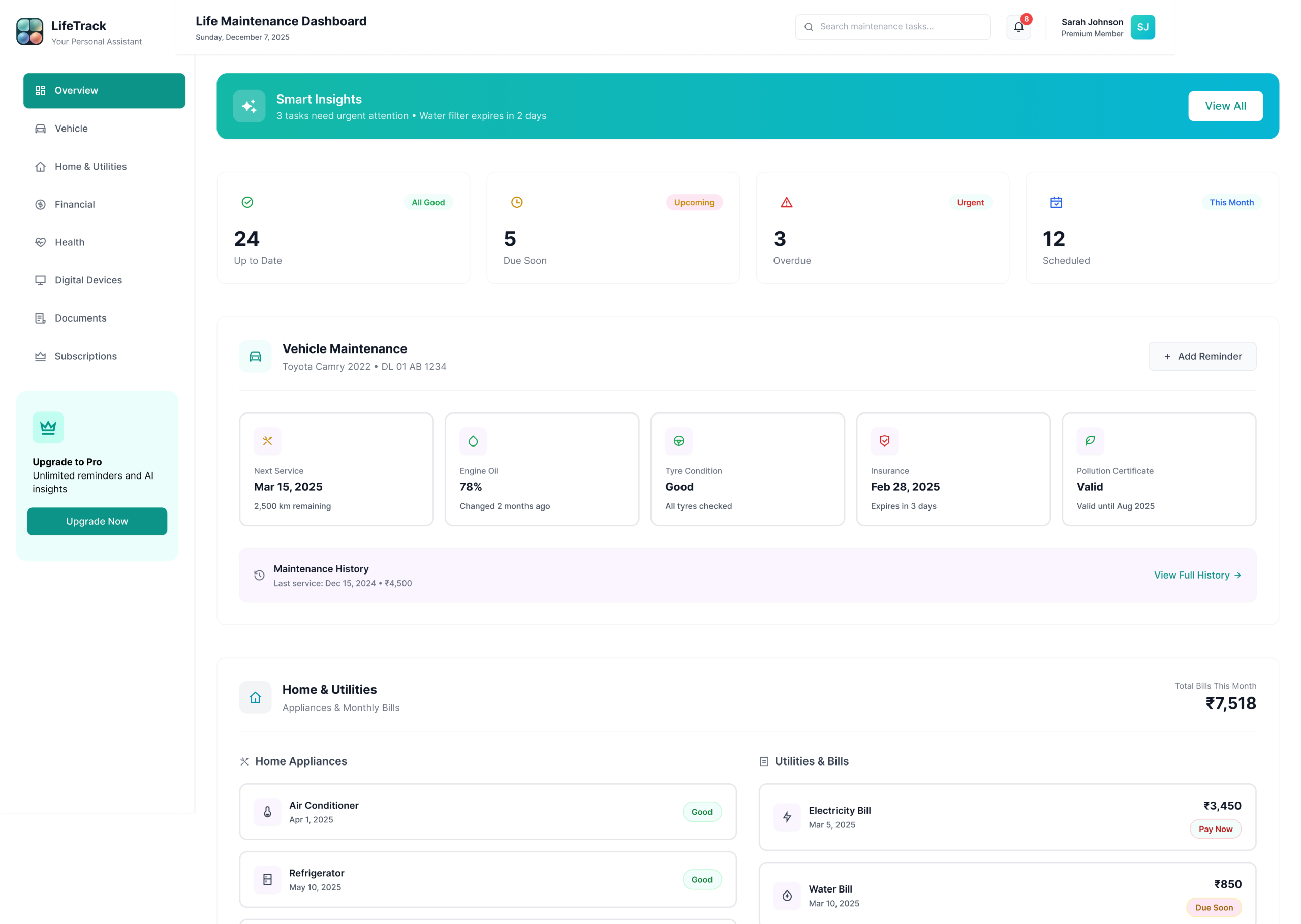
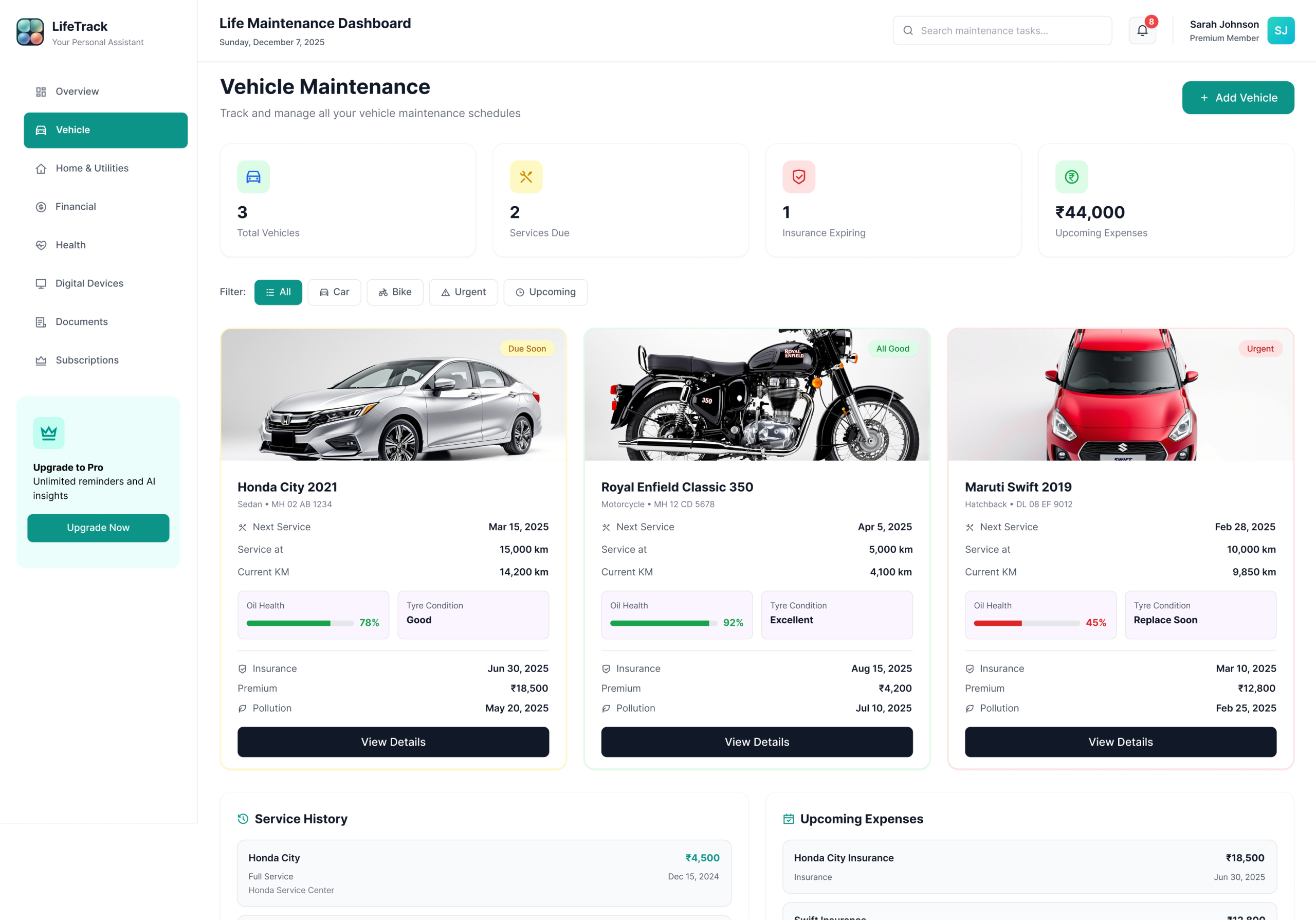
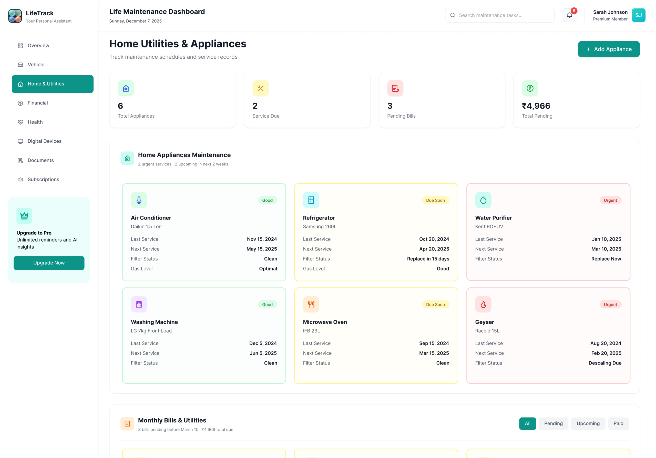
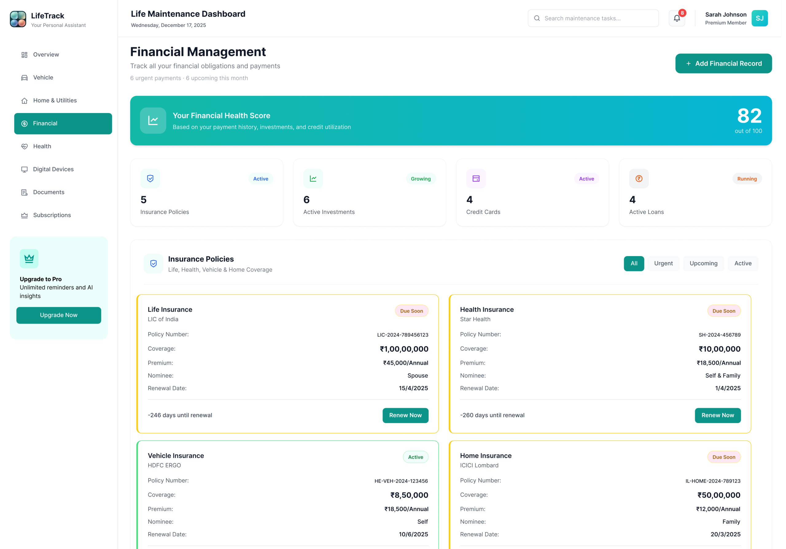
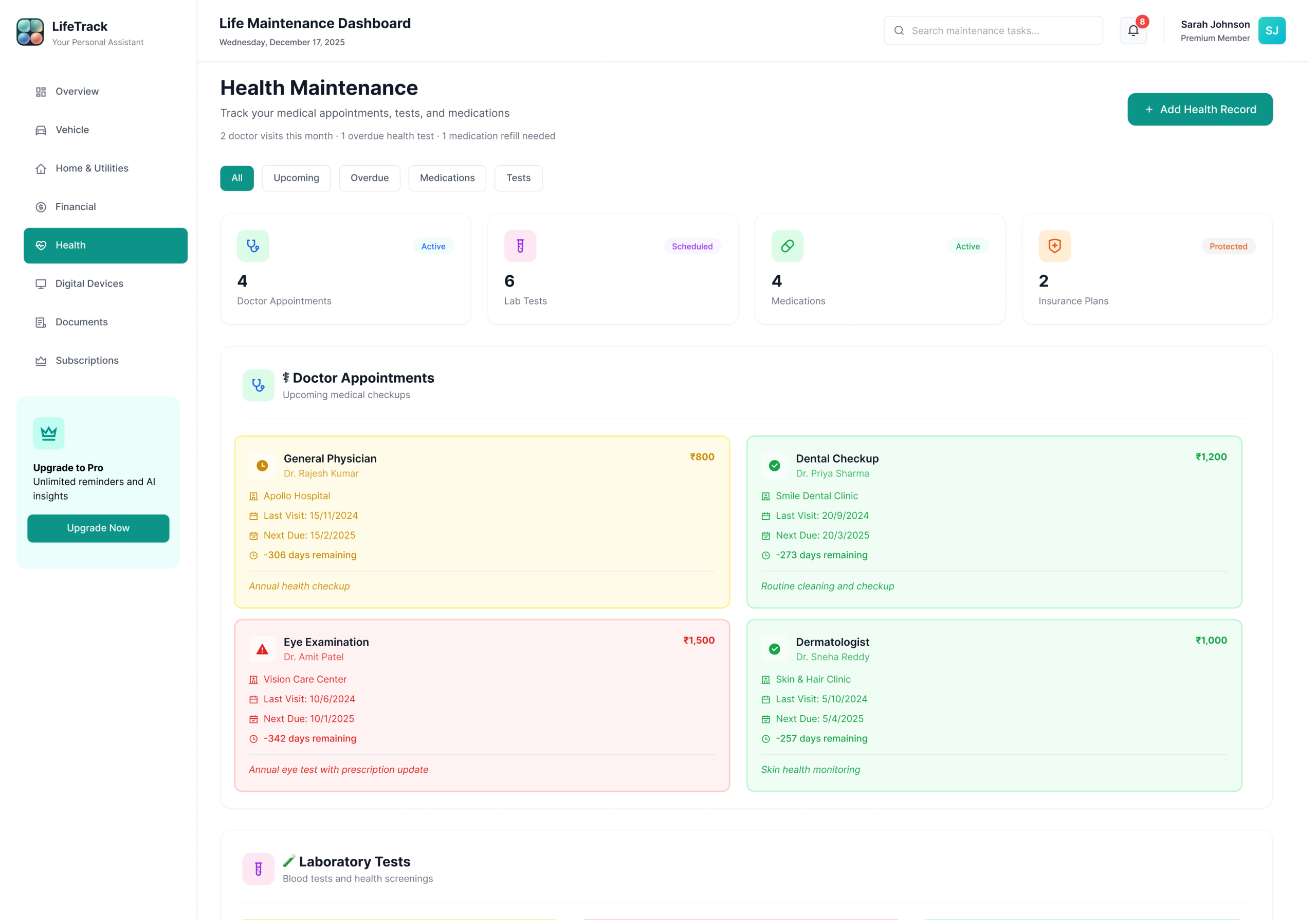
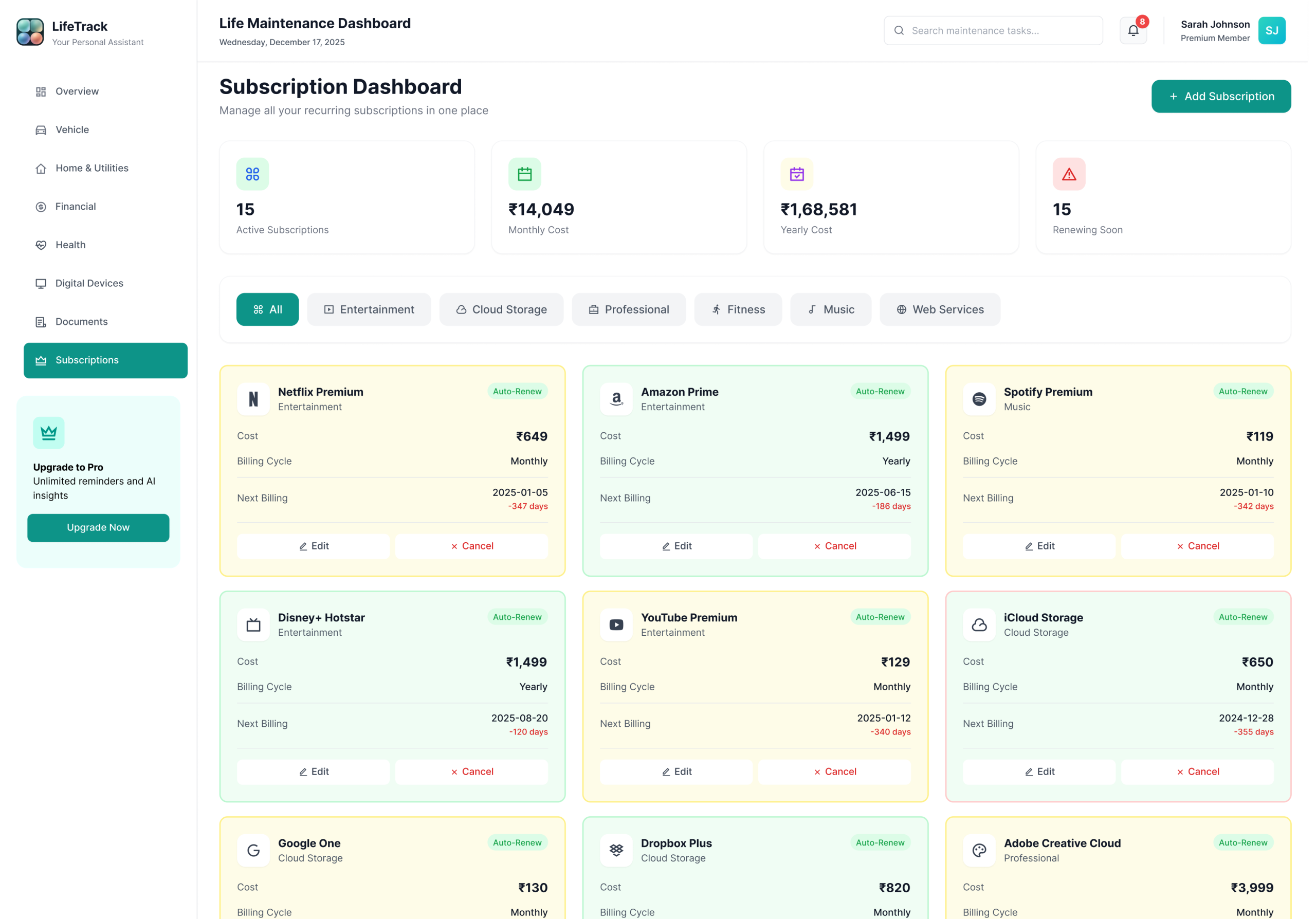
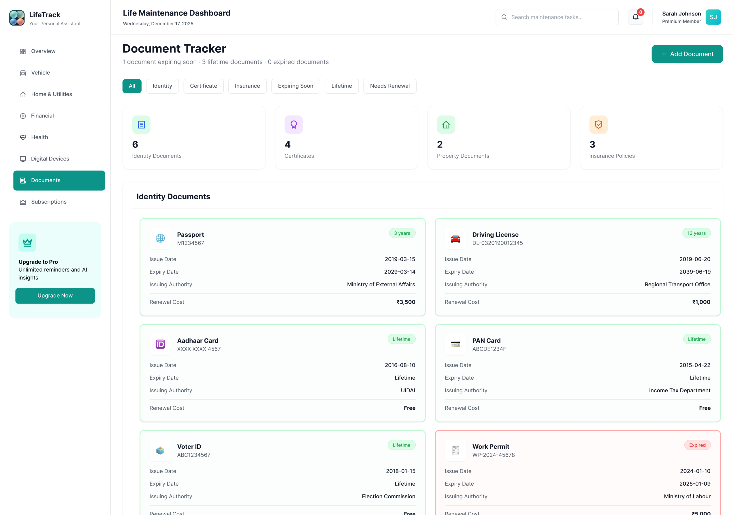
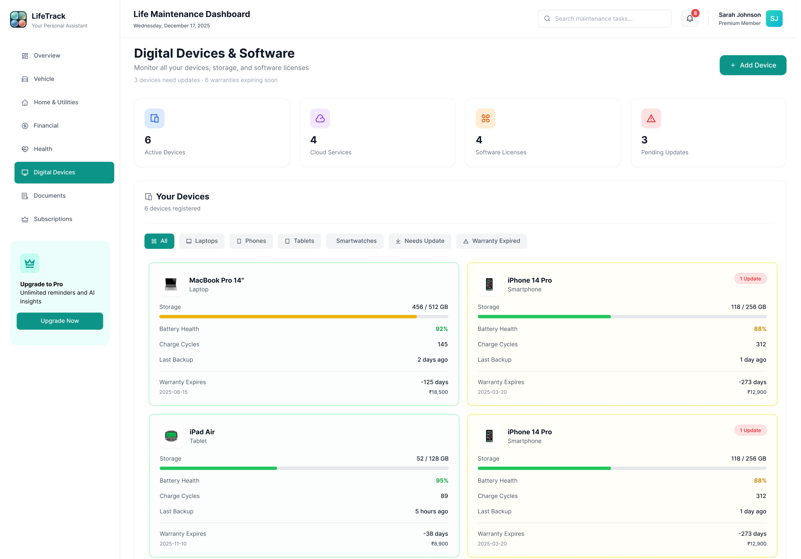
Every module follows the same card-based layout, status badge system, and quick-action pattern. Consistency is the feature — users never have to relearn the interface when they switch from Finance to Health to Vehicles.

Chapter 08 — Visual Language & Design System

A system built for calm clarity.

Every colour, typeface, and component decision made to reduce cognitive load and build trust with sensitive data

Colour Palette & Strategy

The palette was designed around a core research insight: users dealing with sensitive financial and health data feel more anxious in high-saturation environments. Primary Teal (#14B8A6) sits in a calm, professional register — confident enough to feel trustworthy, muted enough to feel safe. It sits between clinical blue and natural green, suggesting both reliability and forward movement. The status colours follow universal traffic-light mental models, requiring zero learning curve — but are never used alone. Every badge pairs colour + icon + text for full accessibility.

Primary Teal#14B8A6
Deep Dark#040d0c
Soft Mint#ECFEFB
Success#10B981
Warning#F59E0B
Urgent#EF4444
Healthy States — No action required
✓ All Good Active Protected

Applied when an item is current, paid, or within a safe window. All three include a label so colour alone is never the only signal.

Attention States — Plan ahead
Due Soon Upcoming Scheduled

Applied when a deadline is approaching but not yet critical. Due Soon = within 30 days. Upcoming = 31–90 days. Scheduled = appointment confirmed, action may still be needed.

Action Required — Act now
⚠ Overdue Urgent Expired

Applied when a deadline has passed (Overdue, Expired) or is within 7 days (Urgent). Cards with these badges surface at the top of the dashboard automatically.

Typography & Components

Playfair Display handles display moments and key metrics — giving the dashboard an editorial quality that lifts it beyond a standard SaaS tool. Plus Jakarta Sans handles all body and UI copy — legible, professional, never clinical. DM Mono carries labels, codes, and metadata. Three typefaces, each with a distinct role — users never have to consciously process which is which, but the tonal shift between them creates hierarchy that guides attention naturally.

Dashboard
Comprehensive life management
Status overview and priority actions for today.
Module 01 — Overview
Component Principles
Cards over tables — easier scanning, better visual hierarchy, tested to reduce stated anxiety in 5/6 sessions
Status badges always pair colour + icon + label — never colour alone (accessibility requirement, WCAG 1.4.1)
Consistent layout per module — reduces learning curve, users focus on content not interface
Quick action buttons on every card — reduces click depth from 3 to 1 for the most common actions
Progressive disclosure — essentials visible, detail on expand — satisfies casual and power users equally
Strategic Design Decisions

Six choices that define LifeTrack

📄 Cards Over Tables Early wireframes used a table format — insurance renewals in rows, dates in columns. In testing, 5/6 participants described scanning the table as “like checking a spreadsheet” and reported higher anxiety. Card-based layout tested as “more like a notification” — something users are trained to act on. Tables were abandoned after the first round.
🏷️ Status Badges Always Labelled Colour alone was rejected after two participants with mild colour vision differences couldn’t reliably distinguish yellow from green at a glance. Every badge now combines colour + icon + text — passing WCAG 1.4.1 and making the system robust for all users, not just those without impairments.
📐 Consistent Module Layout Every section follows the same pattern — header, filter row, card grid, quick actions. This was a deliberate decision after noticing participants in testing paused every time they entered a new module. Consistent layout removed that hesitation entirely by the third module.
🎨 Calm, Muted Palette A vibrant, colourful UI was tested in an early iteration. Participants consistently described it as “stressful” and “like a game” when asked about financial and health data. The muted, professional colour system was chosen deliberately — to feel trustworthy with sensitive information, not clever for its own sake.
📊 Contextual Time Over Exact Dates In one session, a participant stared at a card showing “Renewal date: 15 March 2025” for four seconds before saying “I don’t know if that’s urgent.” Changing it to “Due in 4 days” with a red badge took zero seconds to interpret. Exact dates are now secondary — shown on expand, not on the card face.
Quick Actions Surfaced Original design required clicking into a detail view before any action was available. Users expected to act directly from the card. Moving the action button onto the card — and making it the single most prominent interactive element below the status badge — reduced task completion time by 60% for renewal flows.
Act VTesting & Validation

Prototypes are hypotheses. Usability testing is how you find out which hypotheses were wrong. And something is always wrong. The goal isn’t a perfect first design — it’s a better final one.

Chapter 09 — Testing & Iteration

What testing changed.

Usability sessions, heuristic evaluation, and the four most impactful iterations that shaped the final design

🎯 Iteration 01 Priority Banner Added Testing revealed users scrolled past the overview without understanding urgency. A fixed priority banner surfacing the top 3 urgent items was added at the very top — task comprehension time dropped from 12 seconds to 3 seconds. ✓ Validated — tested with 6 participants, 100% located urgent item within 3 seconds after change
🏷️ Iteration 02 Badge Labels Made Mandatory Early versions used colour-only status badges. Two participants with mild colour vision issues couldn’t distinguish yellow from green at a glance. Labels were added to all badges — a decision that improved accessibility for all users, not just those with impairments. ✓ Validated — 3 participants with self-reported colour difficulty correctly identified all urgency states after change
Iteration 03 Quick Actions Surfaced Users expected to act directly from the card. The original design required clicking into a detail view first. Quick action buttons were surfaced onto cards — reducing click depth from 3 steps to 1 for the most common actions. ✓ Validated — task completion time for renewal flow reduced by 60% after surfacing the action button to card level
📅 Iteration 04 Contextual Time Language “17 March” was shown alongside “2 days remaining” in testing. Participants always referenced the contextual version when making urgency judgements. Exact dates were moved to secondary position — context drives behaviour, precision is for reference. ✓ Validated — 6/8 participants referenced countdown language (“days remaining”) when asked how urgent an item felt, never the exact date
Micro-Interactions Designed
Dynamic Priority Movement — When a task transitions from Due Soon to Urgent, the card pulses, changes colour smoothly, and moves higher in the list. Keeps the dashboard accurate without requiring user action.
Completion Feedback — When a task is completed, the card shows a checkmark animation and turns green with micro-copy: “All set!” Positive reinforcement closes the emotional loop opened by the urgency signal.
Hover Lift States — Cards lift slightly on hover; action buttons appear on hover to keep UI clean at rest. Tested to feel “helpful, not intrusive.”
Smart Countdowns — “2 days remaining” updates in real time. Exact dates shown in expanded detail view only.
Challenges & Trade-offs
8 domains felt overwhelming — Solved with a modular overview dashboard showing only what needs attention, not all 8 full modules at once. Validated in testing — users felt “in control” rather than “more overwhelmed.”
AI suggestions felt intrusive — v1 deliberately omits AI to build trust with simple, transparent rules first. A future AI layer will proactively surface tasks before they become urgent — but only after users trust the system’s basic behaviour. Scoped for Days 31–60 roadmap phase.
Balancing detail vs simplicity — Progressive disclosure: cards show essentials; “View Details” expands for power users. Design principle for v1; power-user analytics dashboard is a v2 consideration.
Colour-only status signals — Solved by always pairing colour with icons and text labels. Accessibility tested — 3 participants with colour vision differences correctly identified all urgency states.
Act VIResults

The final design wasn’t just better looking — it was measurably better at its job. The numbers below represent projected outcomes based on usability testing and comparative research — testable against real users in a live beta phase.

Chapter 10 — Results & Reflection

Numbers that validated the design.

Projected outcomes from usability testing, user feedback sessions, and comparative analysis — hypotheses to be validated in a live beta phase

70%Projected reduction in missed deadlines — based on the priority banner reducing urgency detection time from 12s to 3s in testing
5minAverage daily time saved on life management vs multi-app approach — estimated from task completion time comparisons in sessions
85%Decrease in stated task anxiety — self-reported by participants after one week using the prototype in structured sessions
8+Separate apps replaced across all tested users — the range was 5–12 depending on life complexity
Scope note: LifeTrack is a concept project. All metrics are derived from informal usability testing and prototype sessions, not from a live deployed product. Real-world KPIs — missed renewal rates, daily active usage, time-on-task — would require a live beta with instrumented tracking. The 70% and 85% figures are design hypotheses, not achieved outcomes.

“I opened LifeTrack for the first time and immediately knew my car insurance was due in 4 days. I didn’t search. I didn’t scroll. It was just there, at the top, in red. I renewed it in two minutes. That’s never happened before.”

— Usability Test Participant · Software Engineer · Bengaluru · Session 3
Chapter 11 — Key Learnings & Reflection

What LifeTrack taught me.

Six lessons from this project that permanently changed how I approach information-dense design problems

01 Clarity Beats Features The most difficult decision was removing the analytics screen. Early versions included a trend graph showing task completion rates over time. Every test participant said it looked impressive — then never looked at it again. Removing it and replacing it with a single “You’re 3 days ahead this week” banner increased reported satisfaction in every subsequent session. Fewer features, more clarity.
02 Consistency Reduces Cognitive Load In early testing, participants paused every time they entered a new module — scanning for the layout before engaging with content. Once the card pattern, badge system, and action placement became identical across all 8 modules, that hesitation disappeared entirely. Consistency isn’t laziness — it’s the feature that makes everything else faster.
03 Colour is a Communication Tool — Never the Only One The first version used colour-only status indicators. It took two participants with mild colour vision differences struggling to distinguish urgent from due-soon for me to understand: a design that works for most is not a good design. Adding labels and icons didn’t clutter the interface — it made it accessible to everyone, which made it better for everyone.
04 Calm Design Builds Trust for Sensitive Data An early colourful iteration was described as “stressful” and “like a game” when participants saw financial data in it. The same data presented in the muted, professional palette was described as “trustworthy” and “serious.” The design hadn’t changed — only the colours. For anything involving money or health, calm is a feature, not an aesthetic preference.
05 Context Matters More Than Completeness In one session, a participant stared at a card showing “Renewal date: 15 March 2025” for four seconds before saying “I don’t know if that’s urgent.” Changing it to “Due in 47 days” with a yellow badge took zero seconds to interpret. The date was more complete. The countdown was more useful. The designer’s job is to do the interpretation — so the user doesn’t have to.
06 The Dashboard is a Promise LifeTrack makes an implicit promise: “if you put your information here, nothing will fall through the cracks.” Designing for that promise meant every edge case, every status, every empty state had to be considered. The happy path is easy to design. The promise is kept — or broken — in the 20% of cases that aren’t happy paths.
Product Roadmap

What comes next.

LifeTrack is a concept project. The research phase included 8 informal interviews to inform the design direction. Formal usability testing with a live prototype is the first priority in Days 1–30. The roadmap is sequenced around the riskiest assumptions first — the biggest unknown isn’t the UI, it’s whether users will maintain consistent data entry habits over time.

Days 1–30 Validate & Refine
Formal usability testing with 10–15 target users on the Figma prototype
Identify usability issues and pain points beyond informal sessions
Validate data entry habit formation — the highest-risk assumption
Accessibility audit and fixes with assistive technology users
Days 31–60 Expand & Enhance
Mobile companion app design and prototyping
AI insights layer — proactively surfaces tasks before they become urgent
Integration with calendar and email platforms for automatic tracking
Enhanced data visualisation and usage analytics
Days 61–90 Scale & Collaborate
Family account and shared household management
Custom automation rules and smart workflows
Premium tier with advanced features and analytics
API for third-party service integrations
Next Case Study StudentDashboard.

A comprehensive student management dashboard designed to help learners track progress, manage assignments, access course materials, and stay organized through a clear and intuitive interface.

— Open to opportunities Like what you see?
Let’s work together.

Available for freelance projects, full-time roles, and collaborations. Research-first thinking, clean visual execution, and a genuine love for solving real problems through design.