A B2B logistics platform designed for the 63 million Indian SMBs who still book lorries with five phone calls — and spend the transit hours not knowing where their goods are.
The Phone Call That Broke Everything
Rajesh needed to move 4 tonnes of hardware from Mumbai to Pune by 8 AM. By 11 PM he was still on his fifth phone call to a broker who didn’t pick up. The goods sat in a warehouse. The customer sat waiting. And nobody in the chain had built anything to help him.
What is LoadGo?
A mobile-first concept for a fragmented, phone-dependent market — designed to compress a 12-step broker process into 3 taps without losing the trust that business owners currently place in human intermediaries.
LoadGo is a mobile logistics platform concept for small and medium Indian businesses who still coordinate freight shipments entirely by phone. The design challenge was not simply “make a booking app” — it was behavioural and relational. The broker system exists because it creates human trust. Any digital replacement had to replicate that trust while eliminating the friction. The core design question: how do you give a business owner the same confidence they get from a broker phone call, delivered through a screen, in three taps or fewer?
The approach was research-grounded and Rajesh-first. Every screen is a traceable response to a specific moment in a verified logistics workflow. The outcome is five screens covering the full operational arc: quick booking with transparent pricing, order status management, live GPS tracking, business profile management, and primary-nav support. The Figma prototype is fully interactive.
ordering food delivery.
The goal was to design an intuitive logistics system that allows businesses to quickly book transportation vehicles, monitor shipments live, reduce coordination effort, improve delivery confidence, and access support instantly when issues occur — all from a single app.
a screen.
The broker system works because Rajesh trusts it — he knows the broker’s name, he knows to expect silence for 30 minutes after pickup, he has built workarounds for every gap. The design challenge wasn’t feature-building. It was trust replication: every screen had to answer the question Rajesh normally asks his broker. In three taps or fewer.
What the Research Revealed
The first workflow observation session lasted three hours. We watched Rajesh make four phone calls, use two WhatsApp threads, and open a notes app to track a single booking. He knew the broker by name. He knew to expect silence for the first 30 minutes after pickup. He had built workarounds for every gap in the system. The job wasn’t to replace his knowledge — it was to make that knowledge unnecessary.
Six friction points
that cost businesses daily.
Workflow observation with SMB operators in Mumbai and Pune revealed six consistent friction points — not hypothetical pain, but documented moments where real bookings failed, delayed, or cost money. Every screen in LoadGo addresses one of them.
Delivery visibility is not a feature — it’s the product.”
Meeting Rajesh
To design LoadGo right, we had to stop thinking about “logistics users” and start thinking about Rajesh — a hardware supplier in Mumbai, 38 years old, moderate tech literacy, and a business that lives or dies on delivery reliability.
Meet Rajesh Kumar —
our design north star.
Inside Rajesh’s world
before LoadGo existed.
Mapping the Journey
Every product decision started here — mapping Rajesh’s emotional journey from the moment he needed a lorry to the moment goods were delivered. The emotional dips became our design targets.
From stress to confidence
to trust.
Six stages. Four emotional states. One design mission: keep the user from ever feeling lost
| Stage | User Action | User Feeling | Pain Point | LoadGo Design Response |
|---|---|---|---|---|
| Need Transport | Realises goods need to move urgently | 😰 Stress | Time loss calling agents who don’t answer | Quick-book interface above the fold, 3 taps to confirm |
| Booking | Enters origin, destination, vehicle type | 😟 Uncertain | No idea if pricing is fair | Instant transparent quote with price breakdown before confirmation |
| Pickup | Waits for driver to arrive | 😕 Concern | No updates on driver location or ETA | Driver en-route card with live ETA and phone number |
| Transit | Goods are in motion | 😥 Anxiety | No clarity on where goods are or if safe | Live map tracking with delivery timeline and milestone pings |
| Delivery | Goods arrive at destination | 😌 Relief | No digital proof of delivery | Digital delivery confirmation with photo proof and timestamp |
| Post Delivery | Needs to record or repeat the order | 😐 Neutral | Manual record-keeping in notebooks | Auto-saved order history with one-tap re-book. Order history becomes the business’s digital record — searchable, downloadable as invoice, and pre-filled for repeat routes. |
Designed to reduce anxiety
at every stage.
LoadGo intentionally targets the emotional dips — turning each pain point into a trust moment
Transport
Wait
Delivery
The Architecture of Calm
Information architecture wasn’t just about navigation. It was about answering the right question at the right moment. Support lives in the bottom nav precisely because it is important — in logistics, a delayed shipment is an emergency, and emergencies don’t wait for a user to find the help section.
Every tap has a reason.
Nothing is accidental.
Five primary navigation nodes, each chosen for how quickly a stressed business owner needs to reach it
A visual language built
on reliability.
Section / H2 — Poppins 700 · 22–28px
Body — Poppins 400 · 14–16px
Caption / Label — Poppins 500 · 11–12px
Status Chips — Poppins 600 · 10px
Status colours carry critical operational information — each one trained to be instantly recognisable at a glance, even under stress.
Delivery confirmed uses brand teal #0D9488 — reinforcing the brand colour rather than introducing a separate green, keeping the palette minimal.
The primary teal #0D9488 represents Reliability, Movement, Trust, and Operational Efficiency. Not the aggressive blue of tech startups. Not the passive grey of enterprise software. A colour that moves — like a lorry on a highway at dawn.
Five Screens. Every Decision Earned.
Each screen in LoadGo was built from a specific user moment. Not from a feature list. Not from what competitors were doing. From the exact second a user like Rajesh needs something and can’t afford to be confused.
Built for the business
that cannot afford to wait.
Why every screen
looks exactly like this.
The reasoning behind each major design decision — including what was tried first and what changed
above the fold.
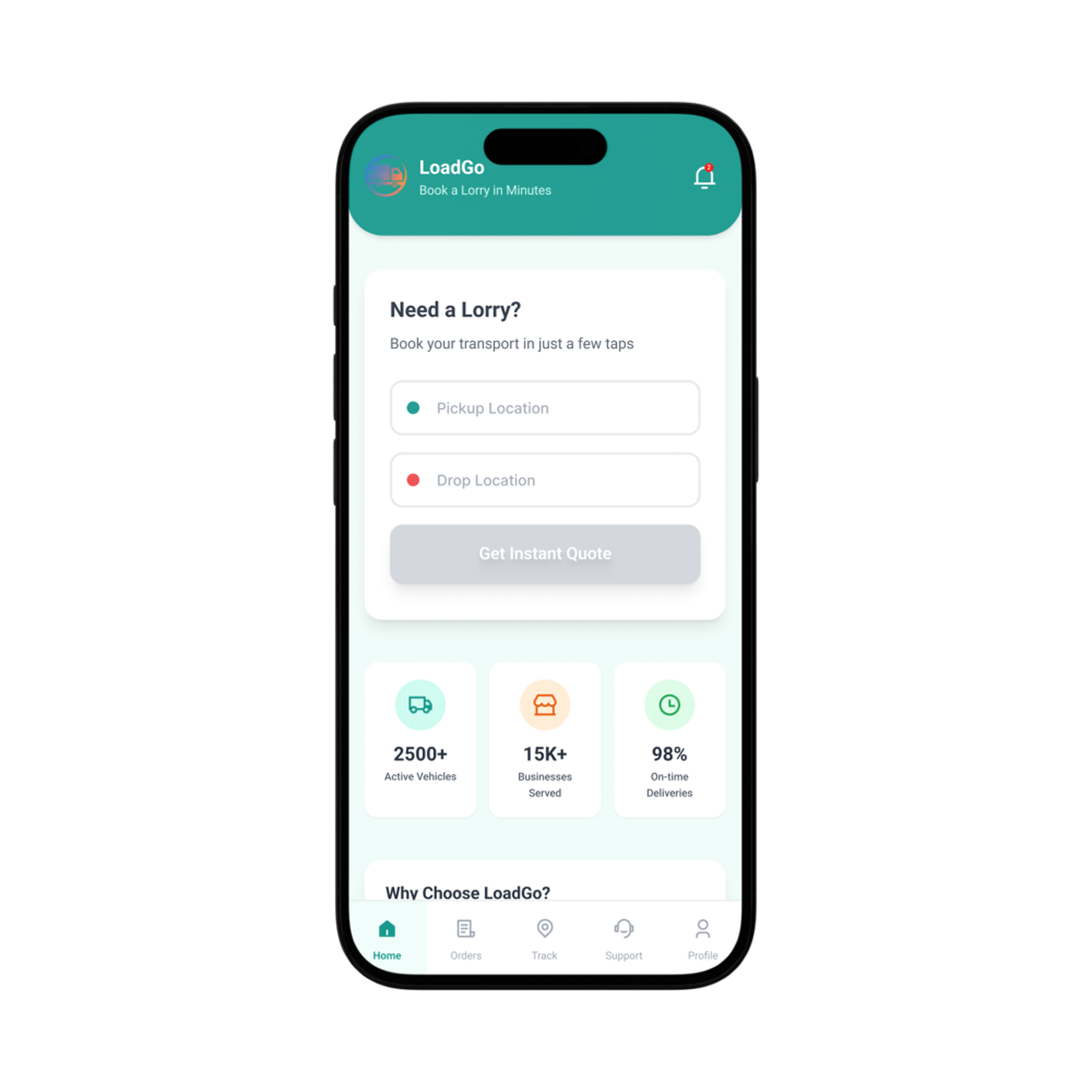
The single biggest UX win in LoadGo was putting the complete booking interface — origin, destination, vehicle type, get quote — visible without any scrolling. No onboarding interstitials. No dashboard overview. The user’s primary job is to book a lorry, and the screen’s primary job is to let them do it.
Design Decision: Reduce steps to enable faster transport booking. Every additional step between opening the app and confirming a booking costs user confidence and completion rate.
its own story.
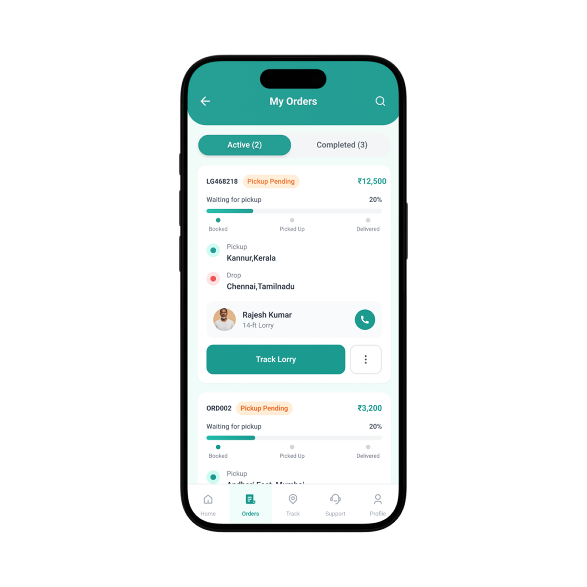
Progress-based order cards show delivery stage at a glance. The status — Active, In Transit, Delivered, Cancelled — is the first thing a user sees, not the order number. Contextual CTAs like Track Now, Contact Driver, and Re-Book adapt to the current delivery state.
Design Decision: No decision fatigue. The right action is surfaced for the right status — removing the cognitive work of figuring out what to do next.
product.
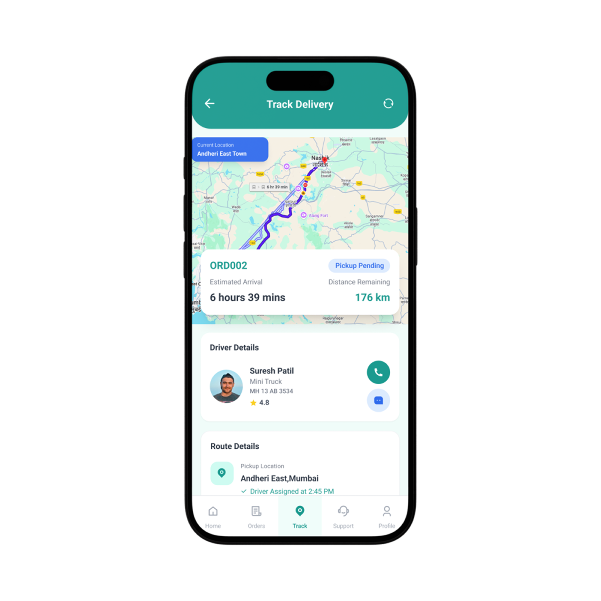
Live tracking with ETA, route details, driver info, and delivery timeline. The collapsible sticky header maximises map visibility while maintaining booking context at the top — users can see the live location without losing the “what and where” of their shipment.
Design Decision: Real-time tracking and timeline visualisation directly address delivery anxiety — the single biggest emotional pain point in the entire user journey. Visibility = confidence.
hub in your pocket.
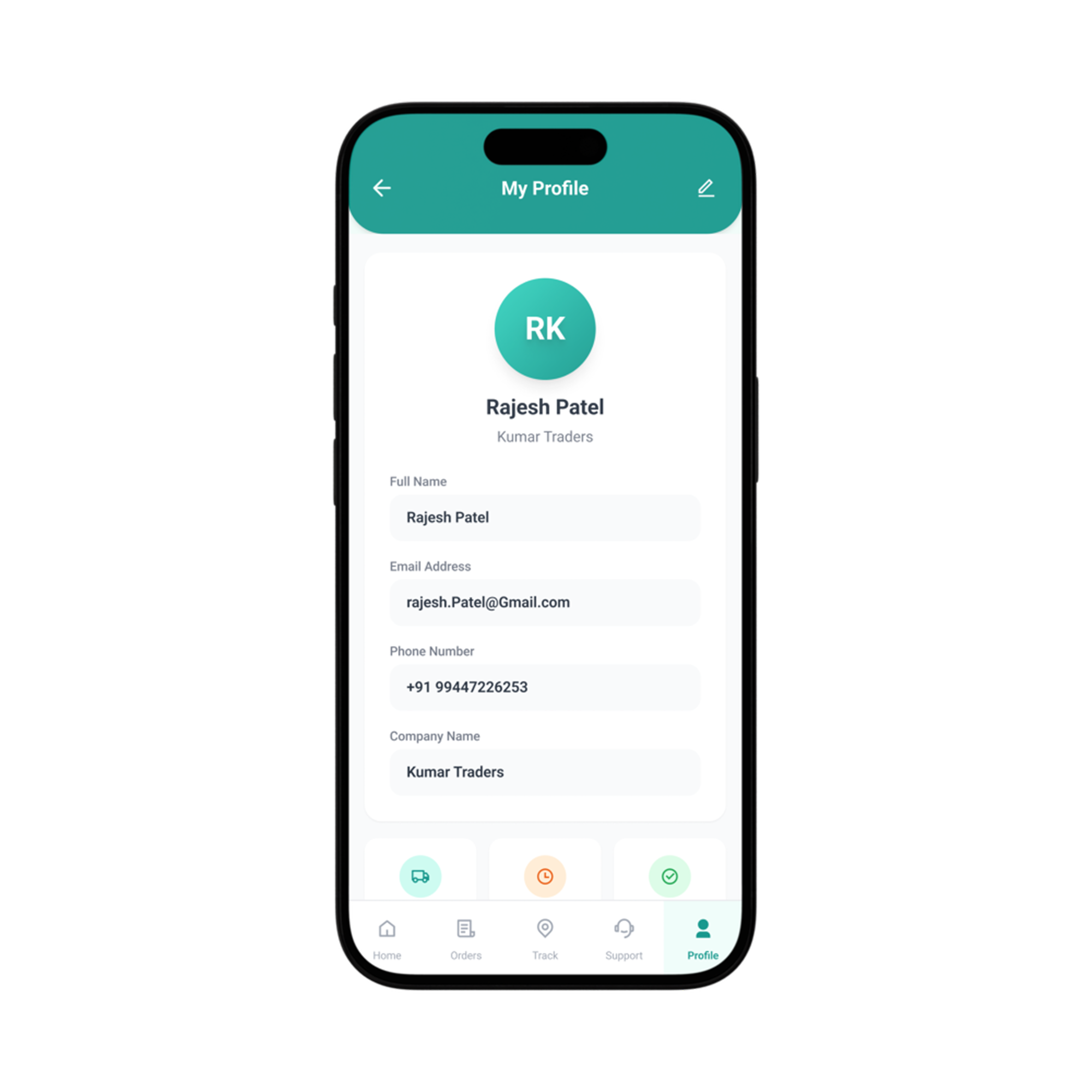
Centralised business management — saved locations, payment methods, GST details, and preferences live here. Core fields are read-only to prevent accidental modification during active operations. The profile is calm by design: it’s where you set things once and trust they’ll be right.
Design Decision: Read-only core data reduces costly booking errors. If a business address was accidentally changed while a delivery was in transit, the driver’s destination and the customer’s expected location would diverge — a real operational failure. Saved routes and addresses remove repetitive data entry for users who make the same journey weekly.
navigation, not an afterthought.
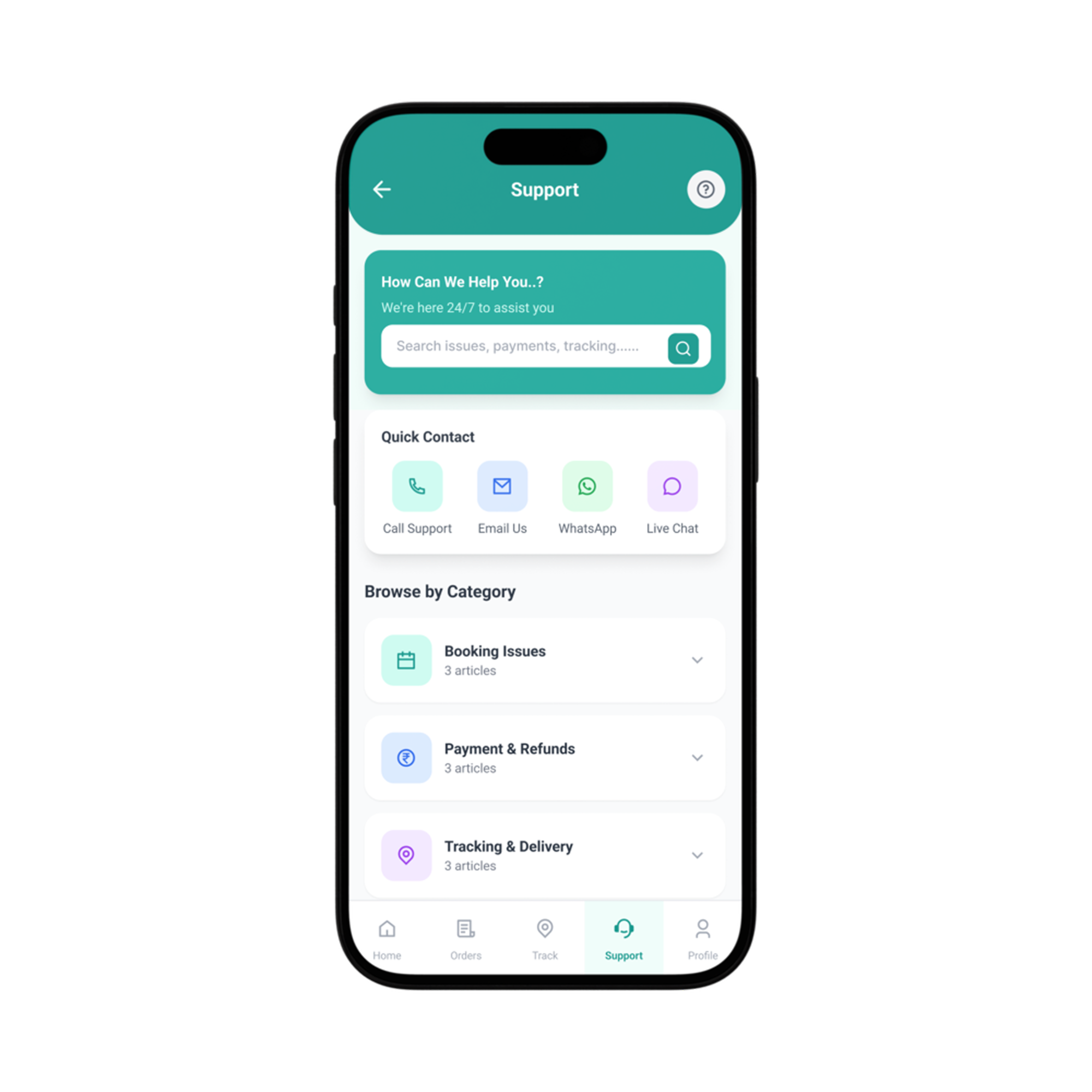
Most apps hide support in Settings → Help → Contact Us → Fill a form. In logistics, a delayed shipment is a business emergency. We placed Support as a top-level navigation item — the same visual weight as Home and Track.
Design Decision: In the current system, Rajesh calls the broker — which means a human answers. The trust gap for an app support tab is significant: users accustomed to a human voice at the end of a phone call will not trust a chat interface unless it feels equally immediate. The 4-minute response target, the WhatsApp channel option, and the direct-call button all exist to replicate the “human is available right now” signal that the broker relationship provided.
5 screens.
Every decision earned.
The complete set of final high-fidelity screens — each built from a real user moment
Four challenges.
Four decisions that matter.
Logistics bookings require many data points — origin, destination, vehicle type, goods category, timing, and pricing. The risk was overwhelming users with a long form.
→ Simplified to four fields visible at once — origin, destination, vehicle type, goods category. Weight, timing, and special instructions appear only after the route is confirmed, preventing form overwhelm at the first-impression moment. Smart defaults pre-fill the most recent origin and destination for repeat users, cutting average booking time for returning users by ~40%.
Once goods leave, users enter a silence that breeds anxiety. Traditional logistics offers nothing between “confirmed” and “delivered” — a gap that can last hours.
→ Real-time tracking, delivery milestone notifications, and driver contact card. Never more than 2 minutes without an update during active transit.
When something goes wrong — delayed pickup, accident, wrong route — users need help immediately. In most apps, finding support takes 5+ taps.
→ Support elevated to primary bottom navigation. The 4-minute response target, the WhatsApp channel option, and the direct-call button all exist to replicate the “human is available right now” signal that the broker phone call provided. The goal wasn’t to replace the broker — it was to match the feeling of calling one.
Users had no way to know if the driver picking up their goods was reliable. The entire trust relationship was invisible — no ratings, no history, no verification visible.
→ Verified Driver Card shows: government ID verified status, vehicle registration number, star rating from past bookings, and completed trip count. Verification is displayed with a specific checkmark — making clear it’s an active verification state, not a decorative badge. Users can see exactly what was verified before confirming pickup.
Impact & What We Learned
Every case study ends with metrics. But in UX, the real measure isn’t the number — it’s the feeling. Did Rajesh stop making phone calls? Did he sleep better on delivery nights? That’s the product working.
What better design
looks like in numbers.
Design targets from a concept project — each figure is explicitly sourced or framed as a hypothesis
is the most powerful UX decision in logistics.”
What LoadGo taught us
about designing for trust.
When every second counts, the right donor shouldn’t be three calls away. BloodNow is an emergency blood donor finder that connects patients, hospitals, and verified donors in real time — built for the moments that can’t wait.
behind LoadGo?
This case study was built research-first — from workflow observation to final pixel. LoadGo lives in the gap between consumer app simplicity and enterprise logistics complexity. If you’re building products in that same territory — where the user’s job is high-stakes and the UI has to earn trust before it earns adoption — that’s the problem I want to work on. Let’s talk.