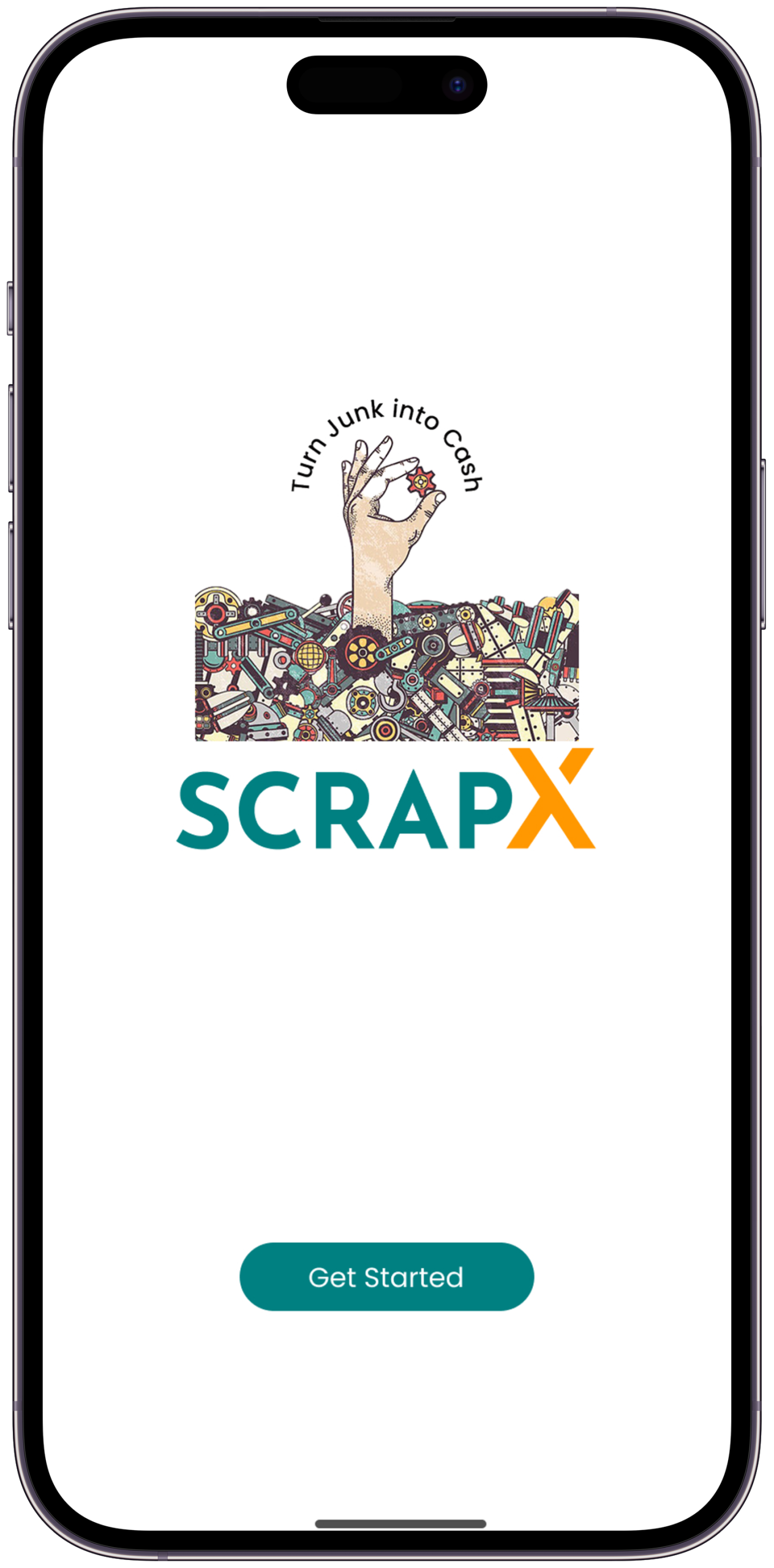
Turning waste into worth — one fair transaction at a time
In India, millions of kilograms of recyclable scrap change hands every day — through a system built entirely on informal trust, opaque pricing, and zero accountability. ScrapX was born from one question: what if this industry worked the way the people inside it actually deserve?
What is ScrapX?
A mobile platform connecting scrap sellers, dealers, and recyclers in one trusted ecosystem
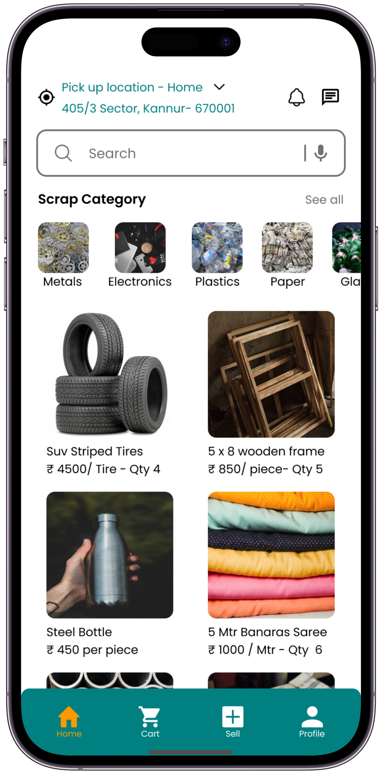
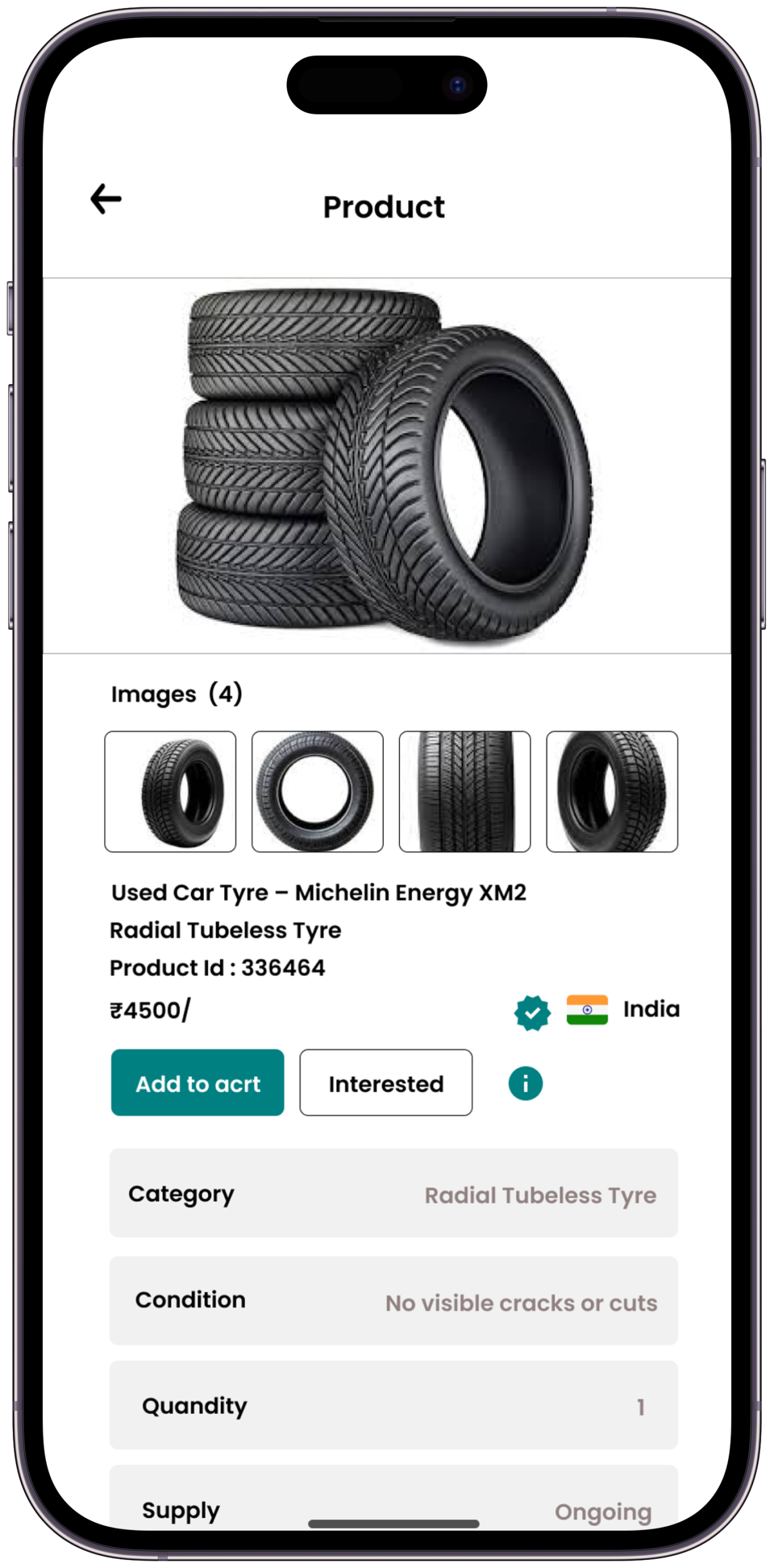
ScrapX is a smart scrap buying and selling mobile application bridging the gap between individual households, small businesses, and organised scrap dealers. In India alone, the informal scrap economy handles millions of tonnes of recyclable material annually — yet it remains fragmented, opaque, and difficult to navigate for ordinary users.
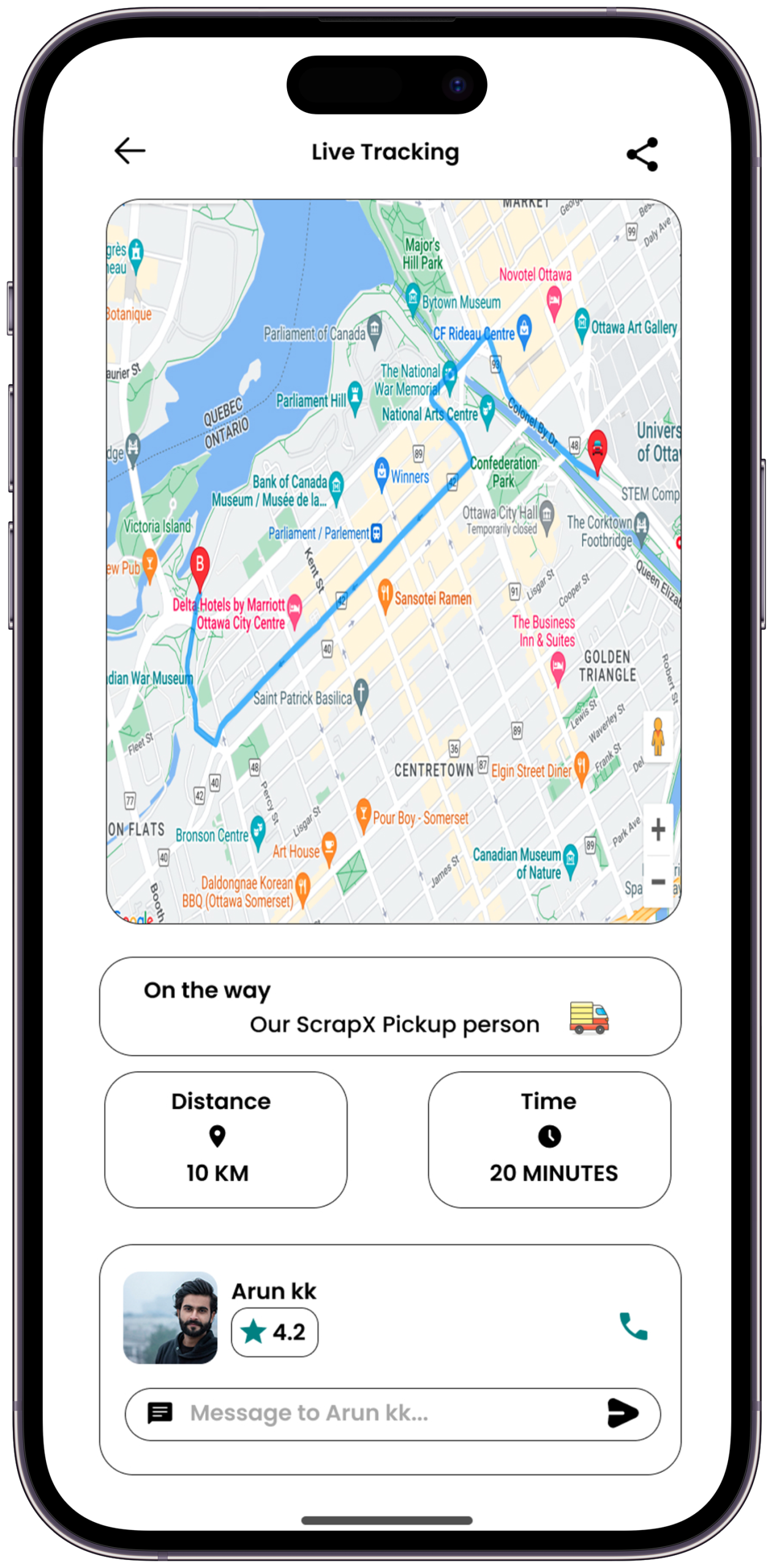
The platform provides fair price discovery, verified dealer profiles, scheduled pickups, live tracking, and digital payments — bringing transparency and trust to an industry that has historically operated through informal networks and word-of-mouth pricing.
This case study covers the complete UX journey: first-hand research, persona building, information architecture, wireframes, a full design system, usability testing, and final impact metrics.
India generates over 62 million tonnes of solid waste annually. A massive portion of recyclable scrap never reaches organised recycling chains — not because people don't care, but because the system that should serve them is built on mistrust, price manipulation, and zero digital infrastructure.
A system designed to confuse
the very people it serves.
Three compounding failures that ScrapX was built to break — on both sides of the transaction
"The kabadiwala came three times this week — but every time the price was different and I never knew who was cheating whom."
— Research Participant · Bengaluru · Homemaker, 44Before touching a single wireframe, I spent two weeks speaking directly to people living inside this broken system — visiting scrap dealers, sitting in household kitchens, and watching transactions happen in real time. Their words shaped every design decision that followed.
Listening before designing.
Qualitative interviews, contextual surveys, and competitive analysis across 3 cities
| Platform | Live Pricing | Pickup Scheduling | Dealer Verification | Digital Payment | Real-Time Tracking | Ratings / Reviews | All 6 Features |
|---|---|---|---|---|---|---|---|
| OLX | Partial | ✗ | ✗ | Partial | ✗ | Partial | ✗ |
| Scrapuncle | ✗ | ✓ | ✗ | ✗ | ✗ | ✗ | ✗ |
| I-Scrap | Partial | ✗ | ✗ | ✗ | ✗ | ✗ | ✗ |
| KabadiwalaExpress | ✗ | ✓ | Partial | Partial | ✗ | ✗ | ✗ |
| Local App A | ✗ | ✗ | ✗ | ✗ | ✗ | Partial | ✗ |
| Local App B | ✗ | Partial | ✗ | ✗ | ✗ | ✗ | ✗ |
| ScrapX | ✓ | ✓ | ✓ | ✓ | ✓ | ✓ | All 6 ✓ |
While several apps solve for one piece of the puzzle — like scheduling or classifieds — none create a trusted, end-to-end transaction loop. Users are forced to cobble together multiple tools or fall back to cash and uncertainty. ScrapX's core advantage isn't just having all six features — it's weaving them into a single, seamless experience that builds confidence at every step of the transaction.
The people we designed for.
Two primary personas that shaped every feature decision throughout the project
Inside the seller's world.
Inside the dealer's world.
The biggest barrier to adoption wasn't price or technology — it was trust. Users didn't need a smarter app; they needed to feel the system was finally working for them, not against them. Every design decision flowed from this single finding.
With research complete, I moved into structure. Before any visual design, I needed to map out how users would actually move through the product — what they needed to do, in what order, and what could go wrong at each step.
Mapping the journey.
Visual user flows built for both personas before a single pixel was placed. V1 scope is seller-first; a dedicated dealer product with route optimisation and inventory management is scoped for v2.
Thinking in structure,
not pixels.
Lo-fi concepts tested before any visual design — speed over beauty at this stage
With architecture validated, I moved into the visual layer. The design system needed to feel clean and trustworthy — but not sterile. The teal palette was chosen deliberately: it sits between industrial green and medical blue, signalling both eco-responsibility and reliability.
The mark that says trust me.
A logo built to work across dark interfaces, light receipts, and printed labels — at any size
The ScrapX brand needed to signal two things at once: the environmental responsibility of recycling (green) and the financial reliability of a bank (blue). Scrap Teal sits at the exact intersection of these two ideas — trustworthy enough for a financial transaction, earthy enough to mean something ecological. It's not just a colour; it's a positioning statement in a single hex value.
Built for trust at first glance.
A design system grounded in clarity, confidence, and environmental responsibility
Five tones spanning from deep environmental dark through to high-contrast action. Teal signals trust, dark backgrounds reduce eye strain for outdoor use, and contrast ratios ensure readability in bright sunlight.
Built with full states: default, hover, active, error, disabled. Minimum 44px tap targets, high contrast for outdoor readability, zero hidden affordances.
The final visual language.
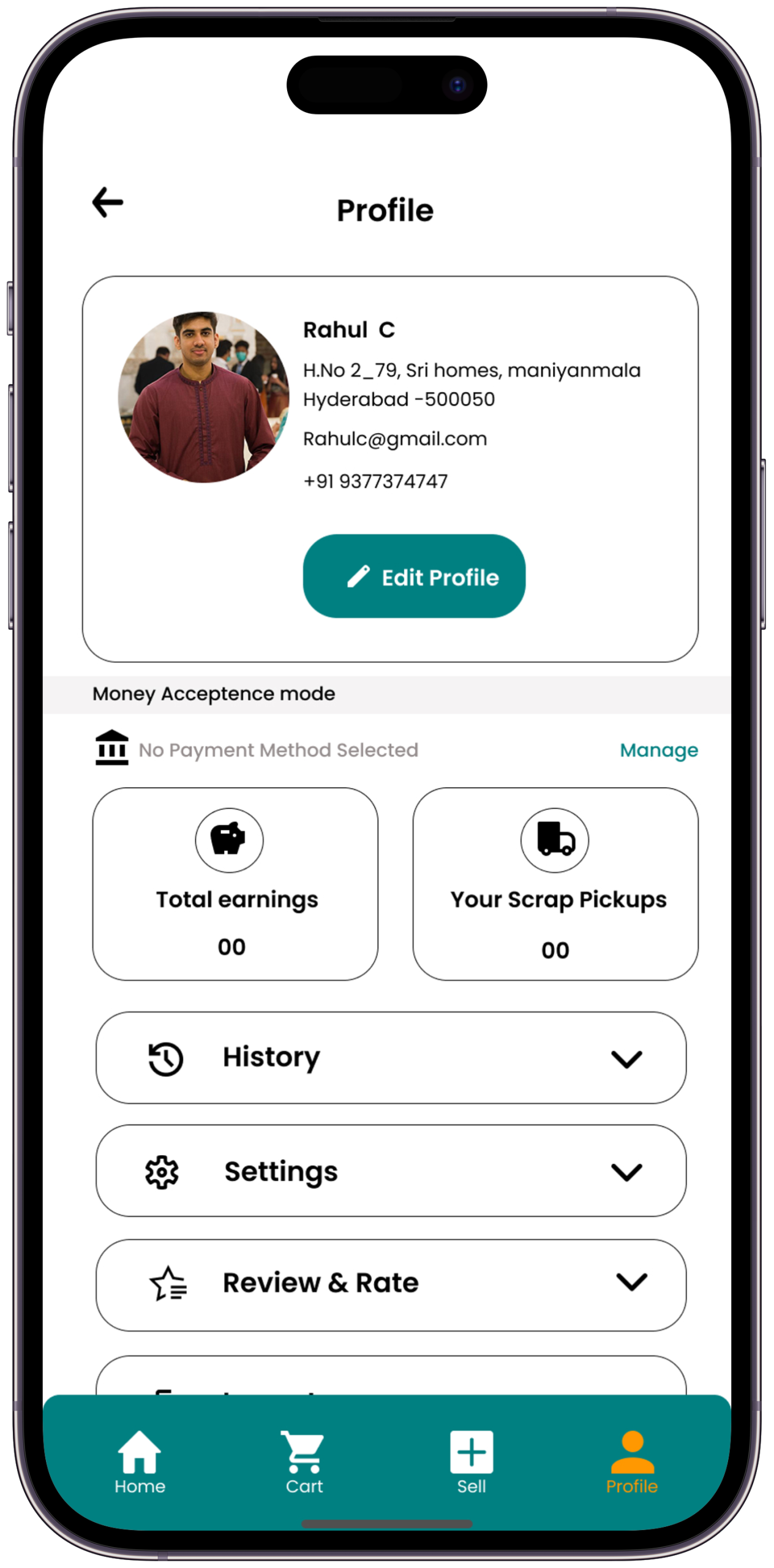
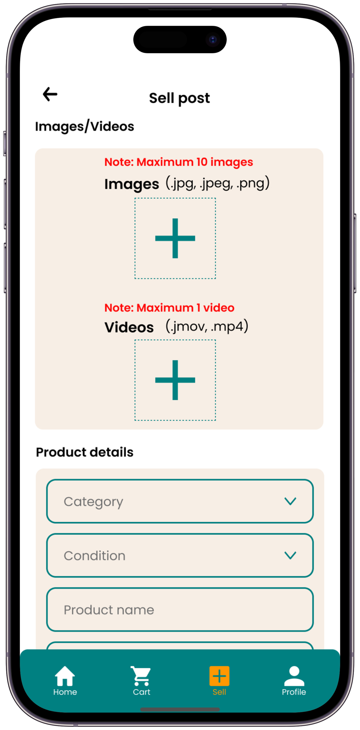
Six screens — each directly answering a user need uncovered in research, built to make the informal scrap economy feel trustworthy for the first time
A prototype is only as good as the people who test it. I ran moderated usability sessions with 8 participants across both personas — measuring not just completion rates, but emotional response and trust signals at each critical moment.
Does it actually work?
8 moderated sessions measuring task completion, trust signals, and drop-off points
| Task | What We Measured | V1 Result | After Iteration | Status |
|---|---|---|---|---|
| Find live iron price | Time to locate price on home | Avg 14 seconds | Avg 4 sec (price ticker above fold) | ✓ Resolved |
| Book a pickup | Completion rate + steps | 62% — 6 steps | 91% — 4 steps after flow simplification | ✓ Resolved |
| Understand dealer rating | Trust comprehension | 5/8 misread as popularity | 8/8 correct after renaming to "Reliability Score" | ✓ Resolved |
| Complete digital payment | Completion + hesitation | 50% — cash still preferred | 75% after adding UPI shortcut + explanation copy | ~ Improved |
| Find transaction history | Navigation success | 37% found it (buried in profile) | 88% found it after moving to bottom nav | ✓ Resolved |
| Contact dealer in-app | Chat discovery rate | 25% discovered chat at all | 62% — still low, added to v2 backlog | → V2 Backlog |
Even after adding a UPI shortcut and plain-language copy, 25% of seller participants still preferred cash across all three testing rounds. This is less a usability problem and more a deeply held habit and trust issue — cash feels verifiable and immediate in a way digital transfer doesn't, especially for first-time users.
By introducing a "Cash Confirmed" toggle for the dealer — combined with an immediate SMS receipt that mirrors a digital confirmation in familiar language — we can bridge the psychological gap between physical and digital transactions. Target: 60% digital payment rate among first-time sellers within 90 days of onboarding. This is a testable, measurable bet for the next iteration.
"If I can see exactly how much I'll get before the dealer even arrives — that alone changes everything. That's what I've always wanted."
— Usability Test Participant · Seller · Chennai · Session 5"I kept clicking the star rating thinking it was like a Facebook like. Once it said 'Reliability Score' I understood immediately — that's about whether he shows up, not whether I liked him."
— Usability Test Participant · Seller · Bengaluru · Session 2 · Led to the "Reliability Score" renameAfter three rounds of iteration, the final solution was a unified platform that put trust at the centre of every interaction — from onboarding through to the digital receipt.
Before vs. After.
The informal system vs. the ScrapX solution — side by side
Numbers that validated the design.
Designing for real-world impact.
These are the measurable business outcomes that would define a successful v1 launch in Bengaluru. Prototype metrics are the starting point — these are the finish line.
Every project teaches you something about yourself as a designer. ScrapX taught me that the most important UX skill isn't wireframing or prototyping — it's the patience to understand people before solving for them.
What the process taught me.
6 honest lessons from 10 weeks of research, design, testing, and iteration
ScrapX is a case study in designing for people who have been systematically underserved by systems they can't control. This wasn't about making a pretty app — it was about giving someone like Meena the same fair deal that was always available to people who already knew more than she did.
A sustainability-driven product experience designed to help households cook smarter, waste less, and embrace eco-conscious living.