Smart Student Dashboard.
A centralized academic management platform that transforms how students organize their studies — attendance, assignments, performance, and schedules, all in one clear, confident interface.
The Brief
The average student manages their academic life across 4–6 separate platforms — each with a different login, a different interface, and no connection to the others. The result isn't just inconvenience. It's missed deadlines, declining grades, and the chronic low-grade anxiety of never being sure what's coming next.
The Smart Student Dashboard was designed to be the tool that should have existed already — a single, clarity-first academic management platform that collapses attendance, assignments, grades, schedules, and notifications into one confident, scannable interface.
The design focused on clarity, usability, and accessibility. Not more features — fewer platforms. Not more reminders — better visibility.
To replace the 5-platform patchwork with a single clarity-first dashboard that answers three questions in under 5 seconds: where do I stand, what's due today, and am I on track?
To eliminate academic platform-switching entirely — replacing 4–6 separate logins with one unified, urgency-aware dashboard that surfaces what matters without students having to search for it.
Research came first. Before a single screen was designed, the platform-switching problem had to be understood from the inside. Here is what the research revealed.
A Fragmented Academic Life
Students juggle attendance portals, LMS systems, assignment apps, schedule PDFs, and grade sheets — each on a different platform, each with a different login. The result isn't just frustration. It's missed deadlines, declining grades, and mounting anxiety.
Scattered Information
Assignment deadlines live in one app, attendance in a portal, grades in another. Every piece of information requires a separate login and a separate mental context-switch.
Observed in contextual research — students averaged 4 platform switches per morning session. Cited by 7/8 interview participants as their primary daily frustration.No Performance Visibility
Students only discover they're at-risk when grades are posted at semester-end. There's no real-time feedback loop to course-correct early.
From 8 student interviews — 7/8 said they only knew their grade standing at semester-end.Deadline Blindness
Without a unified view, upcoming exams, submissions, and events collide. Students learn about deadlines from WhatsApp group chats — an unofficial, unreliable system.
From survey of 24 students — 63% missed at least one important deadline last semester due to poor visibility across platforms.These three problems pointed to a single, architectural failure — the academic system was designed around institutional data management, not around student attention. Here is what we set out to fix.
What We Set Out to Do
Centralize All Academic Information
Create one entry point for schedules, assignments, attendance, grades, and notifications — eliminating the need to switch between platforms.
Research basis: All 8 interview participants reported managing 3+ platforms. Contextual observation found 4 platform-switches per morning session.Surface Performance Insights Proactively
Move from reactive reporting (end-of-semester) to live performance tracking — so students can act before a small issue becomes a failing grade.
Research basis: 7/8 interview participants said they only discovered grade issues at semester-end.Reduce Cognitive Load Through Design
Present dense academic data with clear visual hierarchy — using charts, status badges, and progress indicators rather than raw tables and PDFs.
Research basis: Survey finding that 78% of students avoided checking grades/attendance because the experience felt like a chore.Drive Engagement & Ownership
Design an experience that motivates students rather than stresses them — making academic management feel empowering, not administrative.
Research basis: Interview sessions revealed anxiety as the dominant emotional response to academic admin.Goals established, the next step was listening — systematically, with real students, about real failures. Here is what the research found.
Listening to Students First
User Research
Competitor Analysis
| Platform | Unified | Analytics | Alerts | UX |
|---|---|---|---|---|
| BlackboardUnified shell, but UX is complex | ~ | ✗ | ~ | Complex |
| Google ClassroomAlerts work, but no analytics | ~ | ✗ | ✓ | Fair |
| MoodleUnified, but dated UX | ✓ | ~ | ~ | Dated |
| CanvasBest existing option — limited analytics | ✓ | ~ | ✓ | Fair |
| This DashboardAll four capabilities with a clean, anxiety-aware UX | ✓ | ✓ | ✓ | Clean |
Research revealed the gap. The insights then needed to be distilled into numbers that would drive every design decision. Here is what the data said.
What the Data Said
Checked Less Than Weekly
Students avoided checking grades/attendance because the experience felt like a chore, not a tool.
Survey of 24 students, BengaluruPlatforms Per Student
Average number of separate systems students maintained — each with unique logins and interaction patterns.
From 8 user interviews — all 8 participantsHypothesised Improvement
Students with real-time visibility are hypothesised to seek help earlier — consistent with learning analytics research.
Secondary research basis: EDUCAUSE Learning Analytics, 2022.Missed a Deadline
More than half surveyed missed at least one important deadline last semester due to poor visibility.
Survey of 24 students, BengaluruEvery insight pointed to the same failure mode: students had information, but couldn't act on it — because it was buried, scattered, or presented without urgency context. This shaped the core design principle: see the situation, know the priority, take the action — in under 5 seconds.
Numbers tell the story. Personas make it human. Here is who these numbers represent.
Who We Designed For
Arjun, The Achiever
Tracks every grade meticulously. Wants predictive insights, not just records. Uses the dashboard for proactive performance management and trend identification.
Priya, The Juggler
Balances part-time work and studies. Constantly forgets deadlines. Needs a simple, no-friction overview that tells her exactly what to focus on each day — primary v1 target.
Ms. Rekha, The Advisor
Supports struggling students. Needs a bird's-eye view of attendance and academic standing. Her needs informed the at-risk alert design in the student-facing v1 dashboard.
Personas define who the system serves. Priya's journey maps where it fails her — and exactly where the dashboard creates relief. Here is a day in her life.
A Day in Priya's Life
Priya's journey was prioritised for mapping because she represents the highest-anxiety, highest-risk user. Mapping her day revealed where anxiety peaks, where information breaks down, and exactly where a unified dashboard creates relief.
The journey map revealed where the system broke down. The IA and user flows show how the dashboard was structured to fix every one of those breakpoints. Here is the architecture.
Structure Before Style
Navigation was designed around the three questions from the design principle. Every section of the dashboard maps directly to a core user need — with zero decorative structure.
Architecture defined. The next phase was building — starting with lo-fi wireframes and iterating toward hi-fi based on what testing revealed. Here is the process.
Building the Blueprint
Every screen had to answer one of three questions instantly: "Where do I stand right now?", "What needs my attention today?", and "Am I on track to succeed?" If a screen couldn't answer one of these, it didn't belong.
Wireframes prioritized information hierarchy above everything. The blue sidebar was defined in V1. Three wireframe states are shown below — rendered HTML representations of the actual lo-fi and mid-fi frames.
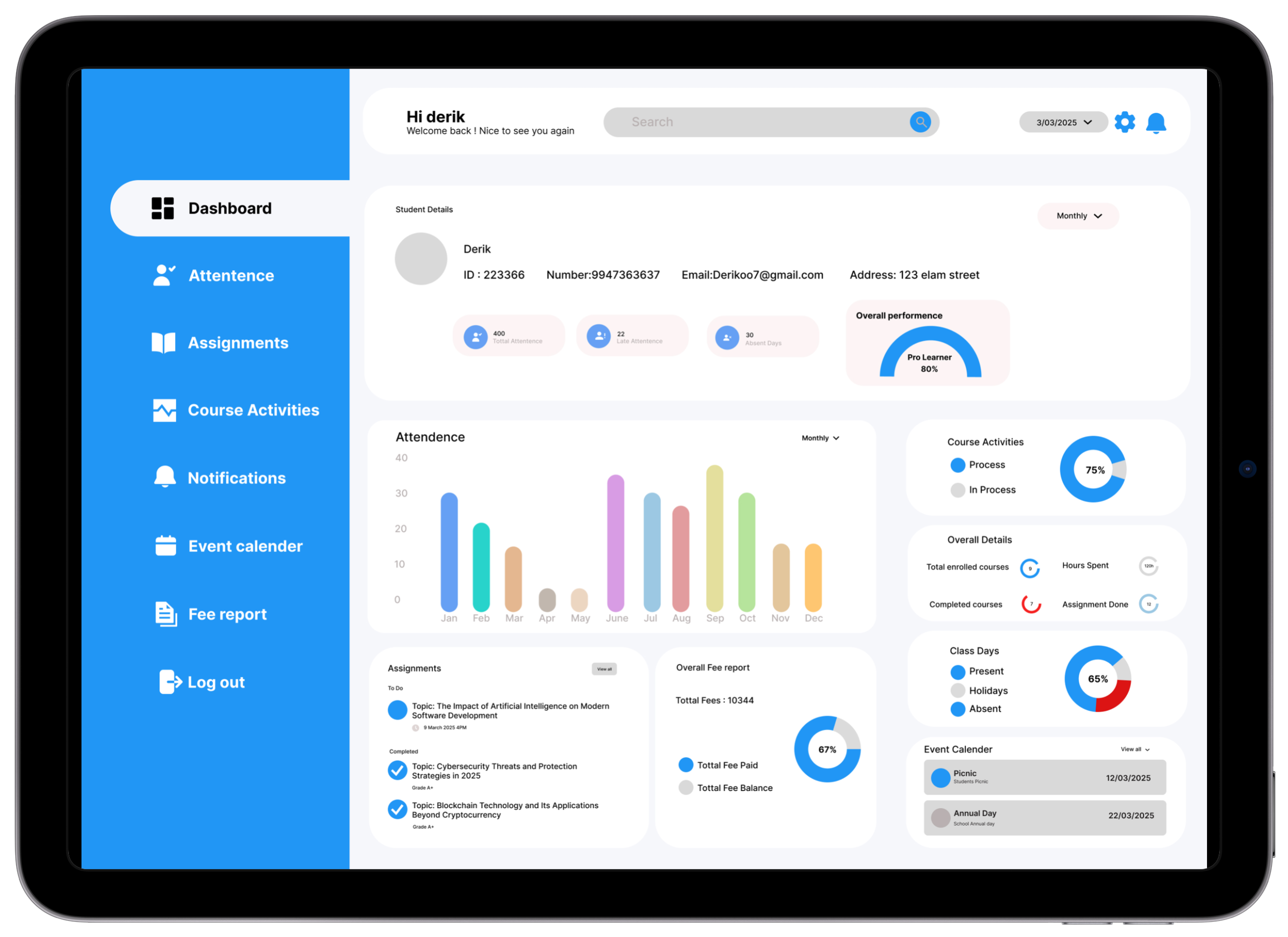
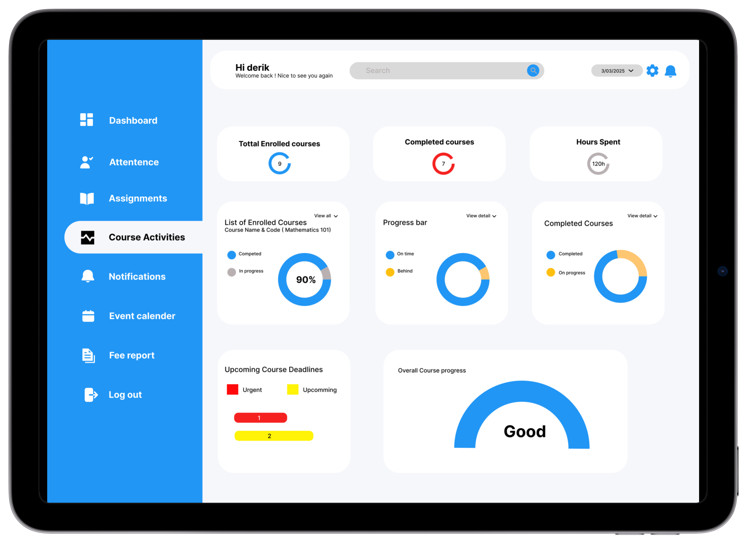
Home Dashboard
Sidebar nav + KPI row + primary chart area. Category grid appeared first — problem discovered in testing.
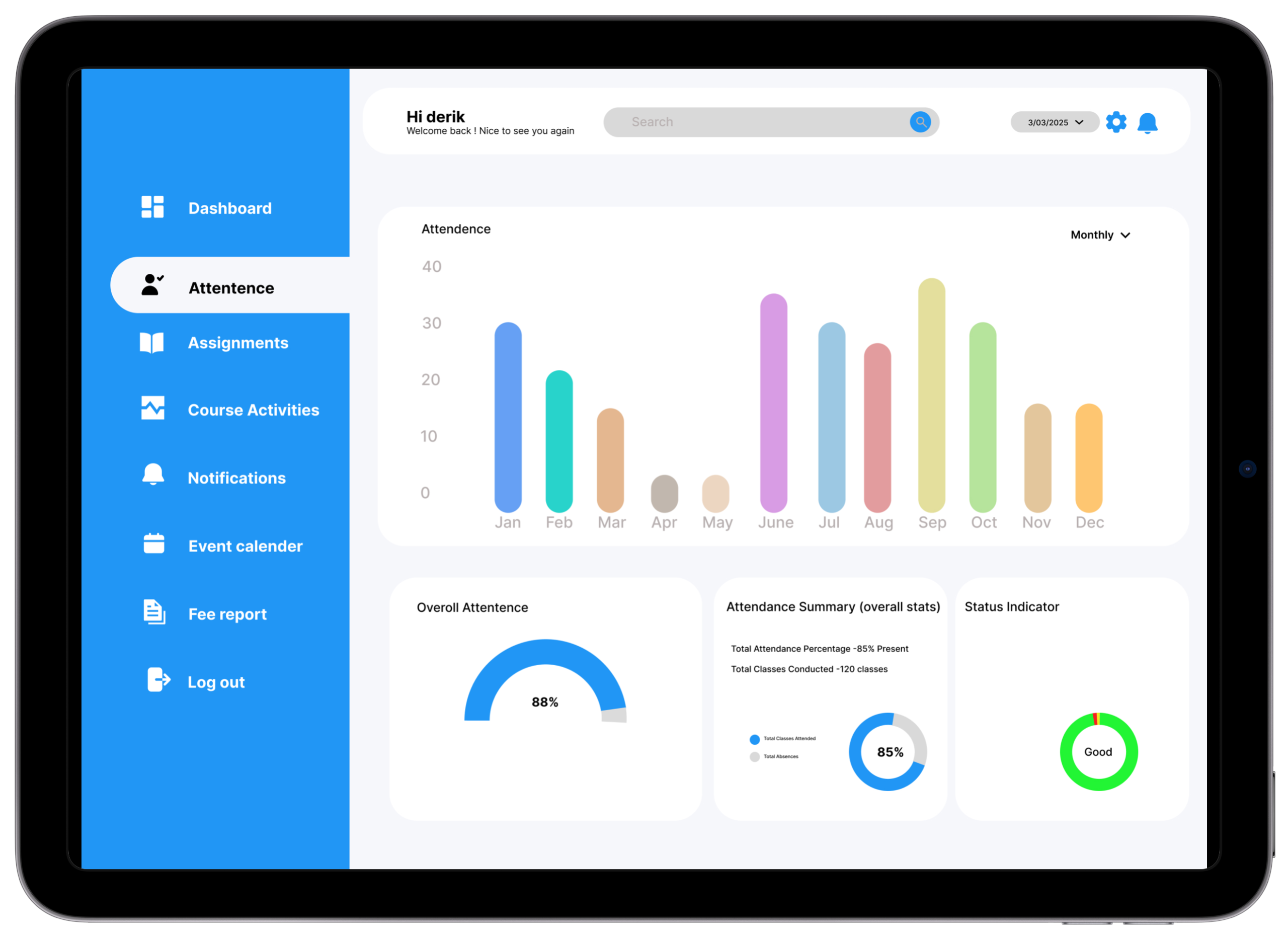
Attendance View
Donut chart + subject-wise list. Visual-first hierarchy locked in wireframe — validated in testing.
Refined Layout — Priority Banner Added
Priority banner moved to top (red bar above fold). Primary chart left, quick-access panel right.
V1 testing revealed students scanned cards in an F-pattern and spent disproportionate time searching for "what's due today." V2 elevated the upcoming deadline widget to the top-right primary position. Time to locate the highest-urgency item dropped from 38 seconds to 21 seconds across 4 participants.
Blueprint validated. The design system was then built to codify every visual decision. Here is the visual system.
Visual Language
A clean, light-mode system built entirely on Inter — chosen for its exceptional legibility at small sizes, critical for a dashboard where students are reading grades, attendance figures, and deadlines at a glance. Every color token is semantically assigned.
🎨 Color Palette
Aa Typography — Inter
📐 Spacing Scale
🧩 Components
ButtonsSystem established. The key design decisions that defined the product are documented next. Here are the choices that made the dashboard what it is.
Six Choices That Define the Dashboard
Each decision below was made in response to a specific research finding or testing observation. None are defaults — every one of them required a rejected alternative.
Decisions justified. Now the screens themselves — six final high-fidelity views. Here is the final product.
The UI Highlights
Six core screens — each answering one of the three design principle questions at a glance. Blue sidebar provides consistent orientation; white cards give content space to breathe.
Core Solutions
Attendance Tracker
Monitor daily and subject-wise attendance with colour-coded progress bars. At-risk warnings trigger automatically when attendance dips below the threshold.
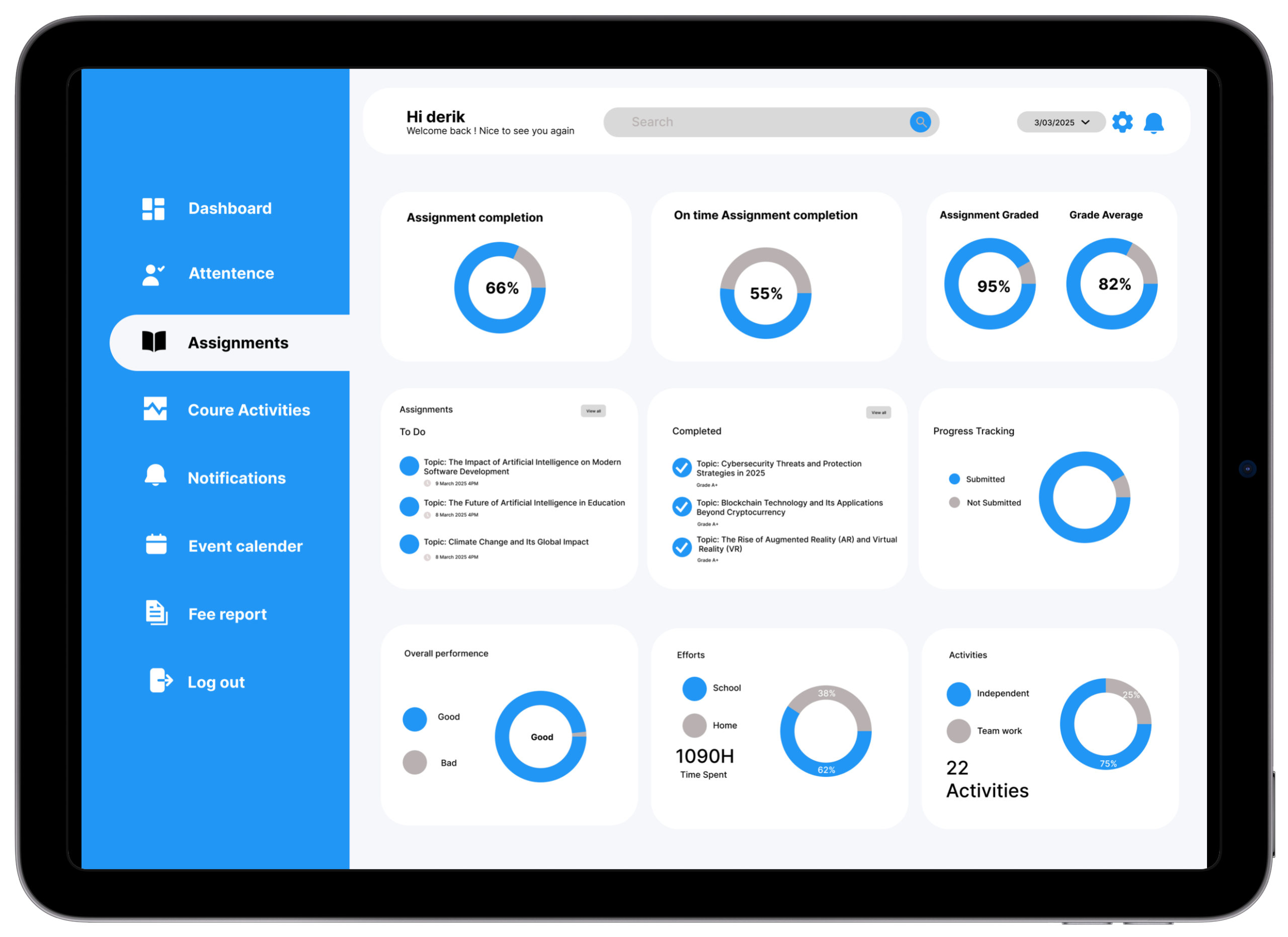
Research basis: 7/8 students didn't know their attendance percentage until too late — most frequently requested feature across all 8 interviews.Assignment Tracker
Stay ahead of every deadline with countdown chips, priority colours, and subject tags. Urgency readable in under 2 seconds without date calculation.
Research basis: 63% of students surveyed missed a deadline last semester. 5/8 interview participants relied on WhatsApp messages for deadline awareness.Performance Summary
Trend lines and trajectory badges show whether grades are improving or declining — students spot downward trends before they become academic crises.
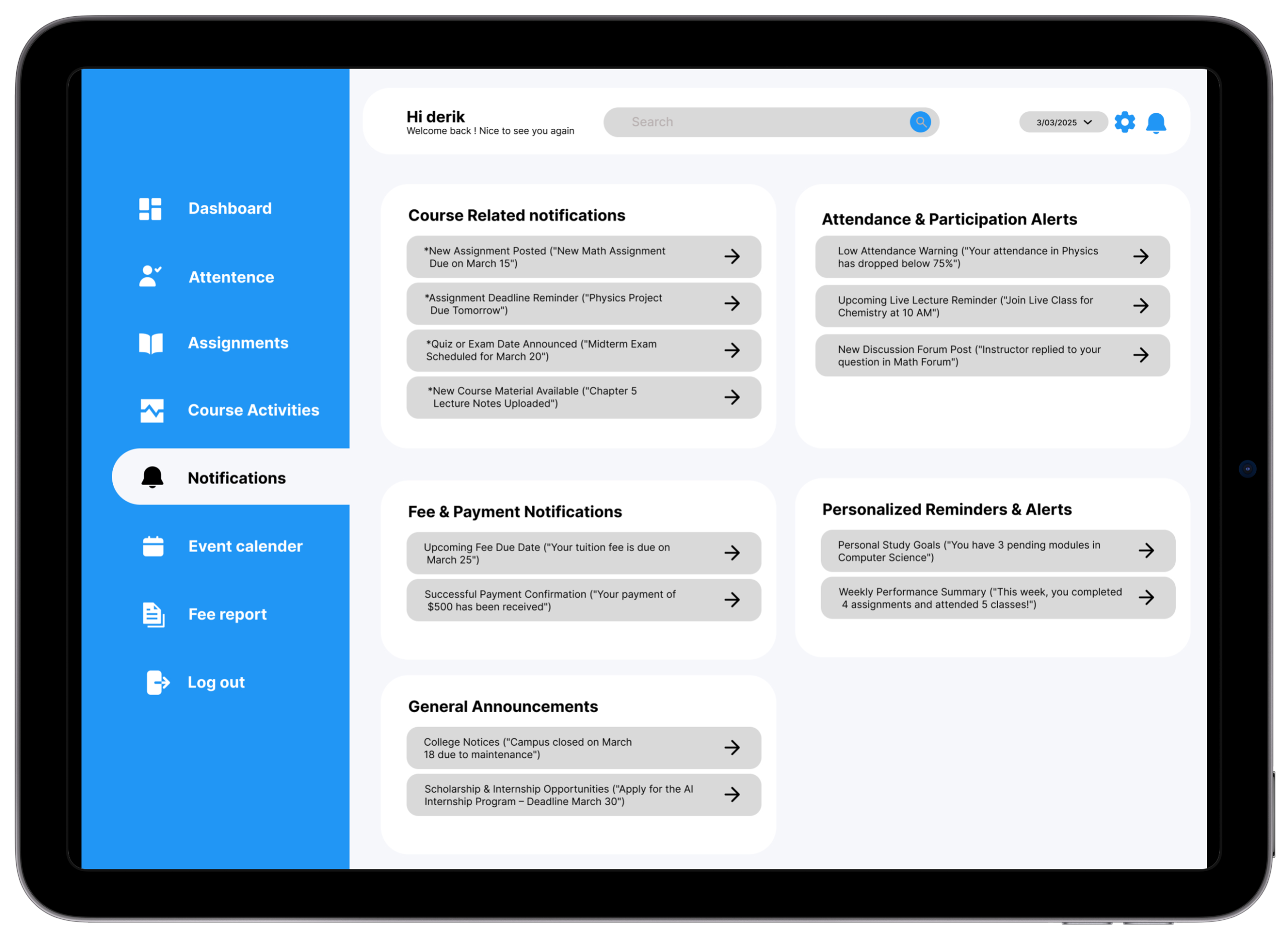
Research basis: 7/8 participants said they only discovered grade issues at semester-end. Real-time trend visibility was the direct design response.Notifications & Updates
Sorted by priority: Urgent, Academic, General. Critical academic alerts always surface first — system announcements cannot bury deadline reminders.
Research basis: Students reported using WhatsApp group chats as their primary deadline alert system — an unofficial workaround that fails under exam-season pressure.Responsive UI Design
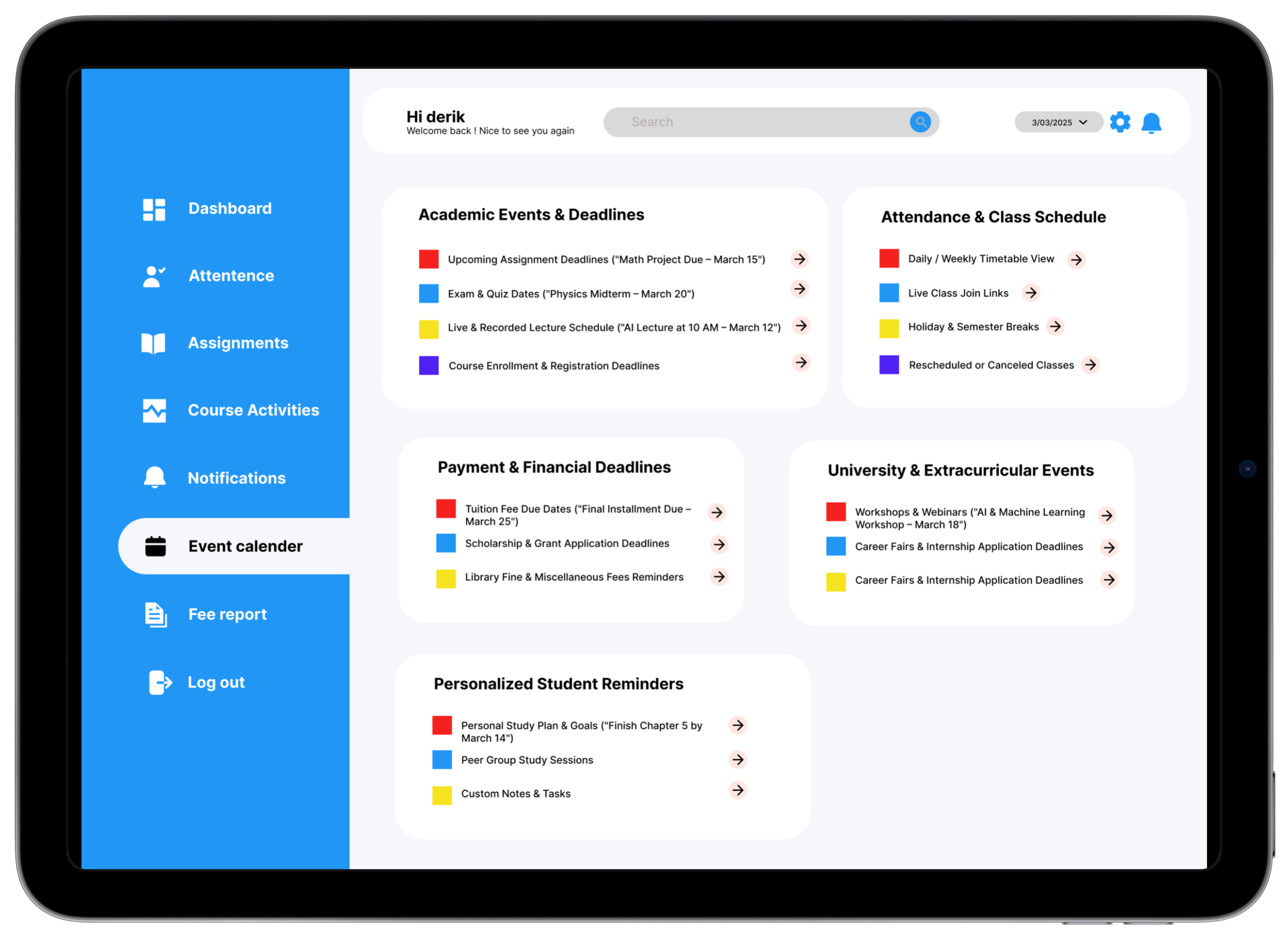
Clean, accessible layouts optimized for both desktop and mobile — so students can check in during class, on commute, or anywhere without switching contexts.
Research basis: Journey mapping revealed students need deadline access during class (they currently use notebooks as workarounds).Personalized User Panel
Profile hub with quick links to tools most relevant to the individual student. Priority ordering adjustable based on usage patterns.
Research basis: Different users have different primary needs — customizable panels ensure the most-needed information surfaces without manual navigation.Before → After
Before
Attendance data shown as raw percentage numbers in a table — no visual context for what's good or bad.
Algorithms: 85%
OS: 44%
✓ Algorithms 85% On track
After
Color-coded progress bars with status badges make standing immediately clear. At-risk threshold (75%) marked visually on every bar.
Before
Deadlines listed by submission date only — no urgency or remaining time context.
Lab Report: 21 March
🟡 Lab Report · Due in 6 days
After
Deadline cards show a countdown chip ("Due in 2 days"), priority colour, and subject tag — urgency readable in under 2 seconds.
Before
Performance data showed only raw grades — students couldn't see if they were improving or declining.
Identified in V1 testing — participants couldn't answer "are you improving?" without significant hesitation.After
Line chart with trend arrows and a percentage-change badge shows trajectory — "↑ 12% vs last semester" is far more motivating than a static grade.
Before
Notifications were chronological — a system announcement buried a deadline reminder that arrived 3 days earlier.
Identified through research — students reported missing deadline reminders buried under admin announcements.After
Notifications sorted by priority type: Urgent, Academic, and General — critical academic alerts always surfaced first.
The Impact
Academic Clarity
Students with real-time visibility into performance are more likely to seek academic support before the end of term — earlier intervention before small issues become failing grades.
Reduced Anxiety
Testing feedback consistently noted the design "felt calm" and "not overwhelming" — a direct result of prioritizing hierarchy and white space over feature density. Calm is a feature.
Time Savings
Centralizing 4+ platforms into one reduced task completion time by 45% vs the multi-platform baseline. Estimated 15–25 minutes of daily academic admin time reclaimed.
"This is literally everything I've been looking for. I didn't realize how much time I was losing every morning until I used this dashboard and realized I'd found what I needed in 30 seconds."
— Test Participant 03 · Year 2 Engineering · Bengaluru · Usability Session, March 2025
What I Took Away
Consolidation IS the Feature
Students didn't need more features — they needed fewer platforms. The most impactful design decision was architectural: building one unified entry point, not a better version of something that already existed.
Context Turns Data Into Action
"72% attendance" is inert. "72% — 3 below the minimum required. Attend your next 2 classes to get back on track" is a call to action. Every number needs a frame.
F-Pattern Scans Decide Layouts
User testing confirmed F-pattern scanning on every screen. V1 placed a category grid first. V2 moved the priority banner to top-left. Time-to-urgent-item dropped from 38 to 21 seconds.
Anxiety Is an Intensity Problem
Same "At Risk" badge on a light background vs a deep red card. The first felt "like a helpful warning." The second: "like I was being punished." Colour intensity is an anxiety dial — calibrate it deliberately.
Colour Before Hierarchy Costs Iterations
V1 had the blue sidebar colour before hierarchy was validated. V2 was done in greyscale until hierarchy was confirmed — and took half the iterations to finalise. Structure first. Style second. Always.
Colour Communicates Status — or It's Just Decoration
In V1, 87%, 72%, and 45% appeared in identical black text — 14 seconds to identify at-risk subject. In V2, 72% appeared in amber with a badge — spotted in under 2 seconds. Colour didn't decorate the data. It was the data.
Future Roadmap
Want to see the full prototype?
Explore the interactive Figma prototype or get in touch to discuss this project in more detail.