Built around the viewer's clock — not the platform's engagement metrics
The World Before
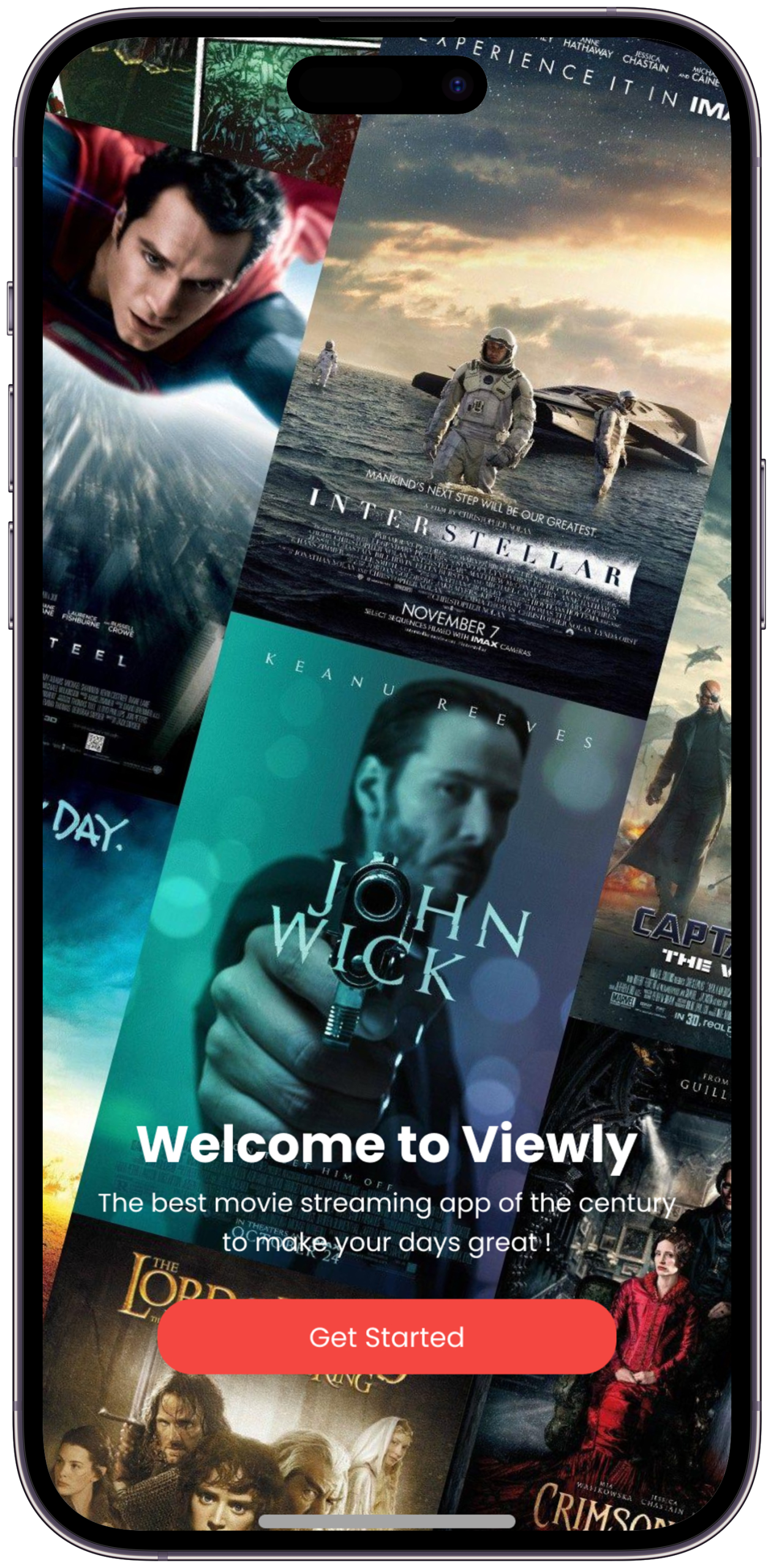
Every design story starts with a person, a moment, and a feeling they couldn't ignore. This one started with a thumb — scrolling endlessly, finding nothing. Viewly was built to answer one question: why does discovering great video feel harder than it should?
What is Viewly?
A smarter way to discover and watch video content — without the noise
Viewly is an AI-powered short-form and long-form video discovery app designed to cut through content overload. Instead of serving an endless, anxiety-inducing scroll, Viewly was designed to learn what you genuinely love — and surface only that. No clickbait. No noise. Just content that earns your attention.
Built for the generation that is tired of being manipulated by feeds, Viewly reimagines video consumption as an intentional, curated experience. The product puts the viewer back in control — of their taste, their time, and their feed.
"I opened YouTube at 8 PM to watch one video. It's midnight. I'm watching a stranger's apartment tour. I didn't choose this. I don't even want this."
What was broken
Every major streaming platform optimises for time-on-app — not viewer satisfaction. These are two very different things.
Modern video apps are built to trap, not serve. The algorithm learns what keeps you watching — not what makes you feel good afterward.
Understanding the Viewer
Before a single wireframe existed, the work was listening. Not to trends. Not to competitors. To the person who opens a video app at the end of a long day — hoping to be rewarded for it.
Listening Before Designing
14 research participants across diary studies, interviews, and competitive analysis — understanding how people actually experience video, not how platforms assume they do
I don't even remember opening Instagram. I just look up and it's been 45 minutes. There's no moment where I decided to do that.
The recommendations used to feel exciting. Now they feel like the algorithm is trying to keep me dumb. I want something that respects me.
I just want to watch something good for 20 minutes and feel like it was worth it. That's it. Why is that so hard to find?
Meeting the User
Research data becomes design direction only when you put a human face on it. Meet Rahul — the person Viewly was designed for. He is not an edge case. He is the mainstream.
Rahul, The Conscious Viewer
A composite persona built from 14 research participants — representing the user Viewly must delight, retain, and empower
Rahul watches video content every day — but increasingly feels like the platforms are watching him back. He values his time, curates his reading list carefully, and is frustrated that the same intentionality doesn't exist for video.
Inside Rahul's Head
What he thinks, feels, says and does — and where the most design-critical pain lives
The Before Journey
Mapped from 7-day diary study observations and interview synthesis across 14 participants — the moments of highest friction in Rahul's daily video experience
| Stage | What Rahul Does | What He Feels | Pain Points | Opportunity |
|---|---|---|---|---|
| Opening the App | Unlocks phone, taps video app with no specific content in mind | Mild anticipation, slight dread of the noise ahead | ↓ Immediately flooded by autoplay noise with no way to set intent | ↑ A calm, intentional entry state with time + mood input |
| Discovery | Scrolls through feed, opening and abandoning videos within seconds | Frustration, decision fatigue rapidly building | ↓ No quality signal, same-type content, no time estimate | ↑ Curated queue with total watch time shown upfront |
| Watching | Settles on a video but autoplay fires before he's finished | Partial engagement, never quite present | ↓ Autoplay drags him somewhere he didn't choose | ↑ Focus Mode — autoplay requires a deliberate tap |
| Post-Watch | Checks the clock, realises it's been 90 minutes, closes the app immediately out of guilt | Guilt, time-wasted feeling, mild self-reproach | ↓ No signal that time was well spent — no session closure moment | ↑ Session summary — time spent, quality score, what was worth it |
| Feedback | Never visits settings, has never rated a single video, gives up on fixing the feed | Resignation and growing distrust of the platform | ↓ The only way to fix the algorithm is to watch more bad content | ↑ One-tap post-watch rating that visibly improves the feed in real time |
Viewers don't hate watching video. They hate the feeling of having lost control. Viewly's job is not to compete on content volume — it's to be the only platform that makes every minute feel intentional. The design challenge is not discovery. It's trust.
Designing the Answer
Armed with research, a clear persona, and a sharp insight — the design process began. Not with screens. With principles. What should every interaction feel like? What should the app never do?
Four Phases, One Direction
A structured design process from insight to interface — each phase building on the one before it
The Solution
The solution was not a feature. It was a philosophy. Viewly would be the first video app designed around the viewer's clock, not the platform's engagement metrics. Here's how that translated into product.
Designed Around Your Time
Every feature in Viewly is a direct response to a specific frustration uncovered in research
"The design brief we set at the start: what if every session ended with the user thinking 'that was exactly what I needed' — and nothing more?"
The Screens Come Alive
Every screen in Viewly is a chapter in Rahul's story. These aren't just screens. They're proof that design can give time back to people.
Six screens, one mission
Each feature is a surgical answer to a real frustration — not a feature added for feature's sake
Screens that respect you
Six core views — each tied to a specific moment in Rahul's journey and a user need uncovered in research
An immersive full-screen content preview during onboarding — showing users the quality of content they can expect. Genre preferences, mood inputs, and time habits collected across a short visual flow before a single recommendation is served.
Rahul: "I want something that earns trust before asking me to use it." — Onboarding establishes the Viewly promise before a single video is watched. Design decision: Early version opened with a preference form before showing any content. Testing showed users felt "interrogated." Reversed it — show a content preview first, collect preferences second. Trust increased immediately.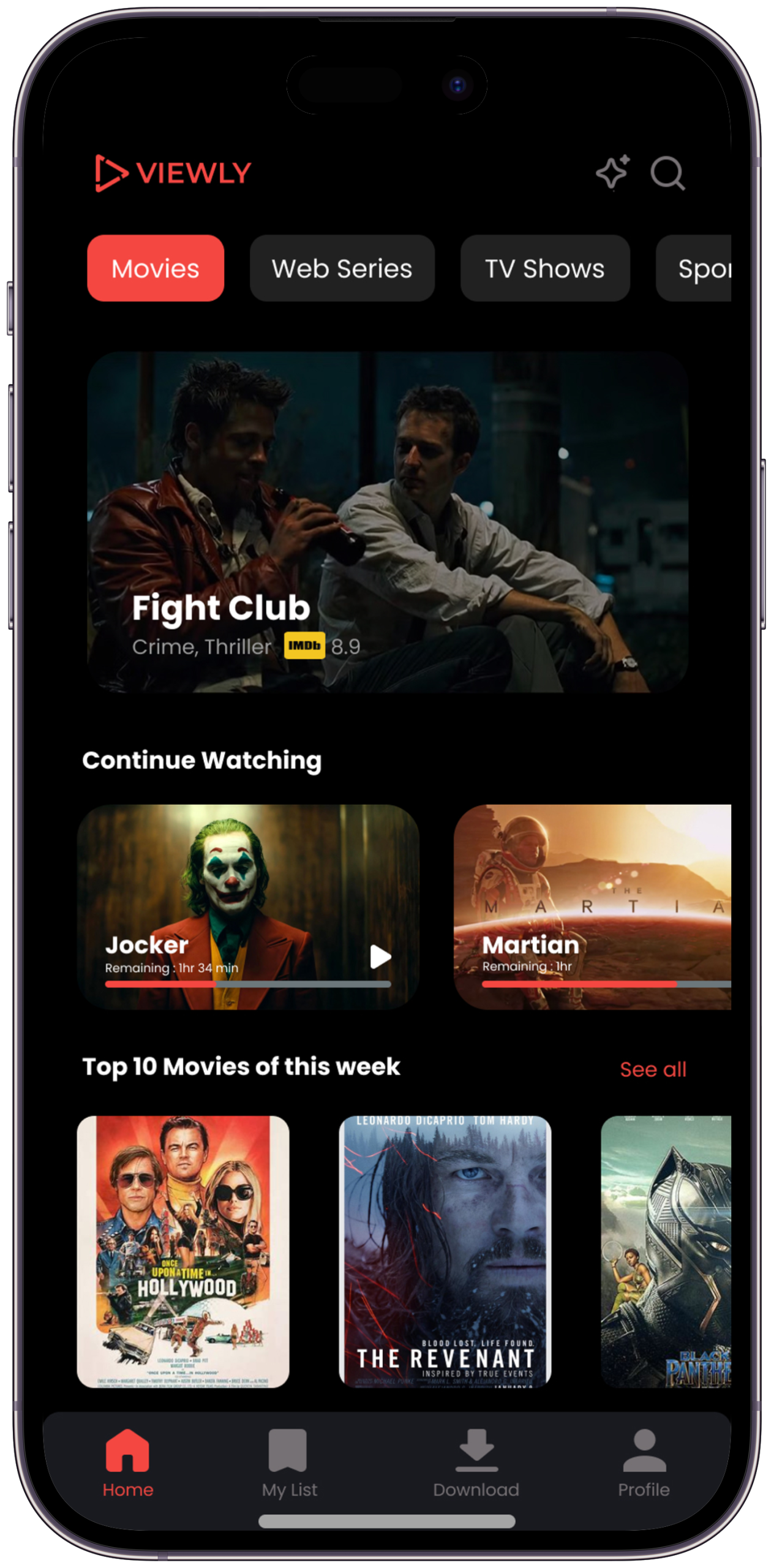
The Viewly home screen with category tabs — Movies, Web Series, TV Shows, Sports — and AI-curated content carousels below. The header keeps the interface purposeful rather than overwhelming.
Rahul: "Show me the best 30 minutes of content" — this screen is built entirely around that ask. Design decision: Total queue time displayed above the list was the single most impactful change in the project. 6/6 participants described feeling "in control" when they saw it — vs "overwhelmed" with the infinite scroll version.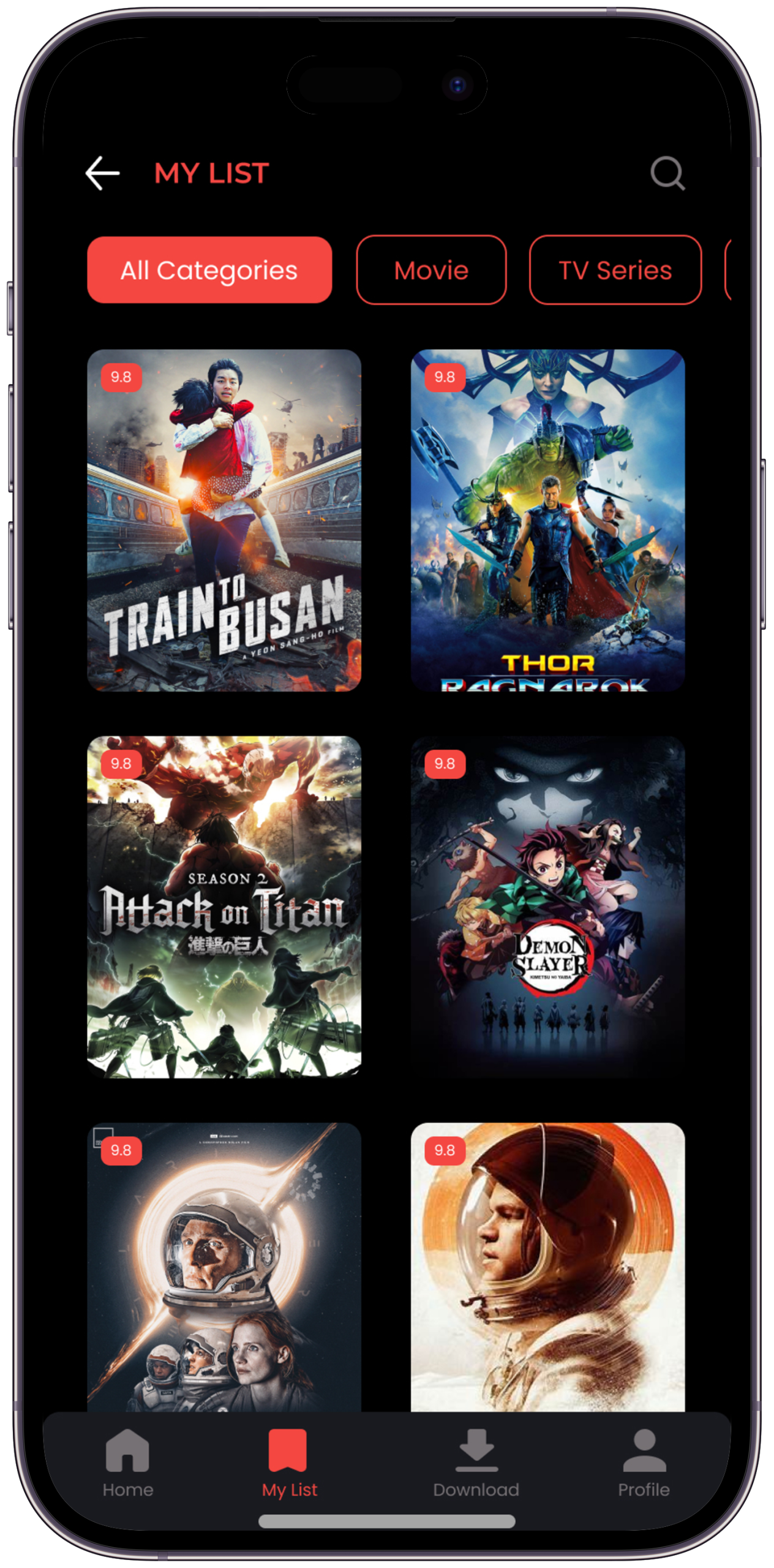
The My List screen with category filter pills — All Categories, Movie, TV Series — letting users quickly switch context. Content cards show rating badges in the corner, giving instant quality signals. Clean back navigation keeps the interface frictionless.
Rahul: "I've saved hundreds of videos. The list just gets longer and more overwhelming." — this screen makes that list usable. Design decision: Research showed saved lists were a major pain point — content was added but never revisited. Adding category filters and quality ratings transformed the list from an archive into an active queue.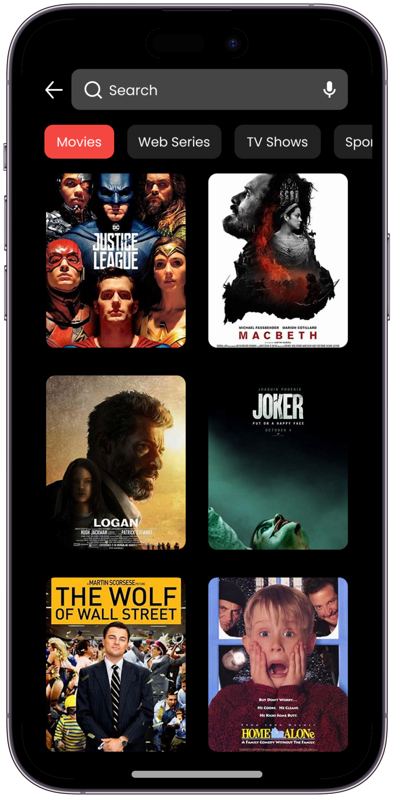
Full-screen immersive playback with distraction-free UI — all recommendations and up-next prompts hidden by default. Playback controls appear only on tap. Autoplay requires a conscious choice — the viewer stays in full control.
Rahul: "I settle on a video but get dragged somewhere I didn't choose." — Focus Mode breaks that pattern entirely. Design decision: Started with full controls visible — 5/6 usability participants felt distracted. Made Focus Mode the default with all elements hidden. 6/6 immediately preferred it. "That's how it should always work."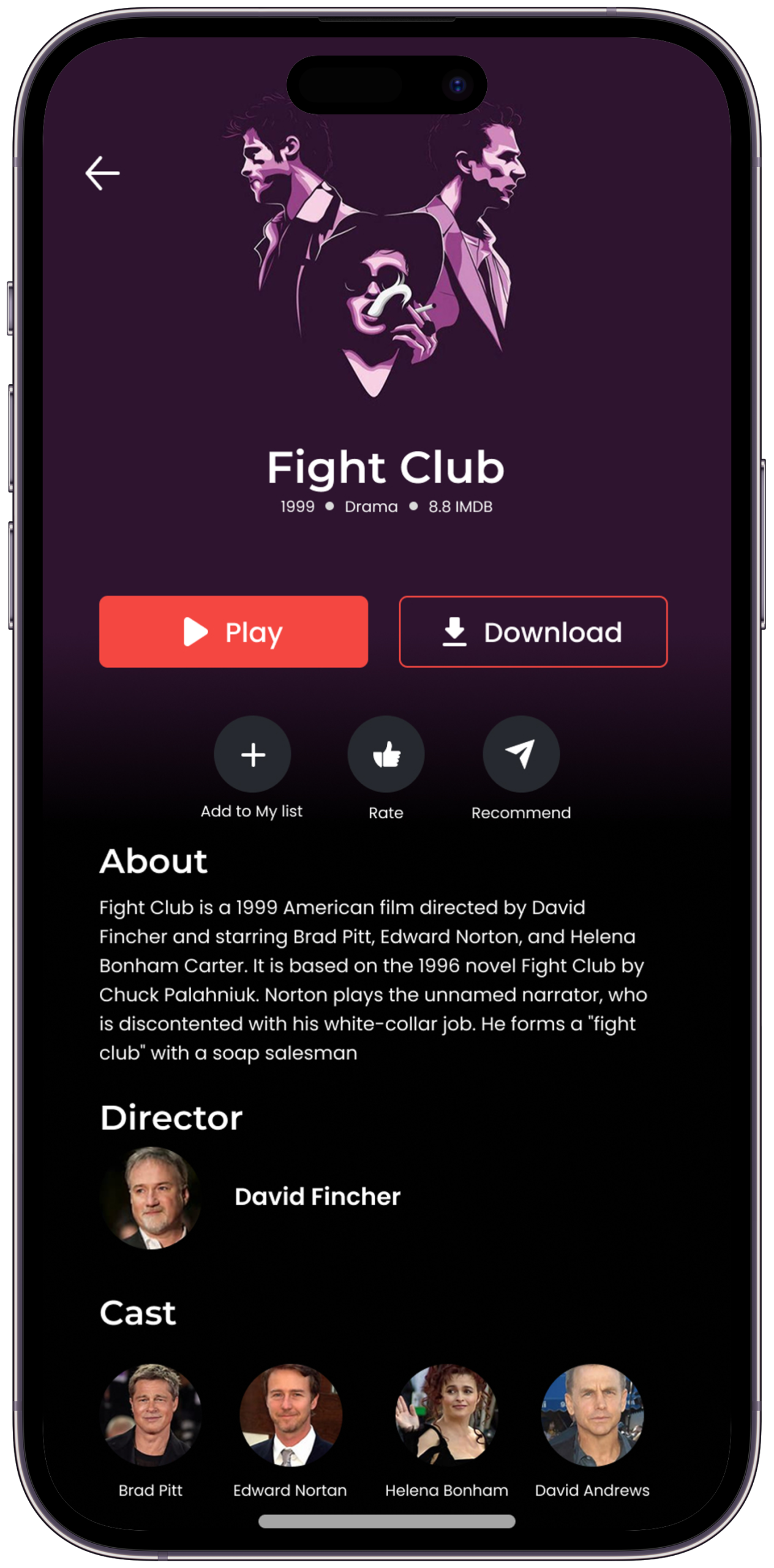
Saved favourites and in-progress content in a clean, scannable layout sorted by recency. Each card shows rating and progress at a glance. The most relevant content always surfaces first, making it effortless to pick up where you left off.
Rahul: "I want to pick up exactly where I left off — without scrolling through everything I've ever saved." Design decision: Added a "Continue Watching" section pinned above saved items — testing showed users always looked there first. Separating active sessions from passive saves reduced time-to-resume significantly.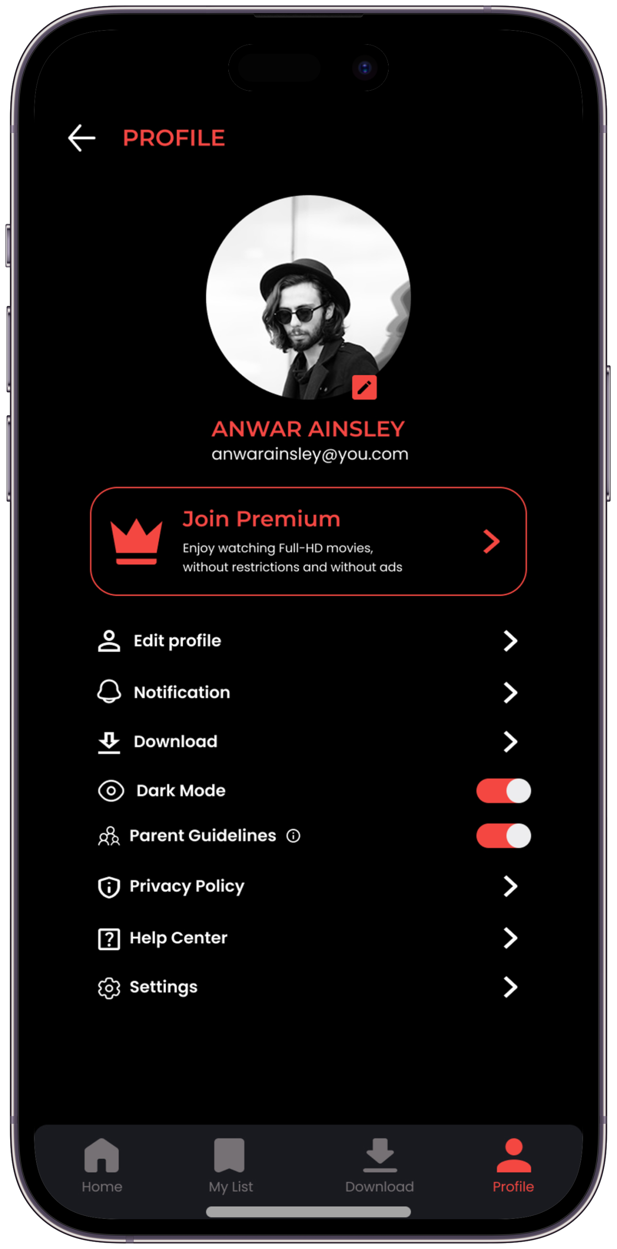
A weekly digest of total watch time, top-rated content, genre breakdown, and quality score — radical transparency as a design feature. Your watching habits reflected clearly and without judgement, helping you stay intentional about your viewing time.
Rahul: "I want to feel like the time I spent was deliberate — not something that happened to me." — this screen makes that visible. Design decision: The Insights screen was the most contested feature in testing — "will users actually want to see this?" Research said yes: 12/14 said knowing their stats would make them more intentional. Transparency is the motivation mechanism.Logo & Visual Voice
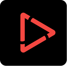
A bold identity built around the signal red play-arrow that says — this one is worth your time
The Viewly logo is built on a simple truth: a play button is the most recognised symbol in digital culture. The triangular outline mark — thick stroked, slightly tilted — communicates instant action, confident taste, and forward motion. The signal red makes it unmissable and memorable across every surface.
 ViewlyViewlyViewly
Every visual decision in Viewly is an editorial statement. The dark backgrounds frame content like a cinema. Signal Red (#ED1E24) is used only where action is possible — a visual language that says "this is what matters". The Poppins typeface gives the brand its bold, modern, geometric confidence.
for every mood.
Colour, Type & Motion
Every visual decision codified — the design language that makes Viewly feel like a single, unmistakable product
Discovery.
to watch — in under 30 seconds."
Curated for your time.
30 MIN · CURATED QUEUE
UI/UX · STREAMING · DISCOVERY
Where does Viewly fit?
Mapping the competitive landscape — how Viewly is positioned against the dominant streaming platforms in India and globally
| Feature / Dimension | Netflix | Amazon Prime | Zee5 | Sony LIV | Viewly ✦ |
|---|---|---|---|---|---|
| Primary Content Type | Long-form originals | Movies + Originals | Hindi + Regional | Sports + Hindi | Short + Long form |
| Discovery Model | ↓ Algorithm-driven | ↓ Algorithm-driven | ↓ Category browse | ↓ Category browse | ↑ AI + Mood-based |
| Time-Aware Viewing | ✗ None | ✗ None | ✗ None | ✗ None | ✓ Core feature |
| Mood-Based Feed | ✗ No | ✗ No | ✗ No | ✗ No | ✓ Yes |
| Transparent Recommendations | ✗ Black box | ✗ Black box | ✗ Black box | ✗ Black box | ✓ Fully visible |
| Focus / Distraction-Free Mode | ✗ No | ✗ No | ✗ No | ✗ No | ✓ Yes |
| Explicit Taste Controls | Partial — thumbs only | ✗ Minimal | ✗ None | ✗ None | ✓ Rich + granular |
| Autoplay Default | ON — opt-out | ON — opt-out | ON — opt-out | ON — opt-out | OFF — opt-in |
| Viewing Insights | ✗ Not shown | ✗ Not shown | ✗ Not shown | ✗ Not shown | ✓ Weekly digest |
| Primary Design Goal | Retention | Retention | Engagement | Engagement | Satisfaction |
The World After
Rahul opens Viewly. He has 25 minutes. He tells it. He tells it he's tired. The queue appears — five videos, 23 minutes total, every one chosen because of his taste. He watches two. He closes the app. He feels good about it.
Numbers that validated the design.
From 6 moderated usability sessions on the Figma prototype — design validation results, not live product metrics
"I opened Viewly with 30 minutes. I watched exactly what I wanted. I closed it feeling like I'd given myself a gift — not lost time I'll never get back."
What this project taught me
How Viewly changed the way I think about digital design — and what I'd carry into every project after this
AI-powered personal finance app — a research-first design story about giving people control of their money.
Let's work together.
Available for freelance projects, full-time roles, and meaningful collaborations. Research-first thinking, bold visual execution, and a genuine love for solving real human problems through design.