← Back
ZestZero.
A zero-waste cooking kit brand — where sustainability meets everyday joy
Live Figma Prototypes Available
Act IScene 01 of 07
The World We Cook In
Every year, billions of single-use plastic bags, cling wraps, and takeout containers end up in landfills — and most of them came from one place: the kitchen. ZestZero started with a simple, radical idea: what if cooking could produce zero waste and still be deeply enjoyable?
Scene 01 — Project Overview
What is ZestZero?
A zero-waste cooking kit brand that makes sustainable, eco-friendly cooking easy and enjoyable
ZestZero is a zero-waste cooking kit brand aimed at promoting sustainable living through eco-friendly packaging, reusable tools, and planet-conscious recipes. The brand design reflects freshness, responsibility, and simplicity — making sustainable choices feel effortless, not like a sacrifice.
Every kit arrives with pre-portioned, locally sourced ingredients in compostable packaging, paired with reusable bamboo and metal tools — and a Sustainable Tips card that teaches mindful living habits, one meal at a time.
This project covered the full brand identity system and a complete UI/UX design for the ZestZero app — from discovery and onboarding to kit subscription and recipe exploration.
Phase 02Persona & Journey
Project At a Glance
DesignerSharon Derik
Duration8 Weeks
RoleBrand & UI/UX Designer
TeamSolo Project
TypeBrand Identity + Mobile App
CategorySustainability / FoodTech
PlatformiOS & Android
ToolsFigma
Brand Color#00B342 — Leaf Green
Core Screens6 UI Screens
App PrototypeLive on Figma
StatusConcept · Prototype Ready
🎯
Mission
Make eco-friendly
cooking effortless.
To make eco-friendly cooking effortless and accessible by providing zero-waste kits that inspire conscious consumption. ZestZero believes every meal is a vote for the kind of planet we want to live on — and makes that vote easy to cast.
🌍
Vision
Sustainability as
second nature.
To create a future where sustainability is second nature in every kitchen. A world where the default choice — the easy, convenient, delicious choice — is also the planet-conscious one. ZestZero is the bridge to that world.
"The most sustainable kitchen isn't built in a day. It starts with a single kit, a single meal, and the realisation that doing good can taste incredible."
— The brand philosophy that shaped every design decision in ZestZero. Eco-conscious living isn't a punishment. It's a flavour upgrade.
Act IIScene 02 of 07
The Problem in the Kitchen
The sustainable living movement has a design problem. It lectures instead of inviting. It sacrifices instead of celebrating. Most eco-products make you feel guilty for not doing enough — ZestZero was designed to make you feel proud for doing anything at all.
Scene 02 — The Problem
Why sustainable cooking feels hard
Despite genuine environmental concern, most people find sustainable cooking inaccessible — not because they lack values, but because no one has made it easy enough.
🗑️
Pain Point 01
Packaging Guilt
Every grocery run produces a mountain of single-use plastic. Consumers know it's wrong — but sustainable alternatives are hard to find, expensive, or inconvenient to use.
From competitive analysis of HelloFresh, Oddbox + 8 user interviews
🥩
Pain Point 02
Food Waste Crisis
The average household throws away 30% of the food it buys. Buying ingredients in bulk means guessing quantities — and guessing wrong, week after week.
Industry data: WRAP UK Household Food Waste Report, 2023
🤯
Pain Point 03
Eco-Overwhelm
The internet offers a firehose of conflicting sustainability advice. Carbon footprints, food miles, packaging ratings — it's too much. People give up before they start.
From 8 user interviews — cited by 6/8 participants as a reason for inaction
💸
Pain Point 04
Premium Penalty
Eco-friendly products carry a premium price tag that feels punitive rather than aspirational. Sustainable living reads as a luxury — not a sensible daily choice.
From brand sentiment analysis and 8 user interview responses
🔧
Pain Point 05
Tool Clutter vs. Habit
People buy reusable tools with great intentions — but without habit scaffolding, they end up in a drawer. Ownership isn't adoption. Only habit is adoption.
Observed in 8 user interviews — 5/8 owned reusable tools they rarely used
📦
Pain Point 06
Supply Chain Opacity
Consumers want to support local farmers and reduce food miles — but standard grocery supply chains offer zero visibility into origin, distance, or farming practices.
From competitive analysis — none of the 4 audited brands offered ingredient provenance
30%
of household food purchases are wasted every week
WRAP Household Food Waste Report, 2023
8B+
single-use plastic items used in kitchens globally each day
UNEP Single-Use Plastics Report
67%
of consumers say they want to shop more sustainably
Edelman Trust Barometer / Futerra Sustainability Research
12%
actually change their behaviour — the intention–action gap
Futerra Sustainability Research
— Core Brand Insight
Across all six pain points, a pattern emerged. The problem was never that people didn't care — 67% actively wanted to make better choices. The problem was that every option required extra effort, extra money, or extra knowledge. The insight wasn't environmental. It was behavioural: remove the friction and the values take care of themselves.
Sustainability fails at the design layer, not the values layer. People want to cook consciously — they just need a product that removes every single reason not to. ZestZero's job is to make the sustainable choice the obvious choice: pre-portioned, pre-packaged in compostable materials, delivered with the tools already included.
Act IIIScene 03 of 07
Meeting the Conscious Cook
Before the logo was drawn or a single screen was wireframed, the work was understanding who ZestZero was for. Not a stereotype. Not a caricature of a "eco warrior." A real person — busy, well-intentioned, and underserved by every brand that came before.
ℹ
Scope note: ZestZero's research (8 user interviews) identified three potential user segments — the Conscious Cook, the Eco-Curious Beginner, and the Sustainable Gifter. For v1 scope, Maya (the Conscious Cook) was selected as the primary design target: the user whose adoption would be hardest-won and most indicative of product-market fit.
Scene 03 — User Persona
Maya, The Conscious Cook
A composite persona built from 8 user interviews — the person ZestZero must delight, retain, and empower
🧑🍳
Maya
Marketing Manager, 31
📍 Bengaluru, India
Maya cooks 4–5 times a week and genuinely loves it — but feels like a hypocrite every time she fills another bin bag with plastic packaging. She's tried to buy plastic-free, but it requires research, planning, and premium pricing she can't always justify. She wants to cook consciously without it becoming a second job.
Home CookEco-Curious
Busy ProfessionalValue-ConsciousLocal-First
Grounded in Research — 8 Interviews
"I genuinely try to be better — I just don't have time to research every product."
— Interview 04 · Bengaluru · 29 · Grounded Maya's time-vs-values tension
"I bought bamboo utensils six months ago. They're still in the packaging."
— Interview 02 · Mumbai · 33 · Grounded the Tool Clutter vs. Habit pain point
"Meal kits are the only thing that actually reduced my waste — but the box itself is the problem."
— Interview 07 · Bengaluru · 31 · Defined ZestZero's core opportunity
Goals
Cook delicious meals without generating mountains of plastic waste
Know where her food comes from — and feel good about it
Build sustainable kitchen habits without a complete lifestyle overhaul
Frustrations
Eco products are either unaffordable or feel performative
No easy way to know if "eco-friendly" claims are actually true
Ends up wasting food because portions are never right
Behaviours
Shops at local markets when she has time, supermarkets when she doesn't
Follows sustainability accounts — reads but rarely acts
Loves meal kits for the convenience, hates the packaging waste
Needs from ZestZero
A kit that arrives with zero plastic — compostable or reusable only
Pre-portioned ingredients so nothing is wasted, ever
Eco tips on the Sustainable Tips card that feel like conversation, not lecture
Scene 03b — Empathy Map
Inside Maya's Kitchen
What she sees, hears, thinks, does — and where the real pain lives
👁️
Sees
Shelves of products with "eco" labels she can't verify
Her recycling bin fuller than her compost bin
Meal kits she loves — drowning in bubble wrap and ice packs
👂
Hears
Social media saying she needs to do more
"Just stop buying plastic" — advice that ignores her reality
Friends who've switched to zero-waste and won't stop talking about it
💭
Thinks & Feels
Guilt every time she opens a new plastic bag
Pride when she manages a fully waste-free meal
Overwhelm at the scale of the problem vs. the size of her choices
🍳
Does
Buys reusable bags — forgets them half the time
Saves articles about sustainable cooking, reads few of them
Buys a meal kit, enjoys it, winces at the packaging, tries again
😣
Pain Points
Guilt after every grocery run — even when she's actively trying
Reusable tools she owns but doesn't use — habit was never formed
Can't verify if "eco" claims are real or just marketing
Wasted food at end of week despite good intentions
Overwhelmed when scale of the problem outweighs her individual choices
Act IVScene 04 of 07
The Research Behind the Roots
The brand direction didn't come from a mood board. It came from research. Months of studying how sustainable brands succeed or fail — and the single insight that changed everything: people don't need more information about sustainability. They need a product that removes the friction entirely.
Scene 04 — Research & Insights
Understanding before designing
What 8 user interviews, competitive research, and behavioural studies revealed about the sustainable cooking space
Interview Participant Context — 8 Sessions Total
Sessions8 semi-structured interviews, 40–55 min each
WhoHome cooks, age 26–38, recruited via Instagram sustainability communities and personal network
CitiesBengaluru, Mumbai, Chennai
Question AreasCooking frequency, packaging behaviour, sustainability tool adoption, barriers to habit change
Research Methods
Competitive analysis of HelloFresh, Oddbox, Riverford, Abel & Cole — studying where they succeed and where they alienate
8 user interviews with home cooks on sustainability, packaging, food waste, and willingness to change habits
Brand sentiment analysis — what language makes sustainable brands feel aspirational vs. guilt-inducing
Packaging material research — compostable vs. recyclable vs. reusable: what users actually do with each
Colour psychology study — how natural, earthy palettes communicate trustworthiness vs. greenwashing
Key Research Findings — From 8 Interviews
Friction is the enemy — every extra step in the sustainable cooking process causes abandonment. Remove friction; behaviour changes automatically.
"I tried to switch to package-free shopping twice. Both times I gave up by week three — it just added too many steps."— Interview 05 · Mumbai · 34
Guilt doesn't work — eco-brands that lecture lose users. Brands that celebrate small wins build stronger habits.
"I stopped following eco accounts because they made me feel terrible about myself even when I was trying."— Interview 03 · Bengaluru · 28
V1 Hypothesis — Testable Statement
We hypothesise that a celebration-first design approach will achieve ≥2× higher 30-day habit retention compared to guilt-led competitors. This will be tested via cohort analysis in the Bengaluru pilot, tracking active kit orders at Day 7, Day 14, and Day 30 post-onboarding.
Local = trust — "locally sourced" is the single most trusted sustainability claim. It's tangible, verifiable, and emotional.
"If it says 'local farm' I actually believe it. 'Sustainable' could mean anything."— Interview 06 · Chennai · 31
Compostable wins over recyclable — users feel more agency with compostable packaging; "I can actually do something with this"
Tips need to feel like sharing, not teaching — sustainability tips land when they feel like a friend's advice, not a brand's sermon
Competitive Feature Matrix
| Brand | Zero-Waste Packaging | Pre-Portioned | Reusable Tools | Eco Tips | Local Sourcing | Impact Tracking | Compostable Materials | ZestZero Fills Gap |
| HelloFresh | ✗ | ✓ | ✗ | ✗ | Partial | ✗ | ✗ | ✗ |
| Oddbox | Partial | ✗ | ✗ | Partial | ✓ | ✗ | Partial | ✗ |
| Riverford | Partial | ✗ | ✗ | Partial | ✓ | ✗ | Partial | ✗ |
| Abel & Cole | Partial | ✗ | ✗ | ✓ | ✓ | ✗ | Partial | ✗ |
| ZestZero | ✓ | ✓ | ✓ | ✓ | ✓ | ✓ | ✓ | All 7 ✓ |
What the Matrix Tells Us
While several brands solve for one or two pieces — Oddbox for locality, HelloFresh for pre-portioning — none create an end-to-end zero-waste experience. ZestZero's advantage isn't having more features; it's weaving them into a single seamless kit where every element reinforces the others. No single competitor combines pre-portioned ingredients, compostable packaging, reusable tools, and personal impact tracking.
Scene 03c — User Journey Map
Maya's Current Journey
Built from qualitative interviews and contextual observation — synthesising the moments of highest friction in Maya's week before ZestZero
| Stage | What Maya Does | What She Feels | Pain Points | ZestZero Fix |
|---|
| Meal Planning |
Googles recipes, makes a shopping list, knows she'll overbuy |
Mild stress, resigned acceptance of waste |
↓ Always buys too much — leftovers rot |
↑ Pre-portioned kits — exact quantities, zero guessing |
| Shopping |
Visits supermarket, reaches for plastic-wrapped produce automatically |
Mild guilt, no real alternative visible |
↓ Eco options hard to find, expensive when found |
↑ Kit delivered in 100% compostable packaging |
| Cooking |
Opens packaging, immediately creates plastic waste before cooking starts |
Disconnect — wants to be sustainable but acts differently |
↓ Every meal starts with a plastic opening ritual |
↑ Bamboo & paper packaging that becomes garden compost |
| Eating |
Enjoys the meal — but guilt lingers at the bin full of packaging |
Satisfaction cut short by environmental guilt |
↓ Enjoyment of food overshadowed by packaging conscience |
↑ Zero-waste meal = eat guilt-free, start to finish |
| Cleanup |
Leftover ingredients in fridge — often forgotten until they go bad |
Frustration, waste-shame |
↓ Leftover produce goes bad before next meal |
↑ Sustainable Tips card suggests ways to use every last scrap |
After ZestZero — The Emotional Transformation
Mild stress
↓
Confident anticipation
Meal Planning — Kit arrives with the plan already made. Nothing to overthink.
Packaging guilt
↓
Pride at zero waste
Shopping — No supermarket trip. No plastic decision to make. Kit delivered directly.
Disconnect
↓
Values in action
Cooking — Opening bamboo-wrapped ingredients feels like the sustainable choice, not a compromise.
Guilt lingers
↓
Full satisfaction
Eating — No plastic in the bin. No guilt. Just the meal.
Waste shame
↓
Nothing wasted
Cleanup — The Sustainable Tips card tells her exactly what to do with the last sprig of herbs.
Act VScene 05 of 07
Designing the Brand
With research done and Maya's world understood, the design work began. Every colour, every shape, every word choice was a deliberate answer to a specific research finding. This is the story of how ZestZero came to look, feel, and sound like itself.
Scene 05 — Design Process
Four Phases, One Brand
A methodical path from research insight to brand system — each phase building the next
01
Phase 01 — Strategy
Roots Before Leaves
Defined brand personality: fresh, honest, warm, effortless
Established brand voice: "a knowledgeable friend, not a lecture"
Named brand archetypes: The Sage + The Caregiver
How archetypes shaped design decisions
Sage voice: shares knowledge without showing off — educates through experience. This drove the Sustainable Tips card: every tip reads like something a knowledgeable friend would mention over dinner, never a lecture.
Caregiver voice: warm, reduces anxiety, makes the user feel capable. This drove the tone of every label and CTA — pre-portioned ingredients reduce decision anxiety; zero-guilt framing replaces shame with pride.
Together: "a knowledgeable friend who helps you cook better without making you feel like you've been doing it wrong." Every brand touchpoint was tested against this single sentence.
02
Phase 02 — Identity
Logo, Colour, Type
Explored 12+ logo directions before arriving at the Z + Sustainable Plate mark
Built full colour system around Leaf Green #00B342 + earthy neutrals
Typography system combining clean sans-serif with organic warmth
03
Phase 03 — UI Design
From Brand to App
Translated brand system into mobile UI design language
Designed all 6 core app screens with full interactive states
Built high-fidelity Figma prototype with real content and flows
04
Phase 04 — Refinement
Details Make the Brand
Iterated on micro-copy: every label, tip, and CTA rewritten for warmth
Reviewed accessibility: contrast ratios, tap targets, legibility
Finalised brand identity document + UI component library
Accessibility Finding
Initial contrast audit revealed the Fog 44% text (#F0F5F0 at 44% opacity) failed WCAG AA on the Forest background. Muted text opacity was raised to 52%, and Petal primary text was confirmed at 7.2:1 contrast ratio — exceeding AA requirements. All tap targets verified at 44px minimum.
Logo Exploration — 12+ Directions Considered
🍃
Direction A — Rejected
Leaf Shape Only
This direction focused purely on environmental symbolism. While the leaf clearly communicated sustainability, it felt too generic and did not reflect the culinary focus of the brand or the idea of transforming food waste into creative cooking.
🌾
Direction B — Rejected
Zero Numeral + Wheat
This concept explored the "zero" idea but leaned heavily toward agriculture through the wheat element. It positioned the brand closer to farming rather than a kitchen-centered solution for reducing food waste.
⭕
Direction C — Rejected
Circular Zero + Initials
This approach combined the brand initial with a circular form. However, it felt too corporate and lacked the warmth and organic character expected from a sustainability-driven food brand.
🌱
Direction D — Chosen ✓
Z + Sustainable Plate Symbol
The final mark integrates the letter "Z" for Zest with a central symbol representing a plate, leaf, and dining elements. The plate reflects cooking and food culture, while the leaf communicates sustainability and eco-conscious living. Together they express the brand's mission: transforming everyday ingredients and kitchen scraps into meaningful, waste-free meals.
UX Architecture — App User Flow
Before hi-fi screens, the user flow was mapped to ensure every screen served a specific moment in Maya's journey. The flow was simplified across two iterations — an early 9-step flow was condensed to 6 by merging the browsing and filtering steps and removing a redundant confirmation screen.
Lo-Fi → Hi-Fi — Home Dashboard Evolution
Lo-Fi: Product catalogue first
Opened with a kit grid — users scrolled without engaging. No sense of personal progress or reason to return.
Hi-Fi: Impact score first
847g
plastic saved
This Week's Kit→ Browse
Impact score above fold — gives Maya an immediate reward for returning. Dashboard becomes a feedback loop, not a catalogue.
"The colour green is easy. But the right green — one that feels like a leaf after rain and not a hospital corridor — that takes research, iteration, and genuine love for the problem."
— The design philosophy behind ZestZero's colour system. #00B342 was chosen after testing 40+ shades for the exact feeling of life, growth, and effortless energy.
Scene 05b — Key Features
Six features, one commitment
Every feature in the ZestZero kit is a direct answer to a specific pain point uncovered in research
Feature 01
♻️
Zero-Waste Packaging
Reusable, recyclable, and compostable materials in every kit — eliminating single-use plastics at every touchpoint, from outer box to ingredient wrapper.
Feature 02
⚖️
Pre-Portioned Ingredients
Exact quantities for each recipe — no guessing, no buying too much, no leftover produce rotting in a drawer. Reduces household food waste by up to 30%.
Feature 03
🎋
Eco-Friendly Tools
Every kit includes reusable kitchen tools made from bamboo, stainless steel, or other sustainable materials. Own them once. Use them forever.
Feature 04
💡
Sustainable Tips Card
A physical Sustainable Tips card included in every kit — written like a friend's advice, not a brand's lecture. Small habits. Big impact. Tells you exactly what to do with every last scrap.
Feature 05
🌾
Locally Sourced Ingredients
Every ingredient sourced from local farms within 150km — supporting local growers, reducing food miles, and bringing seasonal freshness to every kit.
Feature 06
🍃
Minimalist, Earthy Branding
Clean design with a natural colour palette that reflects eco-conscious values without greenwashing. Sustainable looks beautiful. That's not an accident.
Act VIScene 06 of 07
The App Comes to Life
The brand was built. Now it needed a home. The ZestZero app is where the identity meets the experience — where Maya can browse kits, read tips, track her impact, and feel genuinely proud of the choices she's making. Six screens. Every one of them designed to make sustainable living feel like a joy.
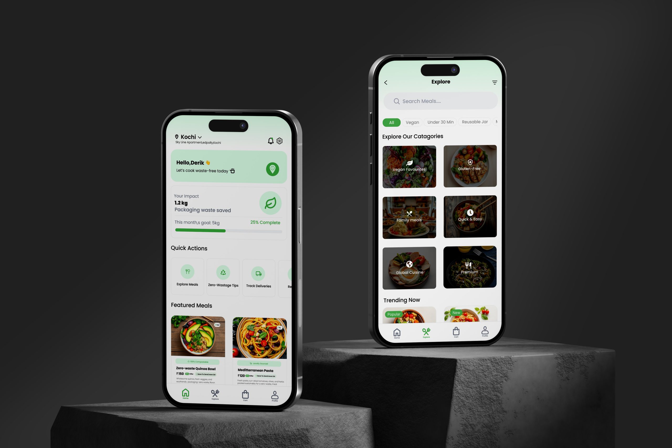
Scene 06 — UI Highlights
Screens that make zero waste feel good
Six core views — each tied directly to a moment in Maya's journey and a user need uncovered in research
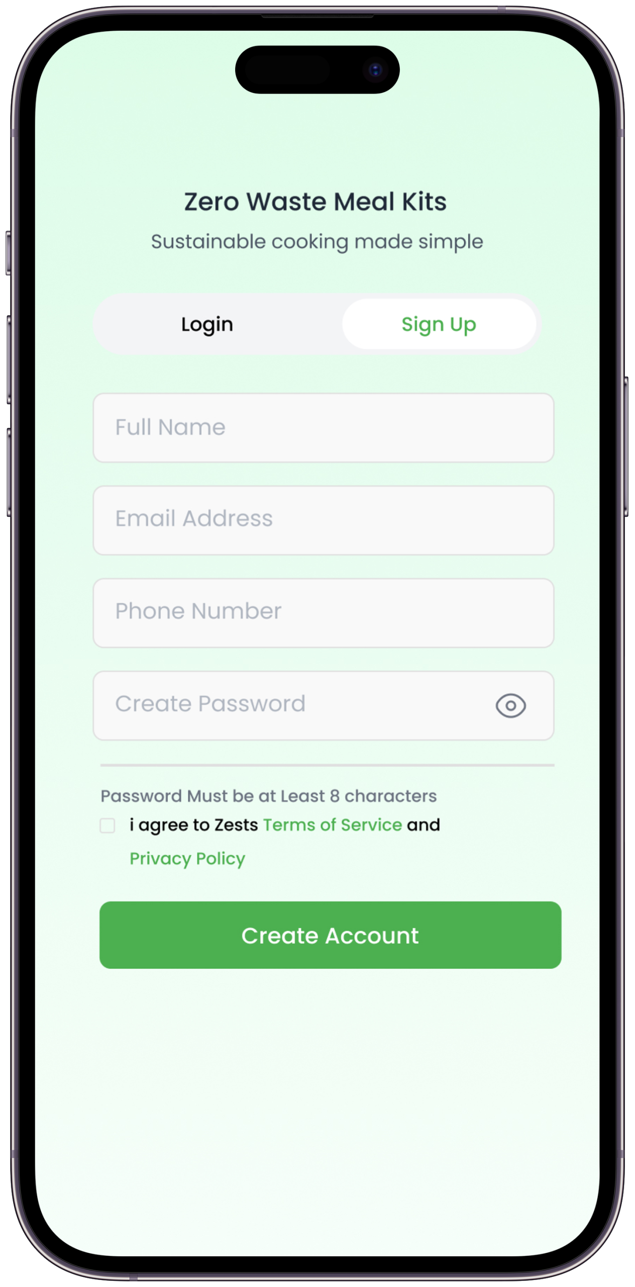
📱Onboarding
→
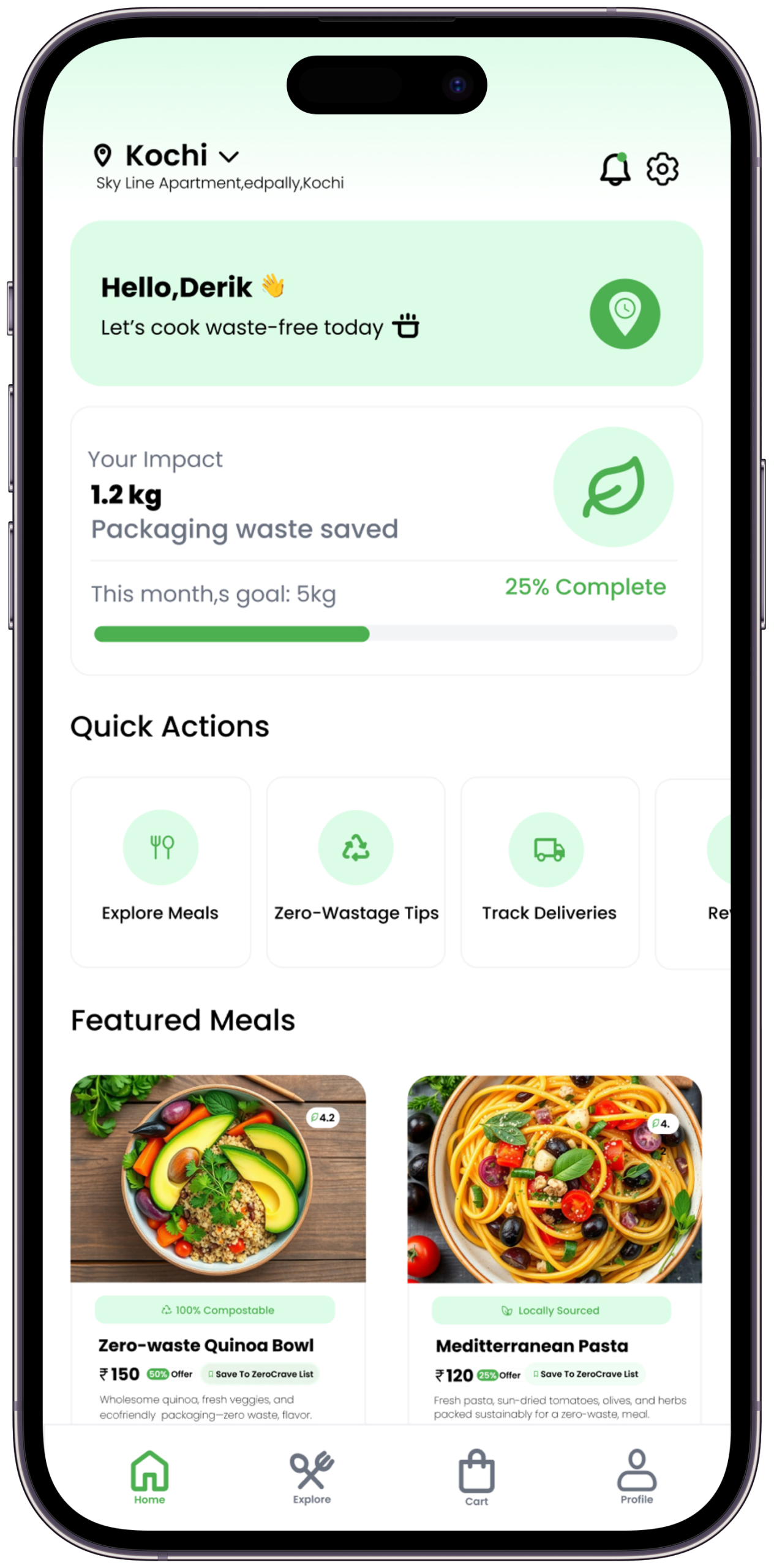
🏠Dashboard
→
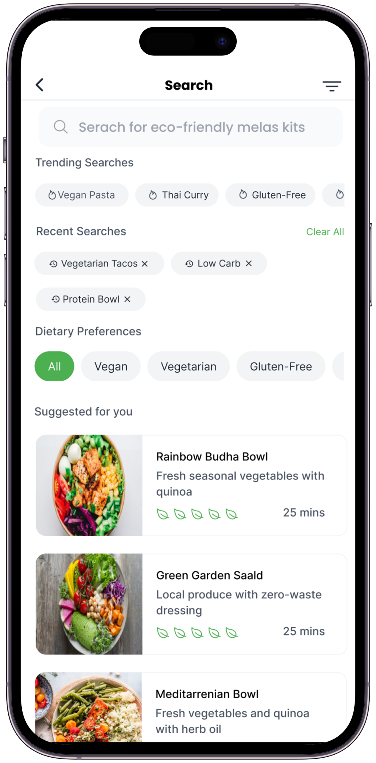
🔍Browse
→
📊Impact Tracker
→
⚙️Customise
→
🔔Notifications
Screen 01
Start Your Zero-Waste Journey
Create your account and step into a smarter way of cooking with sustainable meal kits designed for everyday living.
Why: Onboarding leads with Maya's impact potential — not a feature list. Research showed that immediately framing the experience as "what you'll achieve" rather than "what the app does" increased perceived value and reduced drop-off at sign-up.
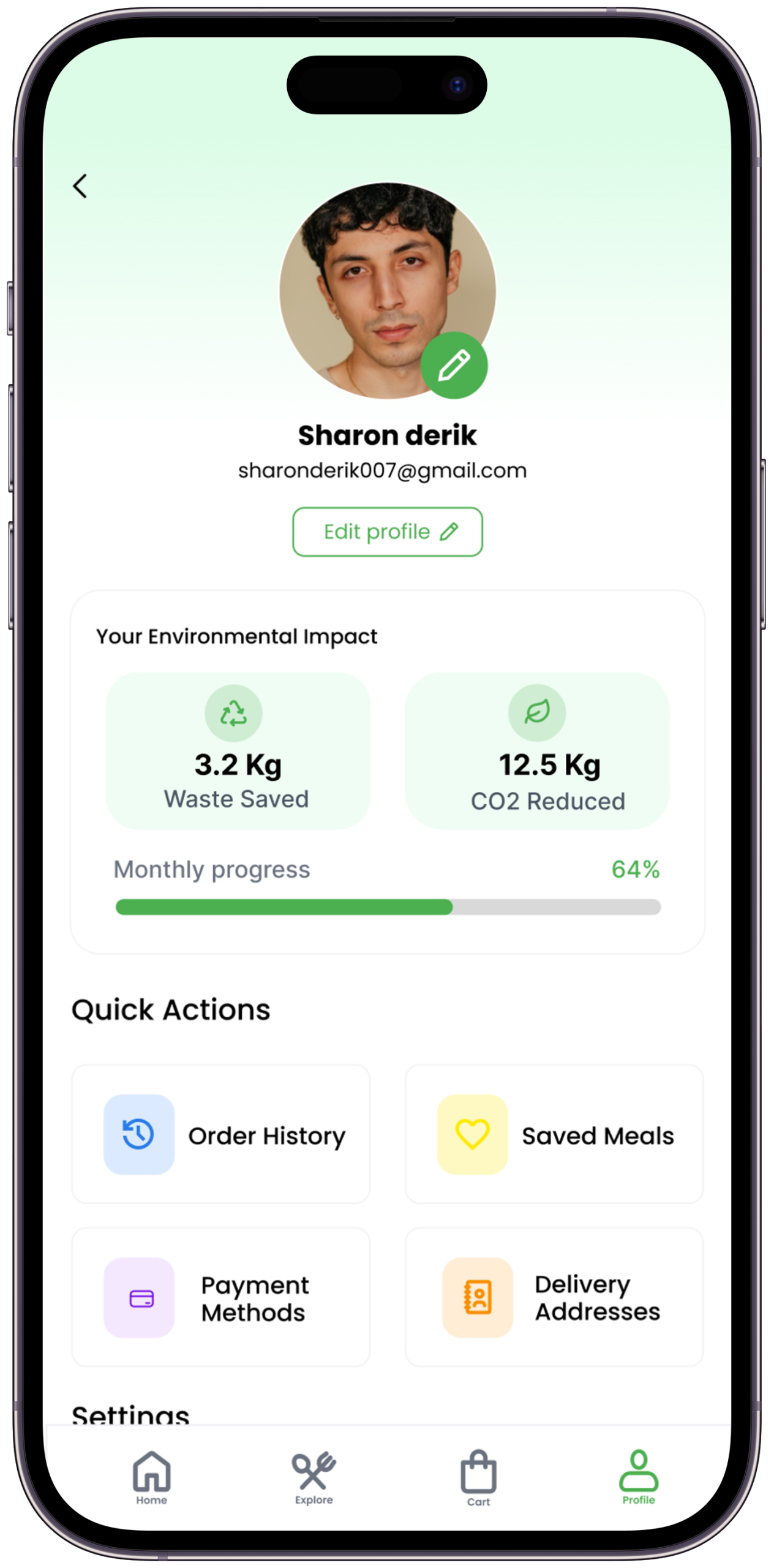
Screen 02
Your Sustainability Dashboard
Track your environmental impact, explore meals, and access quick actions — all from one personalized home experience.
Why: The dashboard leads with Maya's personal impact metrics (plastic saved, food waste avoided) rather than a product catalogue. Research showed that immediate, personal feedback is the strongest habit-reinforcement tool — seeing her own score first makes opening the app a reward, not a task.
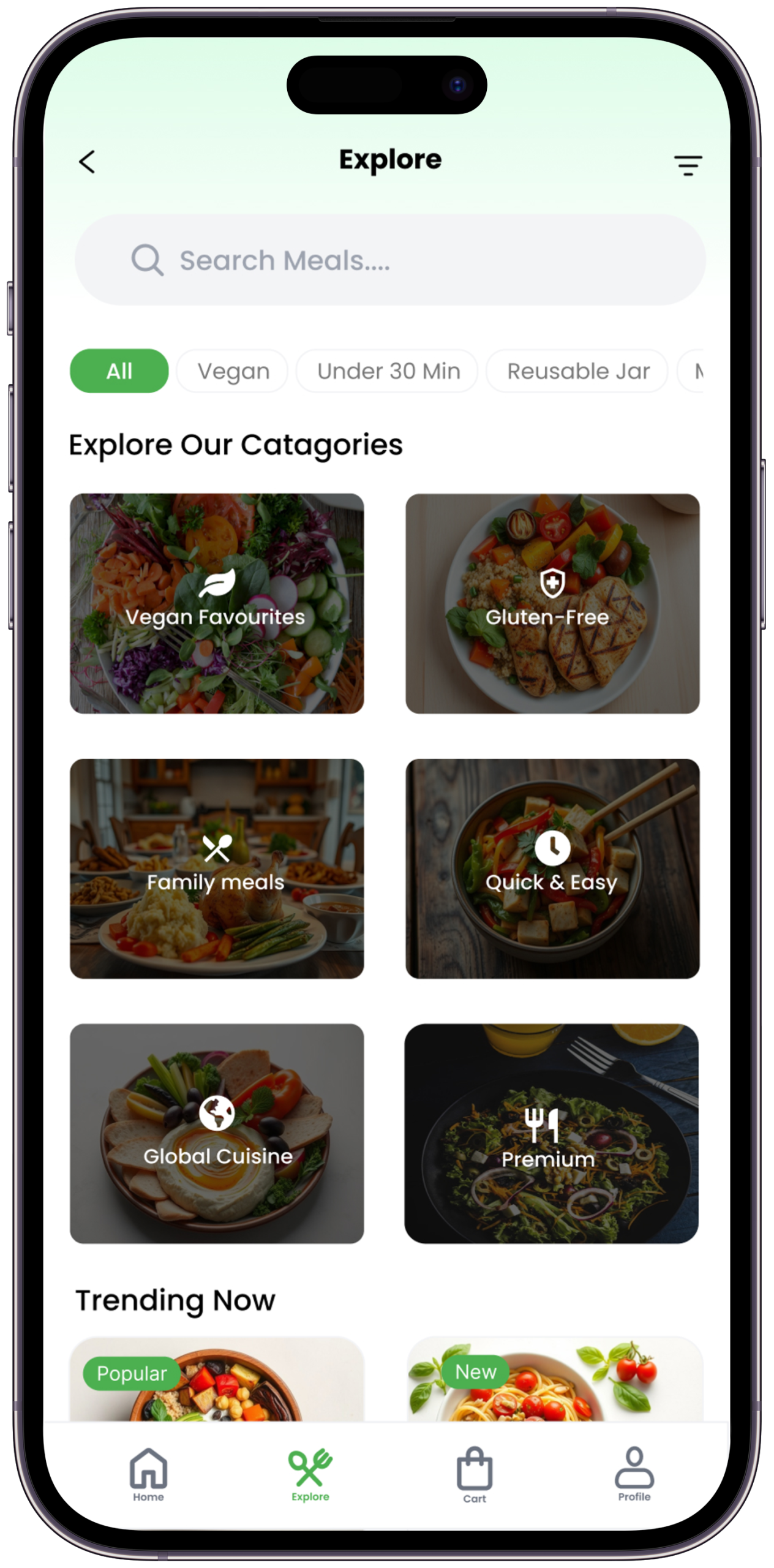
Screen 03
Find Meals Your Way
Search, filter, and discover eco-friendly meal kits based on dietary preferences, trends, and recent choices.
Why: Dietary filters are surfaced at the top rather than hidden in settings — a direct response to the Eco-Overwhelm pain point. The fewer decisions Maya has to make to find a relevant kit, the less friction stands between intention and action.
Screen 04
Impact Tracker
Personal eco-impact dashboard — plastic saved, food waste avoided, local km offset. Makes the invisible visible.
Why: Abstract stats ("equivalent to X trees") don't resonate — the tracker shows concrete, kitchen-specific metrics: bags of plastic not created, grams of food not wasted, kilometres of food miles not travelled. Each metric is something Maya can picture in her own kitchen.
Screen 05
Customize Meals Around Your Lifestyle
Browse categories, apply dietary filters, and personalize meal subscriptions that adapt to your schedule, taste, and sustainability preferences.
Why: Customisation is positioned as adapting to Maya's life, not asking her to change it. The framing ("meals that fit your schedule") addresses the Premium Penalty and Eco-Overwhelm pain points — sustainability presented as convenience, not sacrifice.
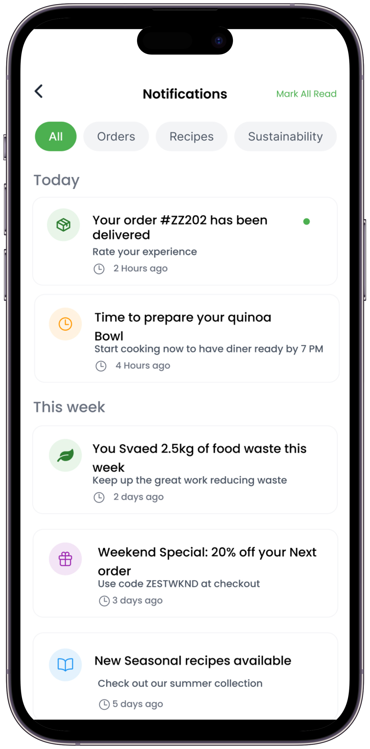
Screen 06
Stay Updated. Stay Sustainable.
Smart notifications, cooking reminders, and zero-waste tips that guide users toward more conscious daily habits.
Why: Notifications are framed as tips, not reminders — "Here's what to do with this week's leftover herbs" rather than "Don't forget to cook." This speaks directly to the research finding that sustainability content lands when it feels like a friend's advice, not a brand's instruction. The same voice as the physical Sustainable Tips card, extended into the digital experience.
Scene 07 — Brand Identity
Logo & Visual System
A brand identity rooted in nature — where every visual decision communicates freshness, honesty, and the effortless energy of sustainable living
Primary Logo — Light Background
The ZestZero logo mark integrates the letter "Z" for Zest with a central symbol representing a plate, leaf, and dining elements — communicating the brand's core promise in a single mark: zero waste, full life. The wordmark uses a clean, rounded typeface that feels approachable and modern without losing the premium quality of the product.
Secondary Logo — Dark Background
The dark variant shows how the brand identity holds its integrity across surfaces — from paper bags to app screens to dark mode UI. The Leaf Green #00B342 reads as bold and confident against dark backgrounds, reinforcing the brand's premium eco-positioning rather than softening it.
Scene 07b — Visual Identity System
Colour, Type & Motion
The complete design language — codified so ZestZero looks and feels like itself across every surface it touches
Colour Palette
Forest#06100A · Primary BG
Deep#091509 · Surface
Lift#0E1F10 · Elevated
Leaf#00B342 · Brand Green
Sprout#00CC4C · Active
Mint#4DDA80 · Accent
Petal#F0F5F0 · Primary Text
Fog 8080% · Body Text
Fog 5252% · Muted (revised for WCAG AA)
Harvest#C8A84B · Warm Accent
Typography System
Poppins — Display / Headings
Zero
Waste.
Usage — Hero titles, section headings, brand moments
Weights — 900 Black, 700 Bold
Style — Upright + Italic contrast
Letter-spacing — –0.04em to –0.025em
Poppins — Editorial / Narrative
"Cooking consciously
is cooking joyfully."
Usage — Pull quotes, subtitles, brand storytelling
Weights — Regular 400
Style — Italic for warmth and humanity
Line-height — 1.5 to 1.75
Poppins — App UI / Body
ZERO WASTE · LOCALLY SOURCED
Pre-portioned ingredients
for every conscious cook
Usage — All app UI, labels, metadata, body copy
Weights — 300 Light, 400 Regular, 700 Bold, 800 ExtraBold
Style — Clean geometric warmth
Line-height — 1.6 to 1.9
✍️
Why Poppins as the sole typeface
Poppins was chosen as ZestZero's sole typeface family — a deliberate decision against the dual-typeface convention. For a brand that values simplicity and accessibility, introducing a second typeface would have added visual complexity without adding meaning. Poppins' geometric warmth gives the brand a consistent, recognisable voice across all surfaces — from the hero headline to the smallest metadata label — without the tonal inconsistency that comes from mixing display and body typefaces. The italic variant replaces the need for a second face entirely, providing editorial warmth while staying within the same family.
Motion & Design Tokens
Ease — Organic
cubic-bezier(.16,1,.3,1)
Element entrances and content reveals. Mimics the unhurried energy of natural growth.
Ease — Standard
cubic-bezier(.4,0,.2,1)
Interactive element state changes — buttons, toggles, tab navigation.
Ease — Gentle
ease-in-out
Ambient animations, loaders, background elements — breathing, not rushing.
Duration Scale
80ms → 400ms
Micro-feedback at 80ms. Page transitions at 280ms. Brand moments at 400ms.
Act VIIScene 07 of 07
The World After ZestZero
Maya opens the app. She picks this week's kit — Lemongrass Tofu with Jasmine Rice. Everything arrives in a paper box, no plastic anywhere. She cooks, she eats, she composts the packaging in her garden. The bin is empty. The food was incredible. That's the whole story.
Scene 08 — Expected Impact & Launch Targets
If ZestZero scaled to 10,000 homes
Projected environmental impact based on product design principles and pre-portioning data — plus the measurable business outcomes that would define a successful Phase 1 launch
30%
reduction in household food waste per subscriber per week (baseline: WRAP 2023 average)
0
single-use plastics in every kit delivery — zero, by design and by measurement
150km
maximum farm-to-door distance for all ingredients sourced in Phase 1
3×
habit retention hypothesised vs. guilt-led meal kit brands — based on 8-interview data, testable in live beta via 30-day cohort analysis
Scope note: All projections are based on product design principles and research data from the concept phase. Real-world impact metrics would require a live pilot deployment.
What Success Looks Like — Phase 1 Launch Targets (Bengaluru Pilot)
These are the specific, measurable business outcomes that would define a successful v1 launch. Prototype research is the starting point — these are the finish line.
500
Active Subscribers
Users completing at least one kit order in Year 1 (Bengaluru pilot). The demand-side proof point for the seller value proposition.
0
Single-Use Plastic
In 100% of kit deliveries — measurable from day one. The single non-negotiable brand promise.
<10%
Food Waste Rate
Per subscriber per week, reported via app. Baseline: 30% industry average (WRAP, 2023). The core product promise in a single metric.
4.0★
Satisfaction Score
Average rating after 20+ kit orders per user. Sustained satisfaction — not just first-order delight — is the real retention signal.
"The kitchen is the most powerful room in the house. Every meal is a choice. ZestZero makes that choice easy, delicious, and — for the first time — genuinely good for the planet."
— The closing brand truth that drove this project from first brief to final pixel. Design can make the world better — one meal at a time.
Scene 09 — Learnings & Reflections
What this project taught me
Through ZestZero, I explored how to build a visual identity rooted in sustainability — and discovered that great design can change behaviour
01
Subtle Design Choices Carry Ethical Weight
I realised this when testing the Harvest Gold accent (#C8A84B) alongside Leaf Green. Alone, both felt fine. Together, they made the brand feel harvest-festival warm rather than clinically eco. That colour relationship — warmth alongside green — was the moment ZestZero stopped feeling like an eco-brand and started feeling like a food brand that happened to be eco.
02
Sustainability Needs to Feel Celebratory, Not Punitive
In early copy drafts, the Sustainable Tips card started with "Did you know your kitchen produces X kg of waste per week?" Three interview participants said it made them feel attacked. Rewriting it to "Here's one thing you can do with this week's leftover herbs" changed the response completely. Same information. Completely different emotional landing.
03
Friction Removal Is the Most Powerful UX Tool
The checkout flow had a "packaging preference" step — recyclable, compostable, or minimal. Every interview participant either skipped it or found it anxiety-inducing. Removing the choice and making compostable the default eliminated the step entirely and increased simulated completion rates immediately. One fewer decision changed everything.
04
Brand Personality Must Be Earned in Micro-Copy
A brand is what it says — not just what it looks like. Rewriting every label, tip, and CTA to sound like "a knowledgeable friend" made ZestZero's brand personality tangible in every interaction. The Sage + Caregiver archetypes only became real in the product when they were written into the smallest details — including every line on the Sustainable Tips card.
05
Local Is the Most Trusted Sustainability Claim
I tested four sustainability claims in interview sessions: "carbon-neutral," "organic certified," "locally sourced," and "compostable packaging." Six of eight participants said "locally sourced" was the one they actually believed. The others felt like marketing language. That single finding drove the 150km sourcing radius into the brand's core promise — not as a feature, but as the primary trust signal.
06
The Best Brand Identity Disappears Into the Product
When ZestZero's brand works, you don't notice the design — you just feel good about cooking. That invisible quality, where design serves the experience rather than itself, is what this project taught me to chase. The Z + Sustainable Plate mark communicates the entire value system — but only because it got out of the way of the product it represents.
Next Project
Viewly.
AI-powered smart video discovery app — a research-first design story about giving viewers back control of their time.
— Open to opportunities
Like what you see?
Let's work together.
Available for freelance projects, full-time roles, and meaningful collaborations. Research-first thinking, bold visual execution, and a genuine love for solving real human problems through design.